
Studio Tasch’s Visual Identity Exploration for SOLIAFEST
Designer: Studio Tasch
Scope: Visual Identity Exploration
Imagine attending a summer music festival that claims the sun as more than a source of our livelihood, but a spirit to learn from; as a beacon of freedom, and celebration. How would this translate into its visual design?
SOLIAFEST, an explorative design project by Istanbul-based graphic design studio Studio Tasch answers this question (with great enthusiasm and vibrancy). Founded by Berkay Taş, their work seeks to enliven the experience of summer joy— tapping into the importance of music as its sonic expression, as well as the conjuring of togetherness— into a language that energizes and connects people in one shared space and moment.
The birth of SOLIAFEST’s design begins from the word "Solia," derived from the word sun (sol), as a representation of summer. Studio Tasch takes the sun as a literal symbol and a metaphor to invoke spirited atmosphere they want to evoke: warmth, intensity, and boldness. The sun becomes the central concept, which is then translated into visual elements, motifs, and an intentionally crafted color palette.
We spoke with Priska Asriani, Art Director at Visious Studio, to unpack the striking aspects of this project. “It’s a colorful and joyful visual identity,” she said. Designing a visual identity for a music festival means shaping a sensory experience for its audience, and Studio Tasch successfully delivers a design that feels vibrant and enjoyable, embodying the very essence of what a music festival should feel like. The identity features a vivid yet thoughtfully curated color palette. The bold interplay of red, blue, green, and yellow energizes the design, while the presence of a softer purple tone adds harmony and balance. These colors feel inviting, as if calling out to anyone who sees them: come and have fun.
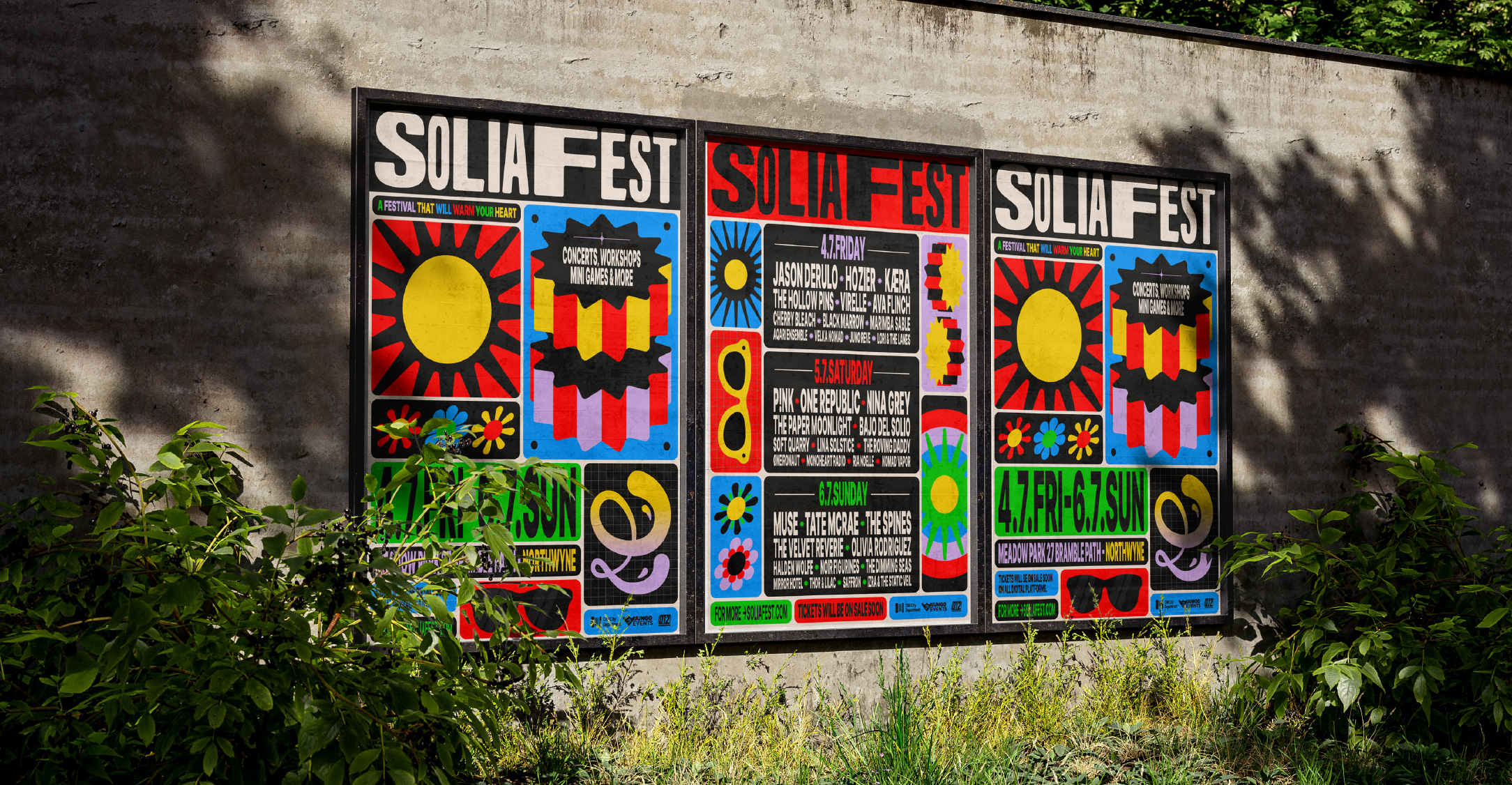
Another key strength of this identity lies in its graphics, which Priska describes as “loud—but not overwhelming.” Every visual element moves with a playful composition—each graphic seems to dance, as if joining a crowd of people moving freely to music. The sun takes center stage as the soul of the graphic concept and is interpreted into organic, flexible shapes. This approach gives the graphics a contemporary edge, avoiding clichés while allowing ample room for creative exploration, whether in digital or print formats. In the context of a festival, where movement and energy are everything, these graphic elements successfully create an immersive and atmospheric experience.
Typography plays a starring role in the visual identity as well. With bold and expressive characteristics, the lettering doesn't merely convey information—it moves. Letters sway left and right, as if responding to an unseen rhythm. This motion reinforces the dynamic and musical nature of the entire system, turning text into a living part of the design.
The identity of SOLIAFEST feels very much alive. Studio Tasch demonstrates careful consistency in translating the identity across real-world applications—from outdoor signage and posters to merchandise and social media assets—all unified by a cohesive yet spirited visual language. Festival signage becomes a massive canvas for the identity’s hallmark bright colors and striking typography. Graphics flow in the background, supporting rather than distracting from the conveyed information. On social media, the identity shows its adaptability—embracing multiple content formats while maintaining a strong, recognizable presence.
One of the identity system’s greatest strengths is its ability to “live and move”—both literally and figuratively. It adapts seamlessly across different platforms, all while retaining the same emotional resonance: one of joy, rhythm, and celebration.
The SOLIAFEST visual identity exploration by Studio Tasch shows how graphic design plays in shaping atmosphere, building narrative, and creating a collective experience for music festivals. With its fearless color choices, expressive typography, and consistently executed cross-media applications, the identity becomes the very face of a festival that lives, moves, and makes itself heard.


