Frutiger Aero and the Nostalgia for Early 2000s Digital Aesthetics
Header Image Credit:
Markus Maribu
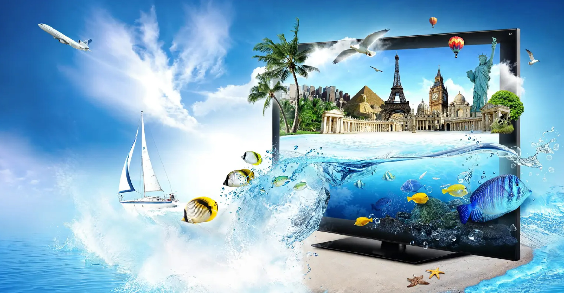
Picture a bright blue ocean enmeshed with green grass fields, with a group of bubble-surrounded dolphins jumping across its terrains. Here lies a landscape of absurdity that entangles the “real” and the “digital” onto a single frame. Do you recognise this vision?
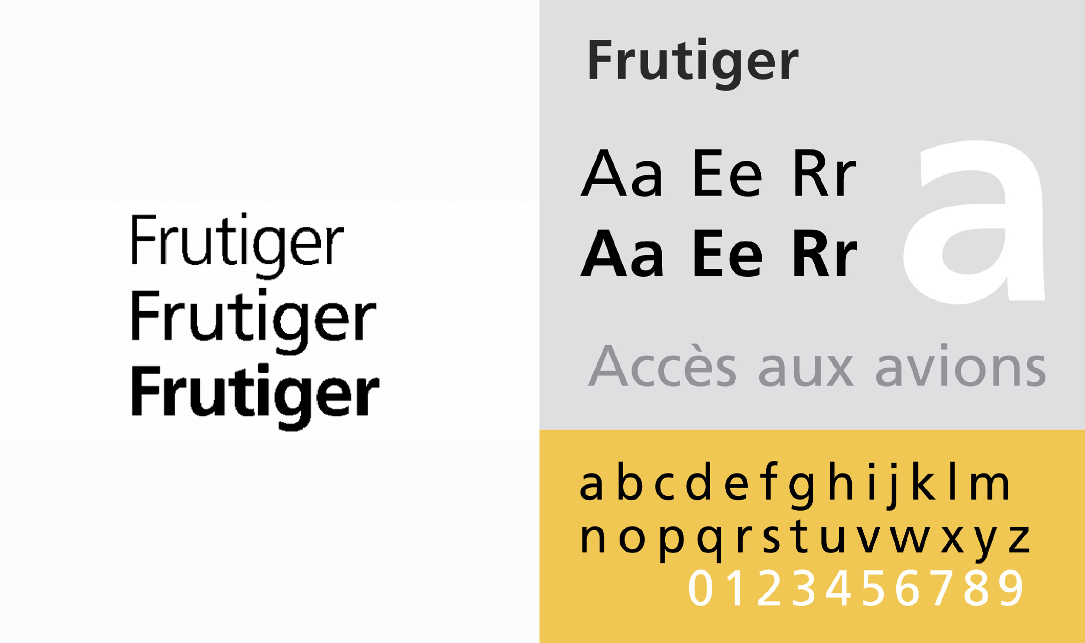
Although its name remains unrecognisable to many, its aesthetic persists. You’ve definitely seen this on your Windows systems, and assumed it to be an image of futuristic technology. Designed in the early 2000s, this style is called Frutiger Aero. Its name was first coined by Sofi Xian of the Consumer Aesthetics Research Institute (CARI) in 2017, which combines two elements that define its (design) aesthetic: “Frutiger,” referring to the modern, clean, and legible typeface designed by Adrian Frutiger, and “Aero,” referencing the visual style of Windows Aero, particularly a nod to the Windows Vista operating system. Following a design wave that was arguably stifled with Bauhaus influences, Frutiger Aero arrived as a breath of fresh air—evoked in the "cool" imagery in the Windows XP background.
Adobe defines Frutiger Aero through its glossy appearance, bright gradients, and futurism—embodying the technological advancements of the early 2000s in its design. This visual language was first seen in the early versions of the Windows Longhorn operating system (which would later be released as Windows Vista), as well as the skeuomorphic design of Mac OS X. It was birthed amidst a period of global transition that include: a shift in the design landscape from the Y2K era and an array of political instabilities that evoked public outcry, such as the 9/11 attacks. In such a turbulent context, Frutiger Aero emerged as a new visual language that brought certainty through its optimism and its expression of hope in an increasingly digital future.

Frutiger Aero gained wider recognition in late 2004 through the release of Windows Media Player 10, which coincided with the launches of seventh-generation game consoles, such as the PlayStation Portable (PSP) that featured the XrossMediaBar (XMB) interface; Apple’s iconic iPod “Silhouette” ad campaign (with its Funky Seasons vibe); and the rise of Web 2.0 design trends. This era evoked a collective excitement in design, embracing a new spirit that was reflected in the visual elements that blend technology and lifestyle with a playful, futuristic touch. Frutiger Aero’s popularity continuously soared in 2005 and 2006, with the launch of Windows XP Media Center Edition 2005, Longhorn Build 5048 (the first to showcase a fully Aero-enabled UI), Windows Vista Beta 1, and various devices like the Xbox 360 with its Blades Dashboard, the Nintendo DS Lite, PlayStation 3, and Nintendo Wii.
Between 2007 and 2012, Frutiger Aero reached the peak of its influence, dominating nearly every aspect of pop culture and was deemed as an evolution from the Y2K aesthetic. During this period, Frutiger Aero intersected with other popular styles such as McBling, Surf Crush, and ElectroPop 08, spawning a variety of sub-aesthetics under what became known as the Frutiger Umbrella.
Unfortunately, the rise of Flat Design in the early 2010s marked the beginning of Frutiger Aero’s decline. The year 2012 marked their downfall, as the skeuomorphic look of Windows 7 was abandoned for the implementation of a flat style for Windows 8 and Windows 10 software designs. By 2013, the launch of iOS 7 and the dominance of minimalist design indicated the shift across the design industry. The Frutiger Aero style– that was once heralded as the face of the future–was now considered outdated and overly complex. The emergence of the Corporate Memphis aesthetic in 2017 further cemented the move towards a more uniform and “clean” design language.
However, over time, the collective nostalgia for the early 2000s has triggered a revival of Frutiger Aero. Fueled by millennials and Gen Z who grew up with the aesthetic, the Frutiger Aero has been revived. Its re-emergence began from pop culture—as it appeared in internet music visuals, such as those from A. G. Cook. Then, new design breakthroughs began to absorb visual elements from Frutiger Aero, such as the iPhone’s recently introduced translucent material called Liquid Glass that behaves like real-world glass. Its color shifts with its surroundings, much like a glossy bubble mirroring the world around it. This material has been implemented across Apple’s software design from the smallest UI elements used daily—like buttons, sliders, text, and media controls—to larger navigation elements like tab bars and sidebars in apps.
In the context of user design, Frutiger Aero has been implemented to evoke a sense of ease in technological use. Soft gradients, glass-like buttons, and clean sans-serif fonts offer a visually comfortable experience for its users, and create a sense of confidence throughout their interaction with technological devices. Before flat design took over, mobile interfaces on phones like Nokia, Sony Ericsson, and early smartphones relied on Frutiger Aero’s signature visuals: simple icons, rounded buttons, and glowing backdrops fosters an intuitive-feel rather than intimidating; creating a sense of closeness with its users. From a branding perspective, major companies like Microsoft, Samsung, and even Lufthansa once embraced the Frutiger Aero style to position themselves as modern, global, and trustworthy brands. Elements like gradients, metallic finishes, and sleek typography communicated the message: we are the future.
Today, in an era defined by uncertainty, visually nostalgic styles are once again in demand. Frutiger Aero recalls a more optimistic digital age—bold, colorful, shiny, and joyful. It's no surprise that brands and designers are bringing it back: its vibrant aesthetic is attention-grabbing, emotionally resonant, and hints at a brighter, more hopeful future. In contrast to the cold, generic feel that minimalism came to embody– despite its security and professionalism– Frutiger Aero offers a welcome antidote to design fatigue.
The resurgence of Frutiger Aero reflects a longing for a time when technology felt more human, hopeful, and delightful. In a digital world now saturated with sterile and generic design, this aesthetic offers an alternative that helps us feel more connected, secure, and optimistic about the (digital) future.


