
A Closer Look at the Visual Identity of Expo 2025
The upcoming World Expo, EXPO 2025, will open its doors on April 13, 2025, in Osaka Japan. Carrying the theme of “Designing Future Society for Our Lives,”, the expo will showcase incredible innovations from around the world over six months. This will be the third time Osaka plays host to the expo having previously hosted in 1970 and 1990. With anticipation for this momentous event, let’s take a look at the brand identity of the event, which was officially unveiled in 2022.
In a press statement from EXPO 2025, it was explained that the goal of the identity is “to unify the designs used in various situations, such as numerous activities, displays, services, etc., all of which are related to the Expo.” The identity was built upon the expo’s official logomark and carried the unique concept of a “living” design system. As described in the official design system overview, “The Expo’s design system is structured to grow and evolve like an organism. We adopted this structure based on the idea that we need a ‘living’ design system with dynamic rather than static elements in order to embody the Expo’s theme...”
The design system itself takes on the concept of “Circulation of Lives” and is structured to combine human-based and technology-based elements. The design system puts the value of connections on center-stage. As they put it, “Connections are becoming stronger and stronger every day in our highly networked world. Meanwhile, disunity and opposition are accelerating as if to reject excessive connections…The relationship between people and our bloated social system is precarious too. We believe the key to relieving this tension is circulation. All forms of life are neither completely connected with nor separated from each other. They keep changing while meeting and parting with one another. Eventually, the circulating forms of life are fused, creating a new existence from the chaos. This design system does not represent a nature-centric, system-centric, or anthropocentric future; it represents a bio-centric future characterised by the circulation of brilliant life.”
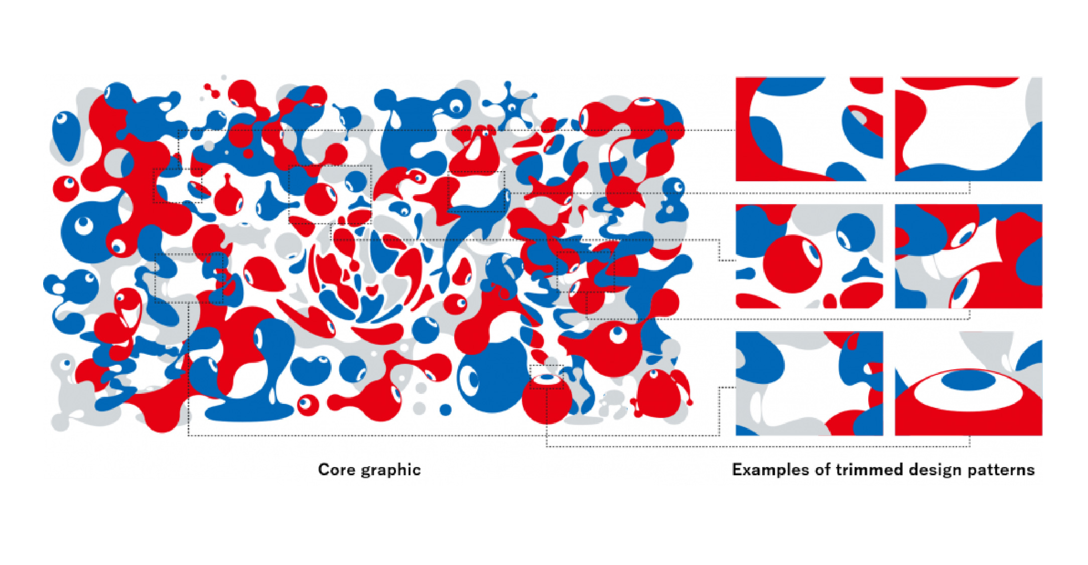
Inspired by the motif of a cell that is born, divides, multiplies, and evolves, the design system is capable of simultaneously providing 3D shapes that can be applied to virtual spaces such as the Virtual Expo and flat 2D images that are used in planar design. This then evolved into design elements that can be split into three categories; ID, which represents individual life, GROUP, representing community, and WORLD, representing a diverse ecosystem coexisting in harmony. As explained in that same overview, “the three elements of ID, GROUP, and WORLD are designed to not only symbolise the Expo’s concept in a decorative role, but also to play a functional role in future broad development of the concept.” The WORLD design element specifically appears in four different color schemes; Inochi (which also serves as the main core graphic), Umi, Noyama, and Hikari, showcases the idea of celebrating “our everyday lives in which we see the same world from different perspectives and in different colours.”
With the expo being only three months away, people are eagerly counting down the days until the doors of the Expo are officially open. The Expo 2025 visual identity bolsters this enthusiasm by highlighting how each and every one of us, as individuals, can come together towards a broader and brighter vision for the future of the world. It successfully boosts the idea of the Expo 2025 as the innovative hub that fosters this hope for a better tomorrow—true to the event’s concept of being the “People’s Living Lab” that brings together the best of the best from all over the world.


