The Official Poster of Nosferatu (2024): An Ode to the Legacy of Gothic Design
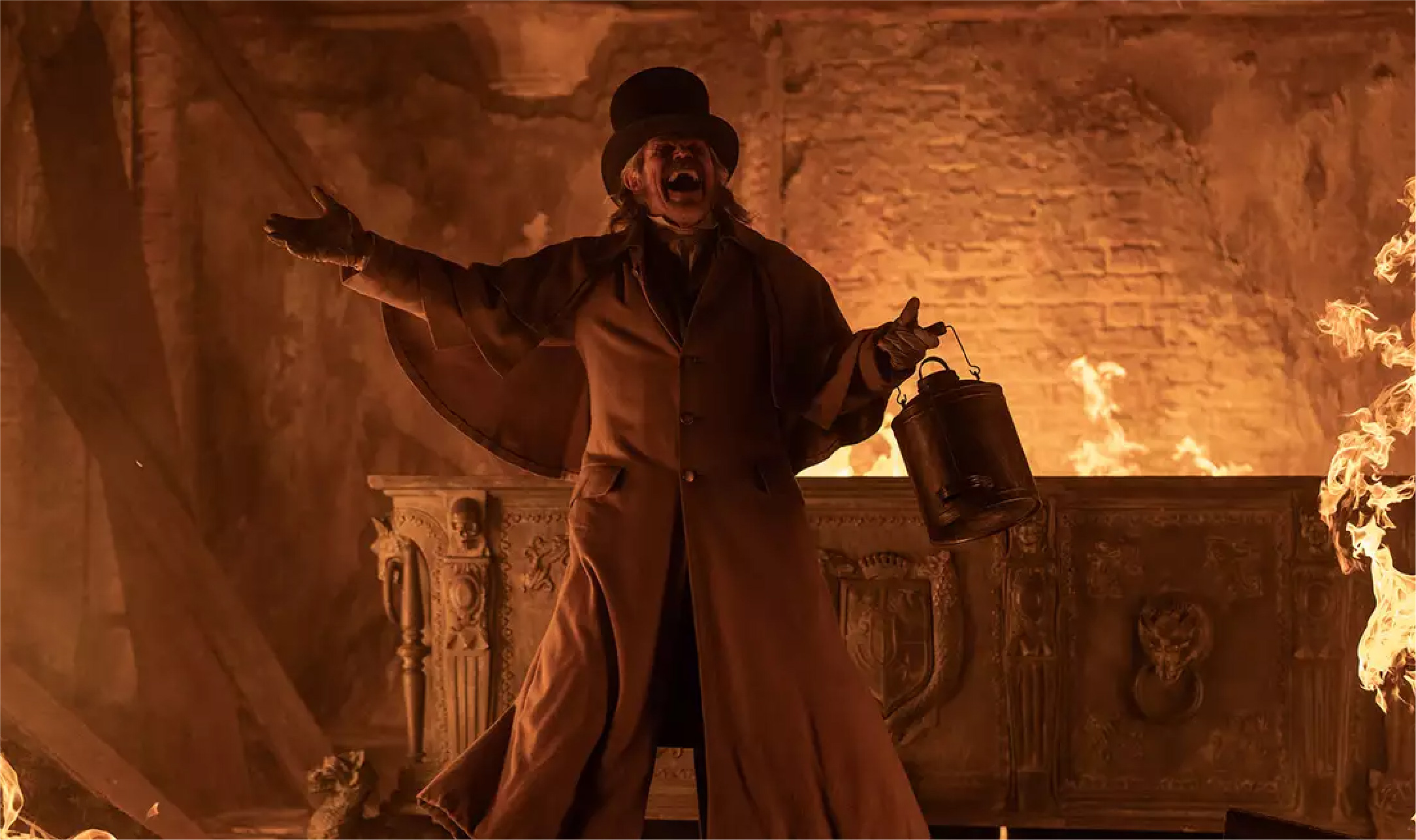
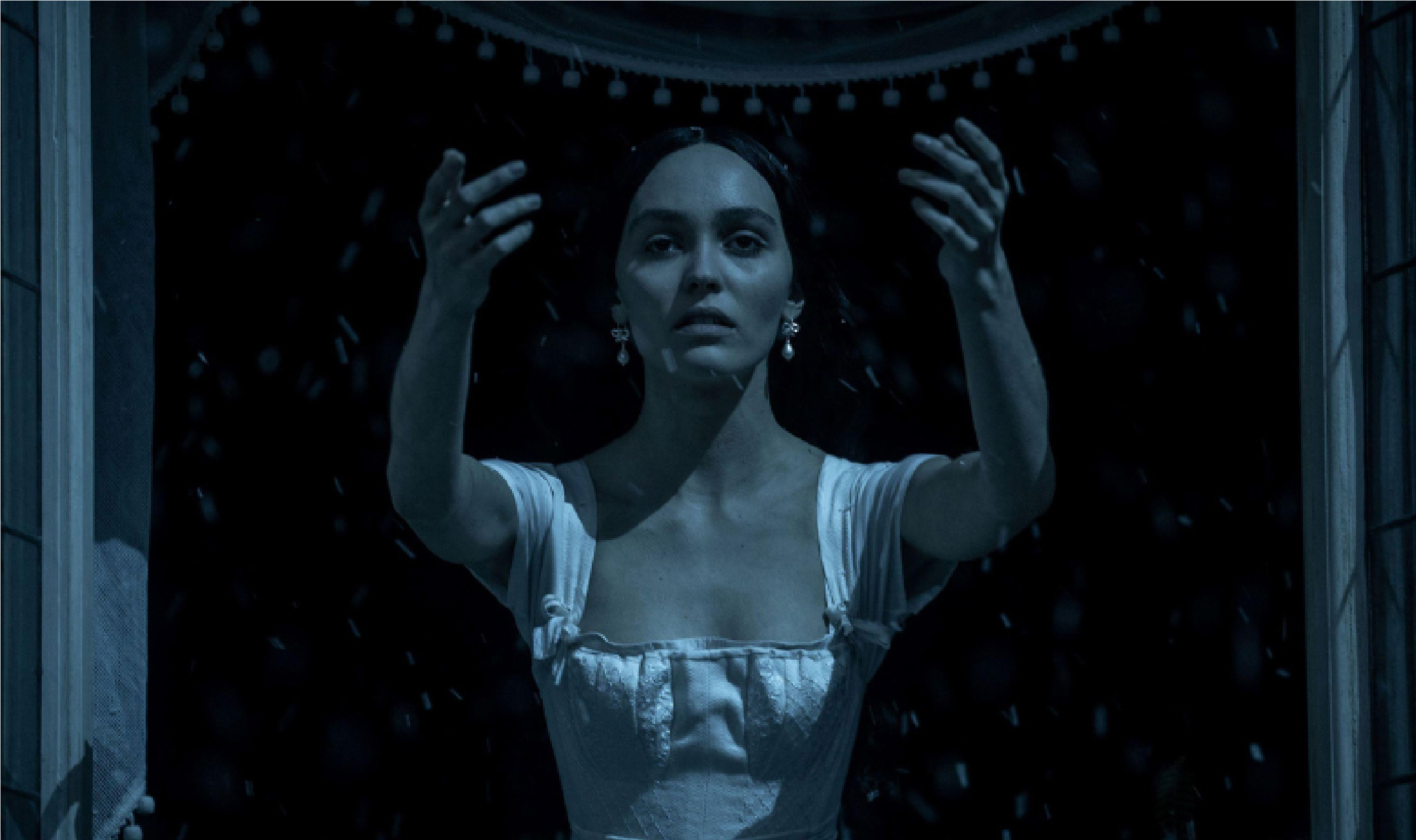
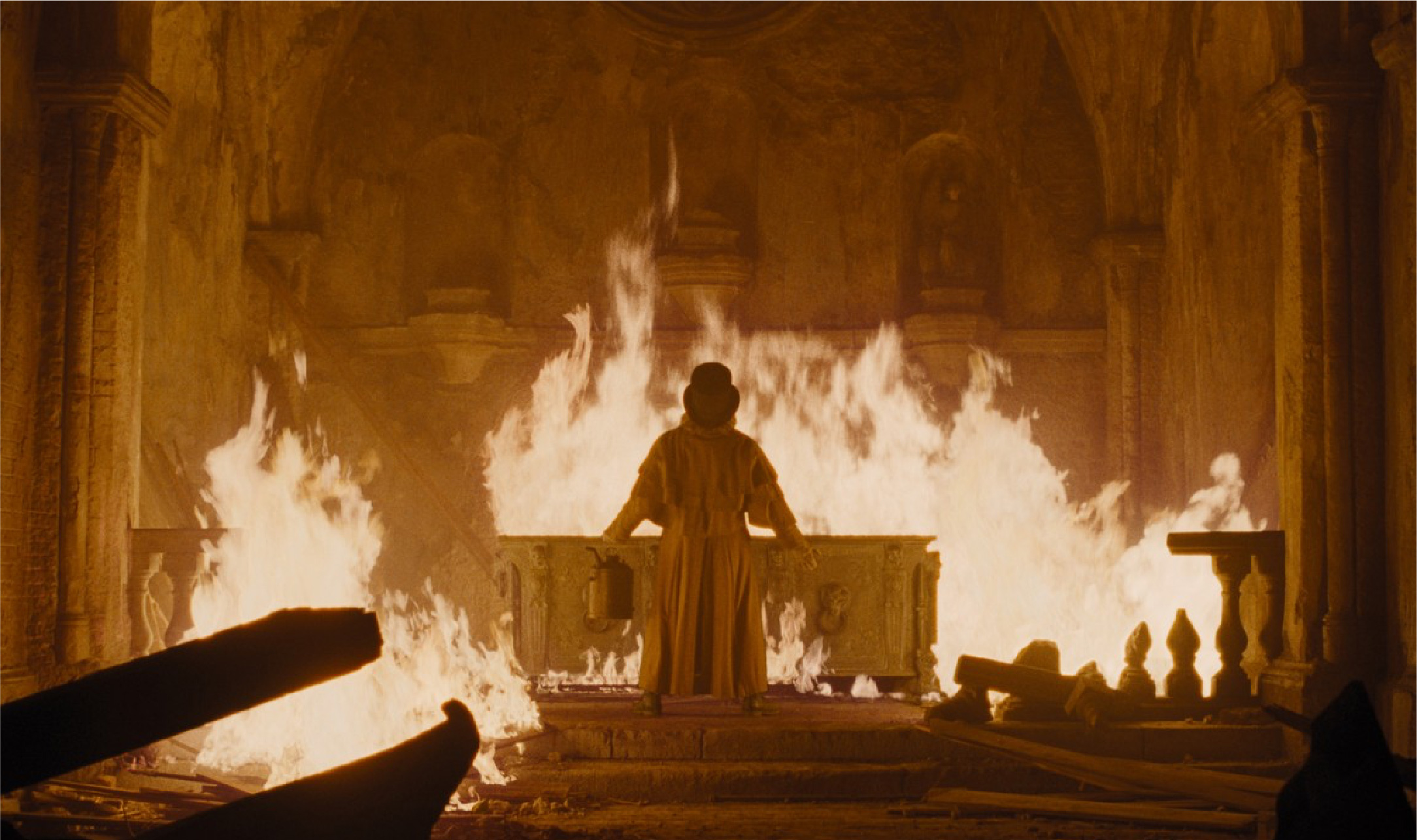
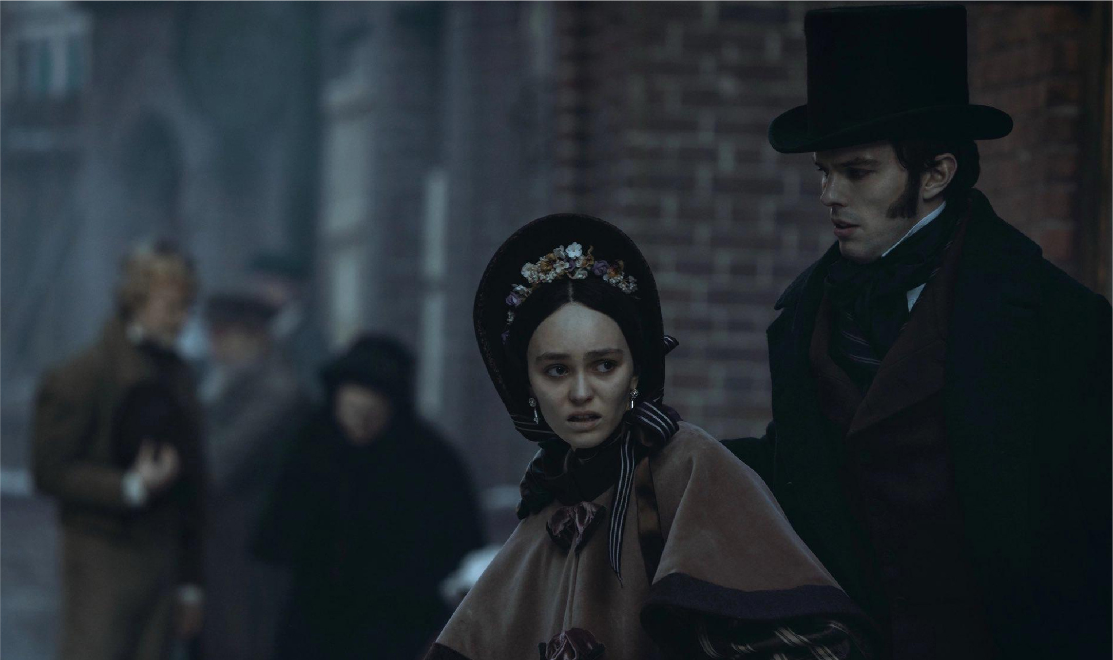
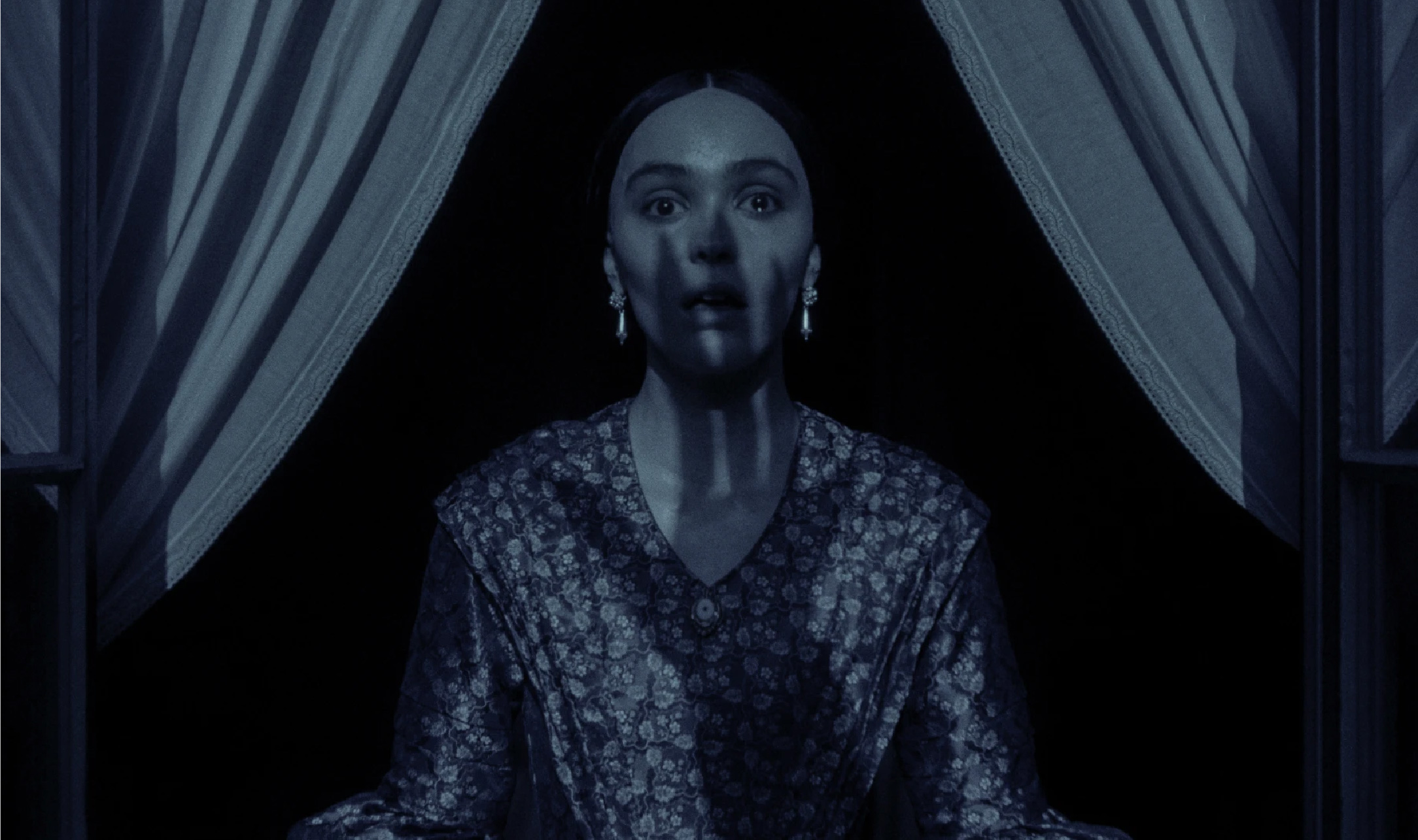
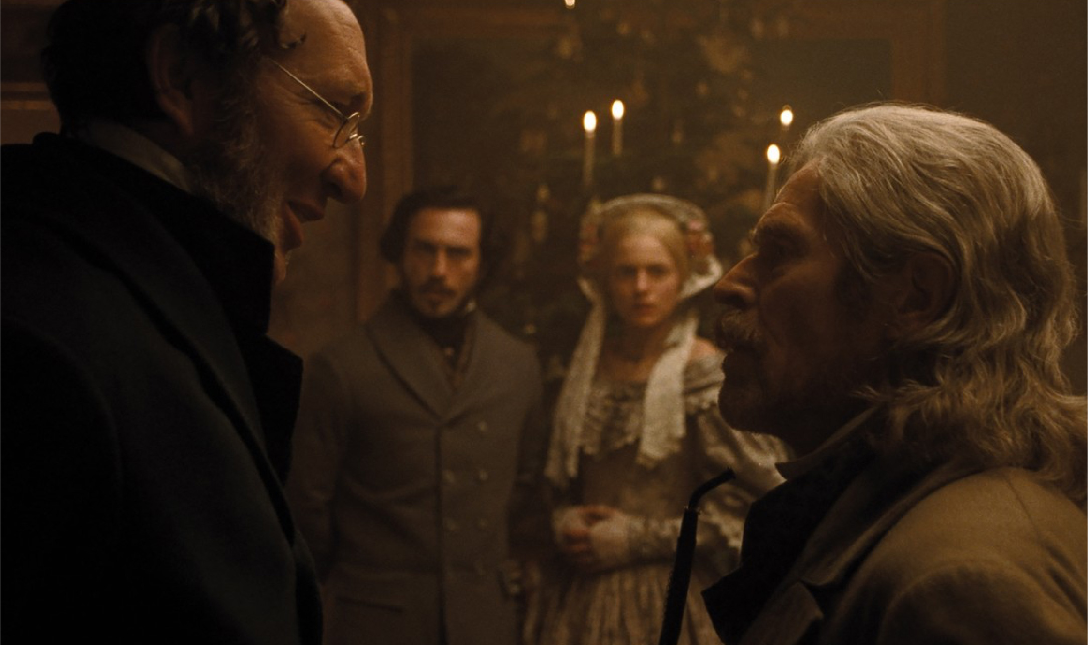
Nosferatu has been an icon in horror film history since its initial release in 1922. Bringing the German Expressionist style, the film directed by F.W. Murnau shaped the aesthetics of horror cinema. Now, director Robert Eggers has revived Nosferatu (2024), adapting it to contemporary cinema while preserving its Gothic atmosphere. The film follows the obsessive relationship between a young woman named Ellen Hutter and the Transylvanian vampire, Count Orlok. This obsession leads Orlok to stalk Ellen, threatening her life with an aura of mystery and terror. Beyond its narrative, another compelling element of the film is its official poster design, which embraces Gothic aesthetics within modern graphic design.
The Gothic style first emerged in the early 12th century in northern France. It quickly spread through architecture, sculpture, textiles, and visual arts such as murals, stained glass, and illuminated manuscripts. According to the official website of the Victoria and Albert Museum, the Gothic visual style combines meticulous detail with an expressive elegance. The term "Gothic" was first coined by Italian writers during the late Renaissance period, initially intended as an insult—used synonymously with "barbaric." These writers condemned the style as impure, linking its emergence to the Gothic tribes that destroyed the Roman Empire and its classical culture in the 5th century AD. Early Gothic visual art featured rigid, simplistic, and hieratic forms. Large-scale paintings developed in the early 14th century were commonly used to decorate retables (decorative panels behind church altars). Flowing and curved lines became distinctive features of Gothic visual art. Additionally, Gothic paintings were characterized by fine details and elegant decorations, often incorporating gold backgrounds on panel paintings. Over time, Gothic painting compositions became more complex and spatially deep.
Gothic style in graphic design takes inspiration from the fine arts movement that flourished across Europe until the 16th century. Its grand structures, intricate details, elaborate ornamentation, and dramatic ambiance are key Gothic characteristics adapted into graphic design elements. In typography, Gothic influence manifests through Blackletter fonts, commonly used in medieval manuscripts and early printed works, such as the Gutenberg Bible (1455). Also known as Gothic script or Gothic minuscule, this font was widely used across Western Europe around 1150 and remained the standard typeface for Danish, Norwegian, and Swedish texts until the 1870s. Still frequently employed in contemporary design, Blackletter exudes an antique, bold, and formal impression. Over time, Gothic aesthetics in design have been widely applied to film posters, particularly in horror, thriller, and fantasy genres. Classic horror films incorporate Gothic elements in their poster designs, featuring Blackletter fonts resembling ancient script, shadowy character illustrations, and backgrounds reminiscent of castles, churches, or graveyards. In modern cinema, director Tim Burton is recognized as a key figure in reviving Gothic aesthetics in films and their visual elements, including posters. The poster designs for The Nightmare Before Christmas (1993) and Corpse Bride (2005) incorporate dark color schemes, intricate classical ornamentation, and lighting that enhances a somber atmosphere.
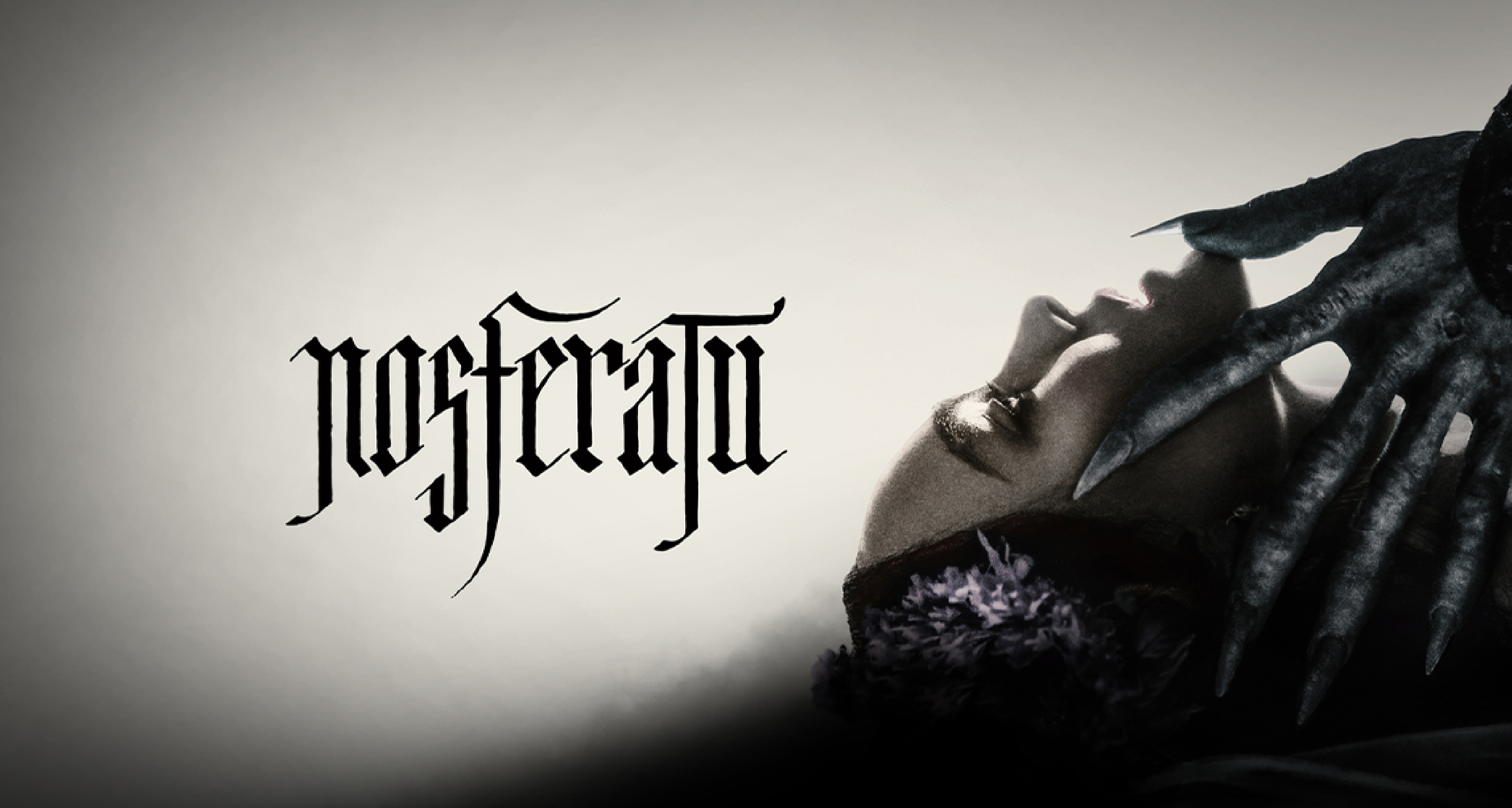
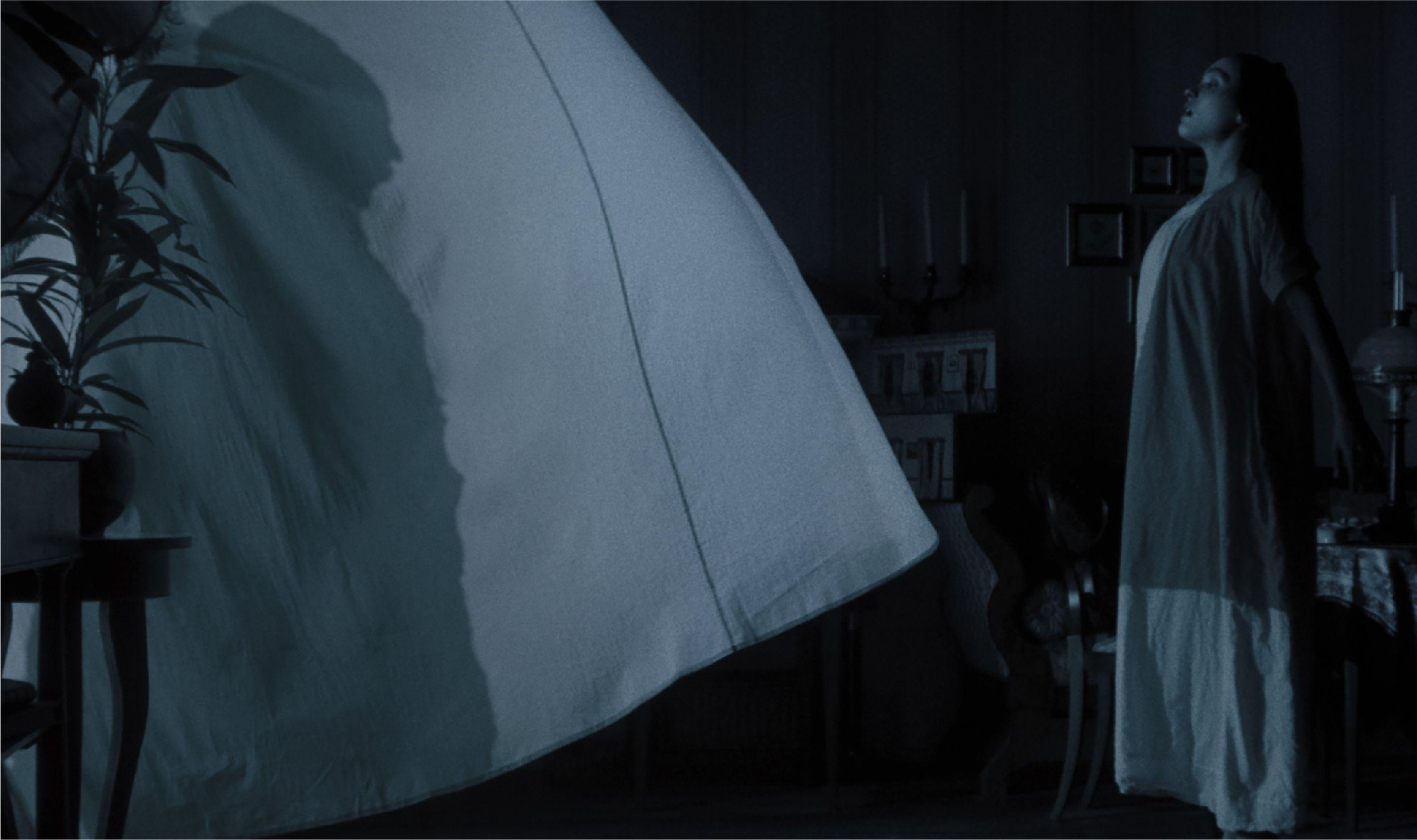
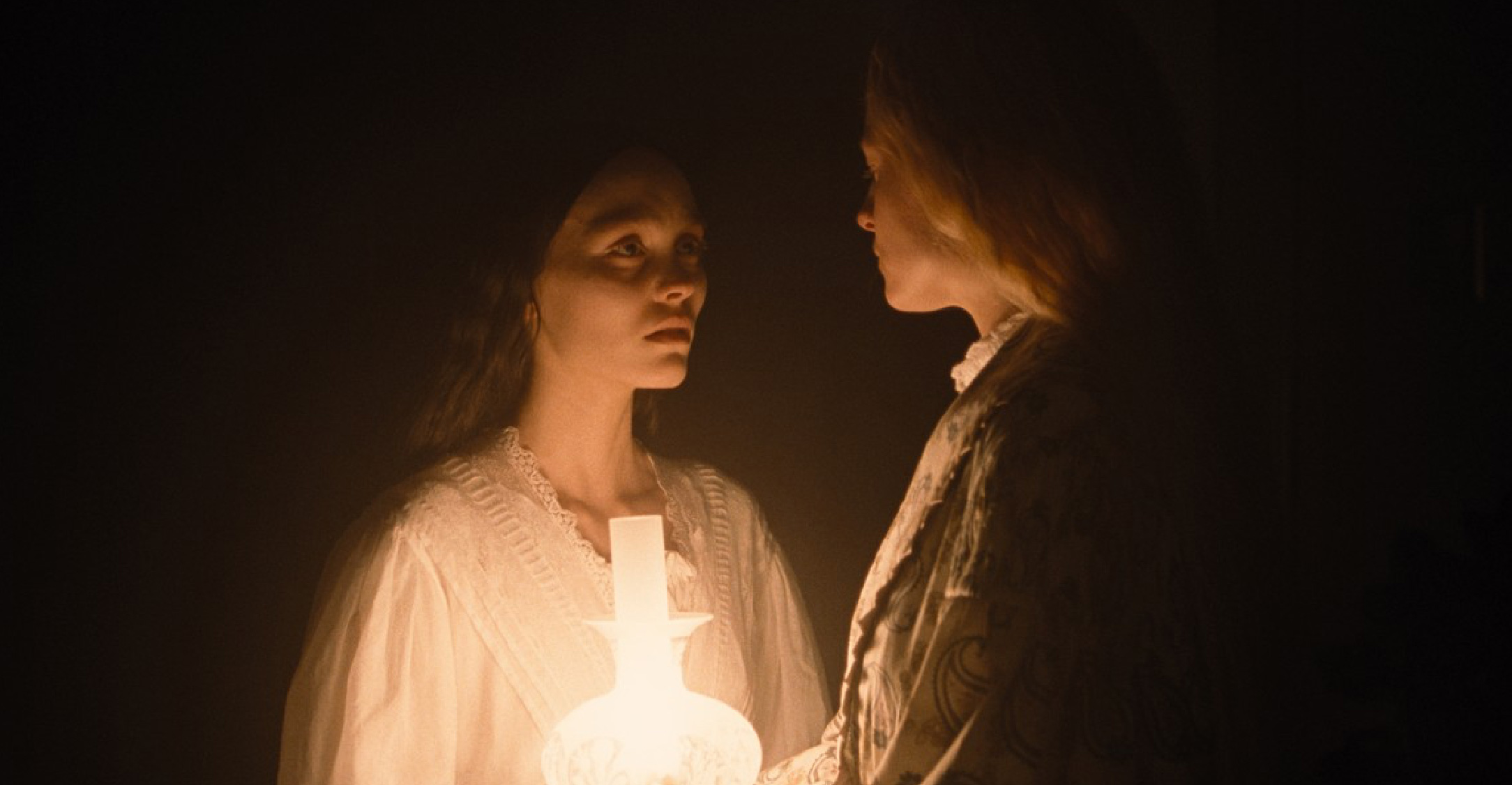
Today, the poster for Nosferatu (2024) exemplifies the application of Gothic aesthetics in modern graphic design. Evoking a sense of classic horror, every visual element in the poster is designed to create a dark and mysterious atmosphere, aligning with Gothic stylistic traits. The poster composition also instills a feeling of unease. The silhouette of the central "creature" dominates the layout—creating a sense of overpowering presence and reinforcing the notion that this figure holds immense power. Meanwhile, the background is left empty, allowing room for viewers' imagination. Dramatic lighting, or chiaroscuro—an essential characteristic of Gothic painting—is also employed in the poster design. Extreme lighting effects that "peek" from outside the frame create sharp shadows that intensify the tension. Color palettes play a crucial role in setting the mood of a design piece. This film poster utilizes a dark color scheme to build psychological tension. In the main poster, darkness prevails—symbolizing fear and the unknown. Conversely, white light introduces a contrast. In other variations of the Nosferatu poster, cool tones such as deep blue and gray contribute to an unwelcoming sensation. The most prominent Gothic element in the Nosferatu poster is the use of Blackletter typography. The typeface reinforces an antique impression rooted in classic horror heritage. Unlike modern film posters, which often favor minimalist fonts, Nosferatu pays homage to the history of Gothic design by maintaining its authentic aesthetic. Distinct Gothic details can also be observed in the poster, from castle imagery to eerie anatomical features, all enhancing the film’s intended atmosphere. Additional design elements further solidify Nosferatu's mystique, making its world feel all the more enigmatic.
As a tribute to classic horror heritage, the Nosferatu (2024) poster proves that Gothic aesthetics remain relevant in modern graphic design. Amidst the growing trend of minimalist design, Nosferatu embraces Gothic complexity, reminding us that this style continues to hold an enduring appeal.
