Sofia Coppola: The Atmosphere Designer
written by Dhanurendra Pandji
Sofia Coppola is a designer of atmosphere. Her films feel like dreams, painted with soft palettes—muted pastels, melancholic pinks, and cool blues. More than just an aesthetic choice, color in Coppola’s films becomes a distinct language, speaking to the women’s experiences, feelings of isolation, and a world that appears beautiful on the surface yet harbors deep complexities underneath.
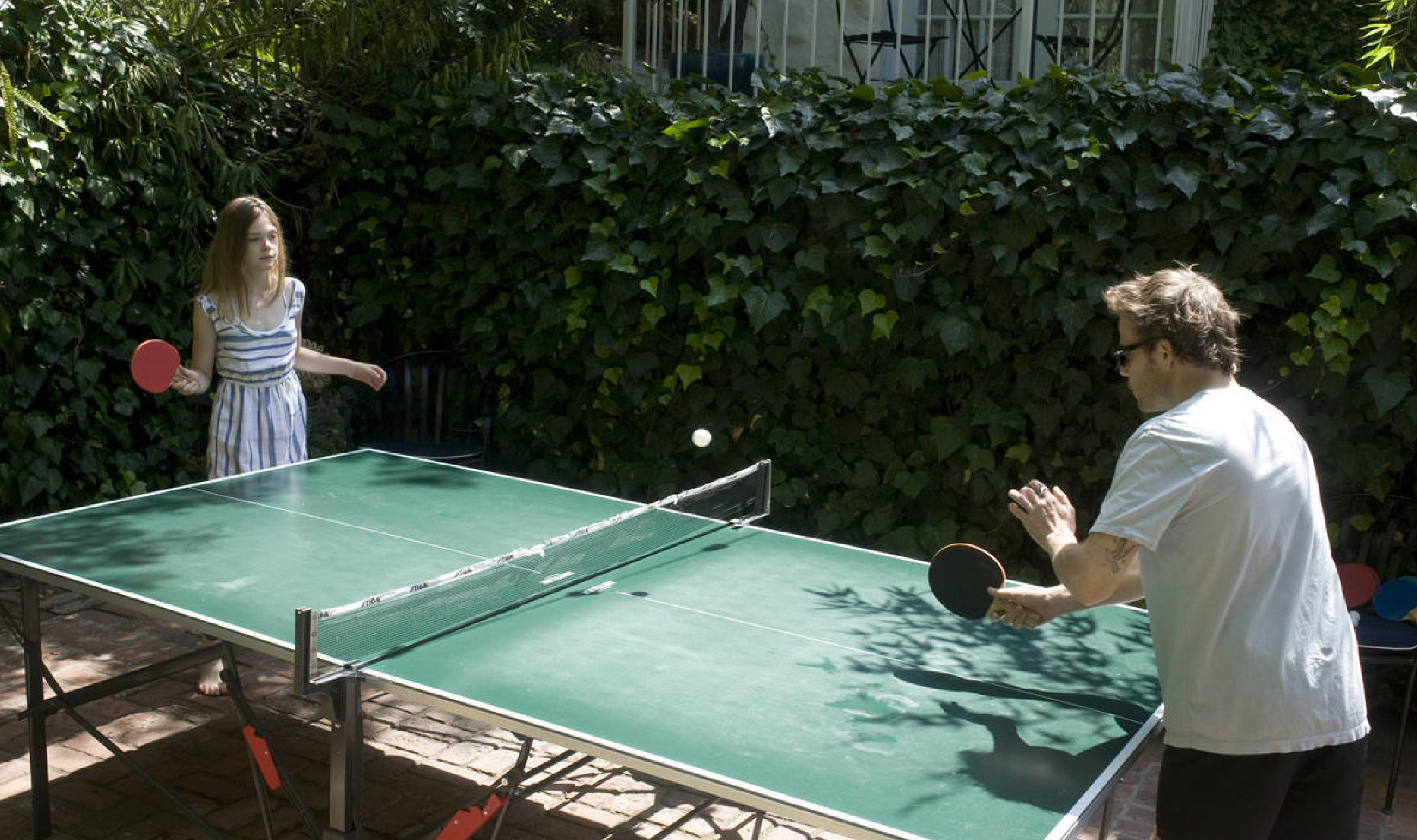
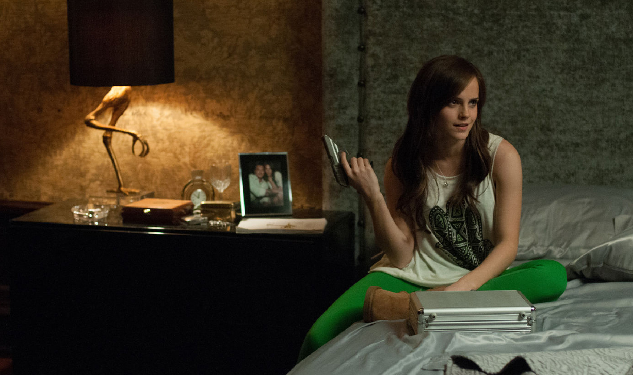
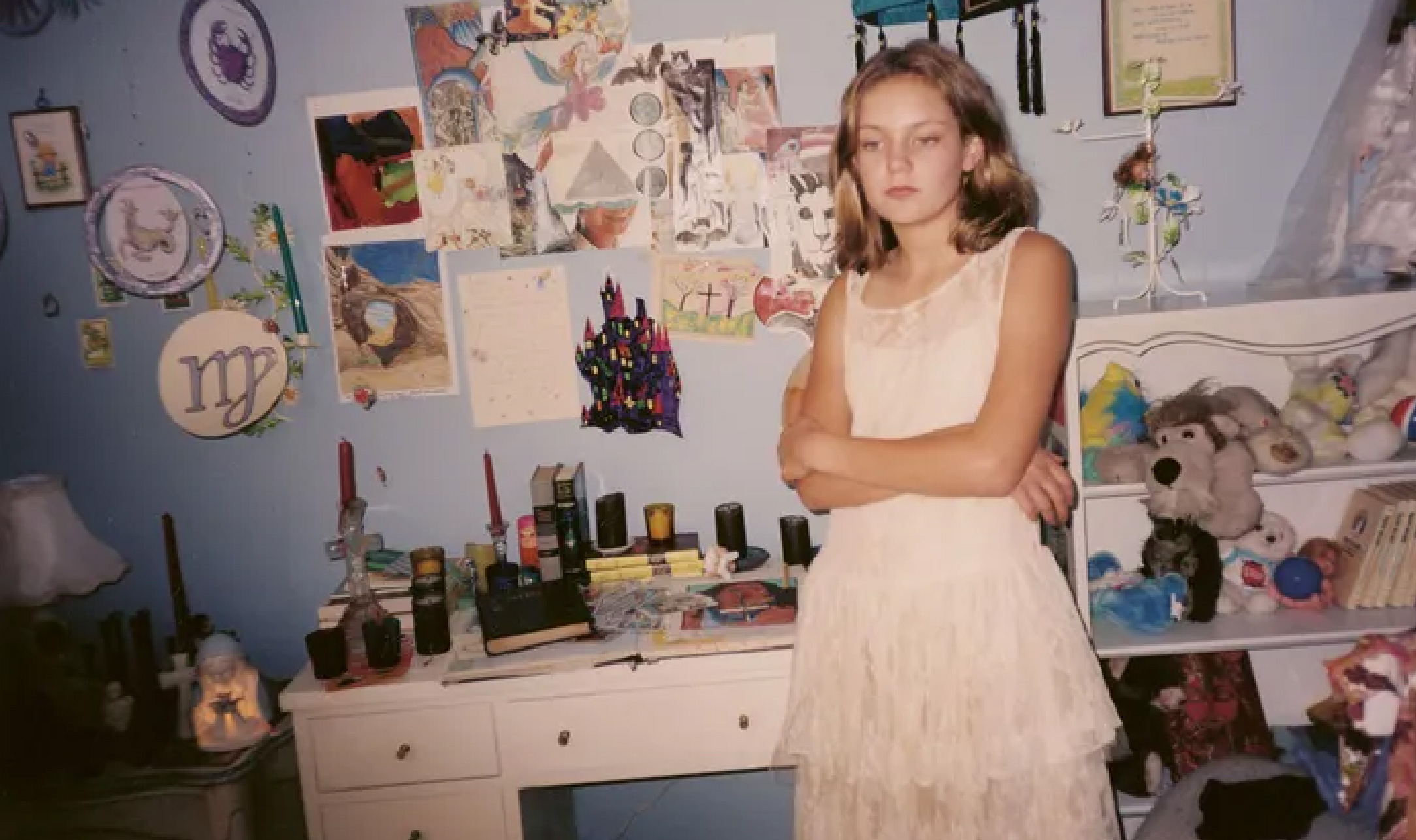
Sofia Carmina Coppola made her directorial debut with The Virgin Suicides in 1999. Her first film received positive responses from critics and became a cult classic among cinephiles. She later won the Academy Award for Best Original Screenplay with her second film, Lost in Translation, and was also nominated for Best Director in 2003. Since then, she has consistently produced films, including Marie Antoinette (2006), the family drama Somewhere (2010), the crime drama The Bling Ring (2013), the psychological thriller The Beguiled (2017), the comedy On the Rocks (2020), and most recently, the biographical drama Priscilla (2023). Thematically, Coppola focuses on women's issues. She states in her book Archive, “Across all of my films, there is a common quality: there is always a world and there is always a girl trying to navigate it. That’s the story that will always intrigue me.”
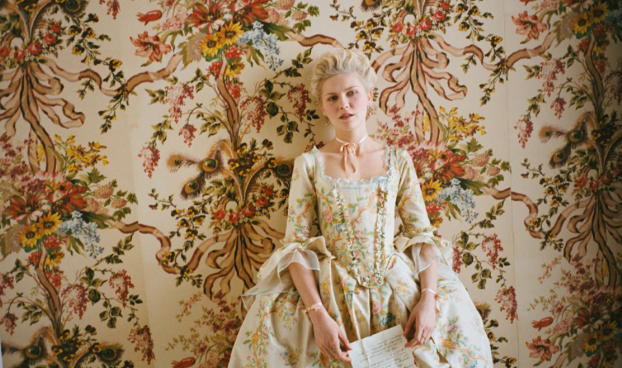
In shaping her cinematic style, Coppola meticulously uses color to reflect the psychological states of her female characters, who are often caught in isolation, self-discovery, or transitional phases in life. In The Virgin Suicides and Marie Antoinette, she employs dominant pastel tones, which are commonly associated with femininity, softness, and nostalgia. However, in Coppola’s world, pastels do not merely signify gentleness—they also reflect women’s fragility and their confinement within societal expectations. Her use of color challenges traditional stereotypes, such as pink in Marie Antoinette, which does not simply symbolize delicacy but rather excess and escapism from a harsh political reality. Meanwhile, in Lost in Translation (2003), pink appears in Charlotte’s hair and the neon glow of Tokyo, underscoring her struggle with loneliness in an unfamiliar world, and feelings.
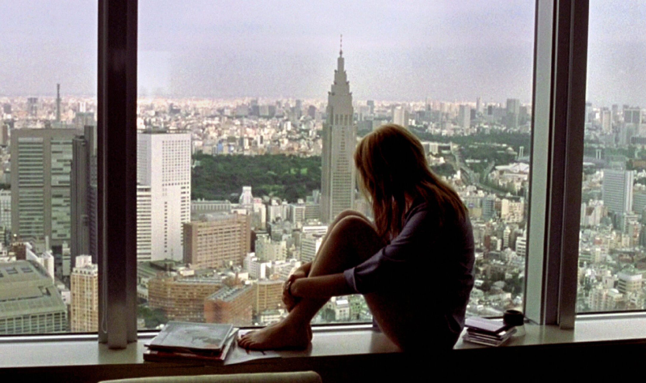
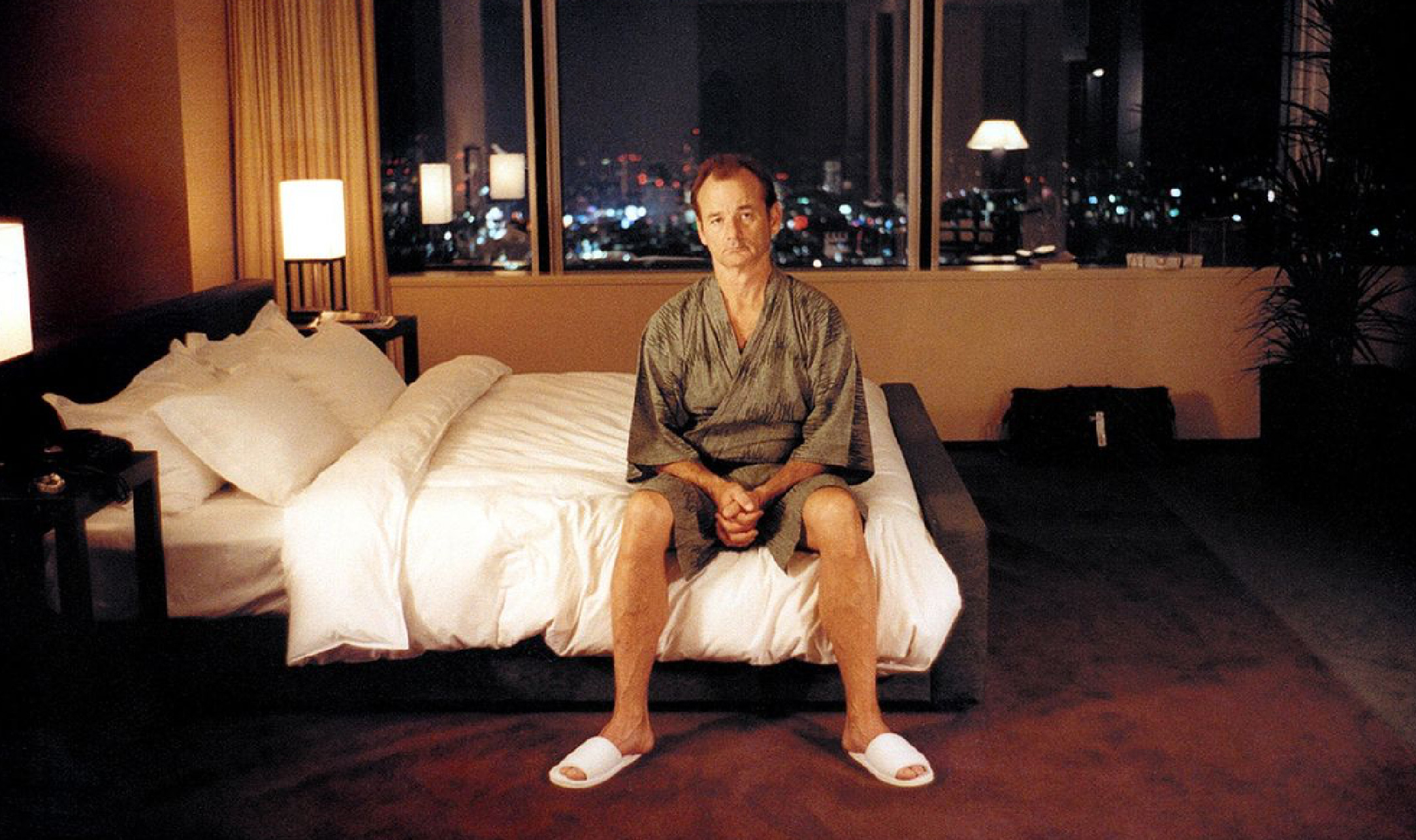
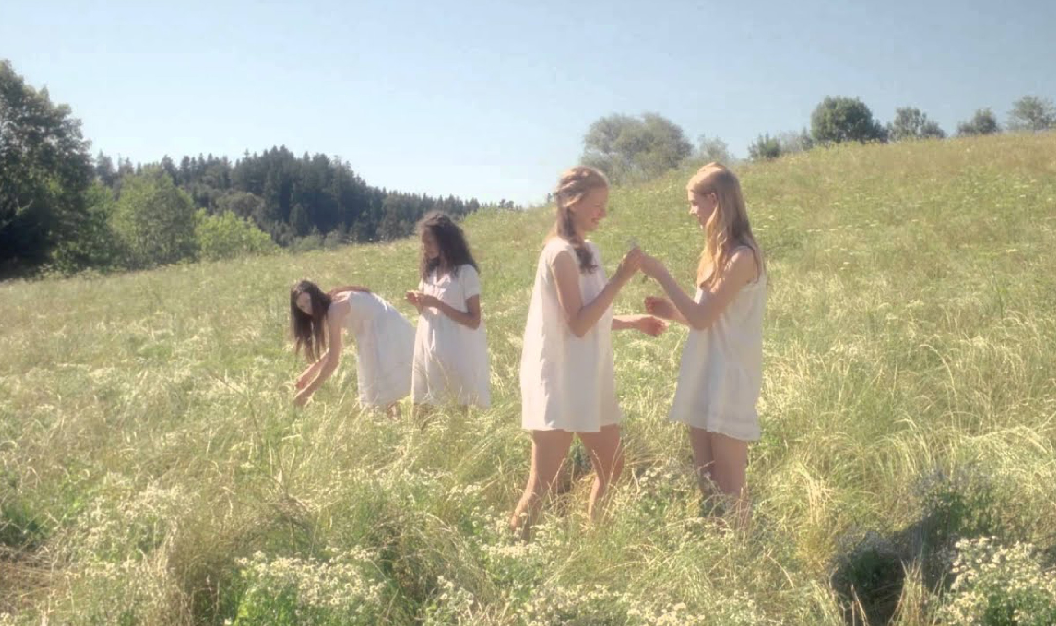
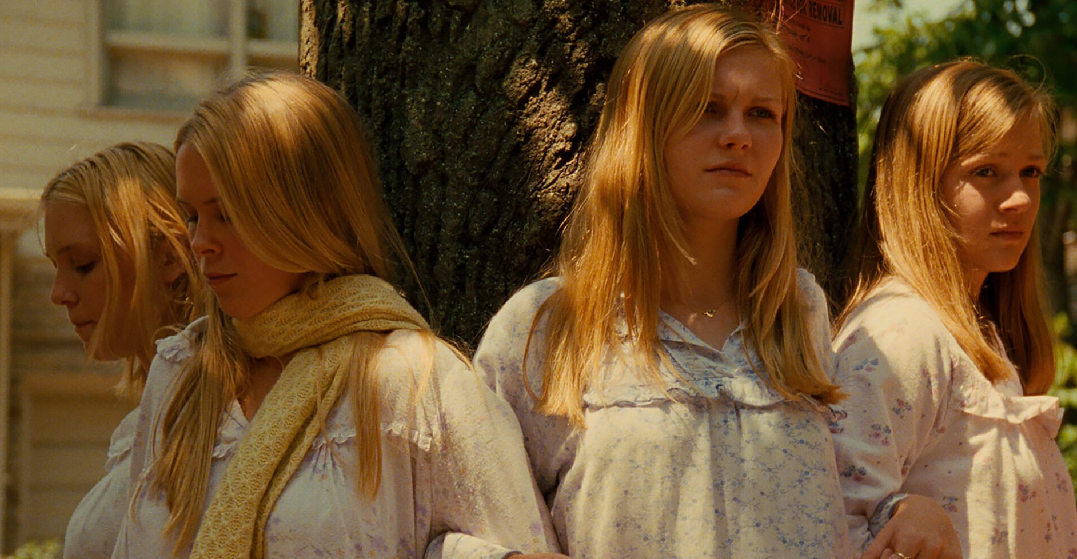
Each of Coppola’s films employs a color palette carefully crafted to match the emotions and atmosphere she wants to convey. The Virgin Suicides is a prime example of how color can depict inner turmoil. Shades of blue frequently appear in scenes of sadness, disappointment, and despair, particularly in the lives of Lux and Cecilia. Meanwhile, pale yellow conveys how the Lisbon sisters are idealized through the perspective of the boys who admire them, creating a nostalgic impression that ultimately leads to tragedy. In the film’s final scenes, green emerges during a party sequence, subtly evoking discomfort and pain in the aftermath of the sisters’ deaths. In Lost in Translation, cool tones like gray and light blue dominate the film, visually representing the alienation and disorientation of Bob and Charlotte as they navigate the unfamiliarity of Tokyo. The use of tungsten lighting enhances the melancholic mood, reinforcing the idea that their isolation is not just a result of their surroundings but also an internal struggle that is difficult to articulate. However, as Bob and Charlotte’s relationship develops, floral colors begin to appear, suggesting that even within their transient connection, warmth can still be found amidst their solitude.
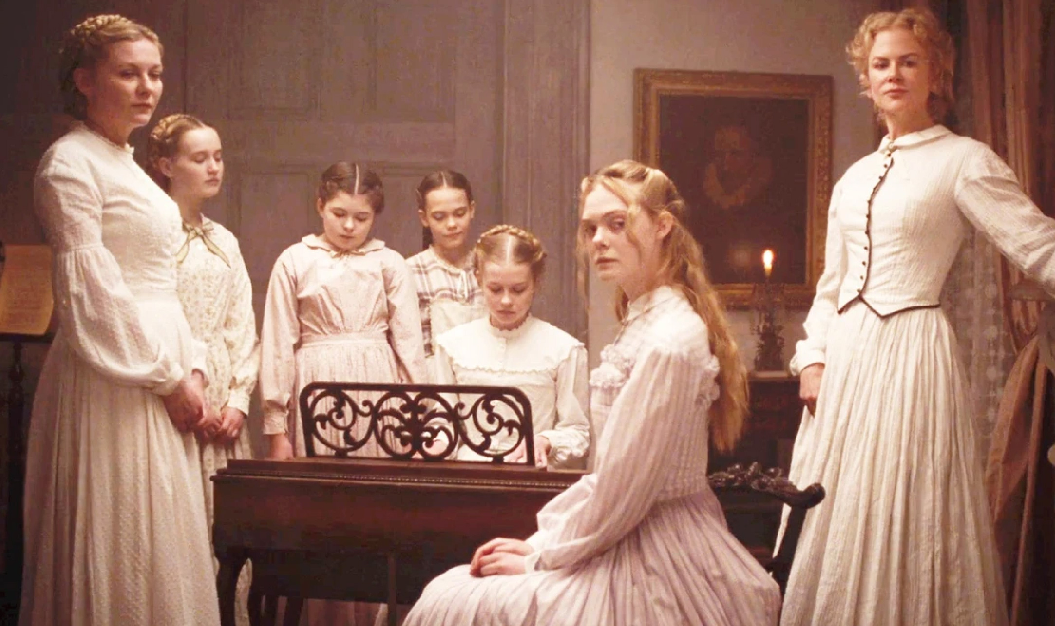
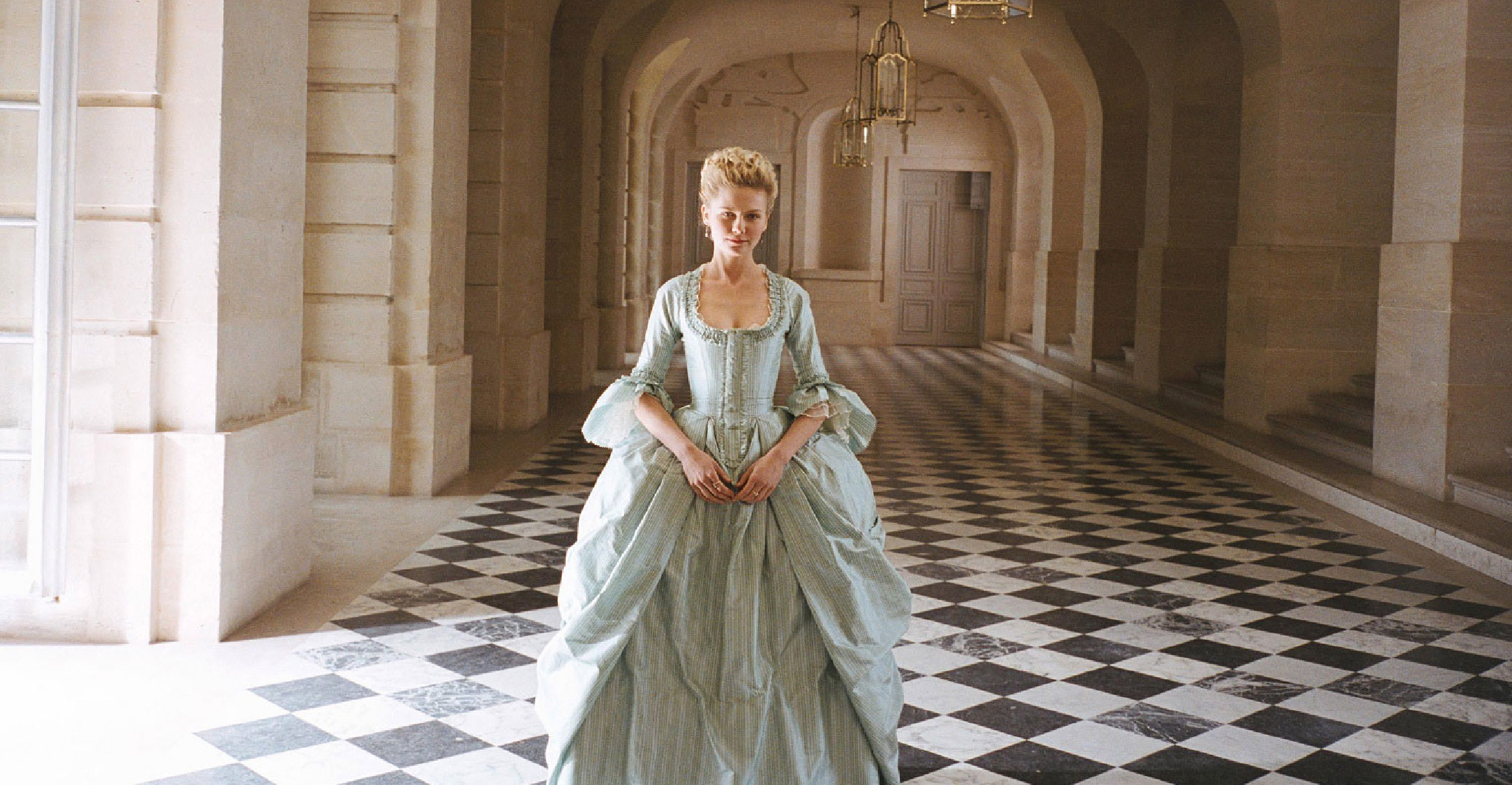
Meanwhile, Marie Antoinette draws its color inspiration from Rococo paintings and Ladurée’s signature pastel palette. Soft pinks, baby blues, mint greens, and gold embellishments illustrate the luxury and naivety of Marie Antoinette, who finds herself trapped in a world of royal expectations. In contrast, The Bling Ring employs neutral tones—white, gray, and black—paired with the flashy glow of club lights and the opulent interiors of Hollywood mansions, visually mirroring the hedonism and moral decay of fame-obsessed Los Angeles youth. The color palette in The Beguiled is another intriguing case. Unlike Coppola’s other films, which often experiment with vibrant color schemes, The Beguiled relies on a more restrained and static palette. The faded whites of the house’s exterior and the women’s dresses create a sense of calm, yet simultaneously evoke a feeling of unease. Green, in combination with the dim lighting from the surrounding trees, forms a contrast between serenity and looming danger, intensifying the psychological tension that pervades the story.
In crafting her visual atmosphere, Coppola always articulates her imagination through photography. When she begins writing a screenplay, the first thing that comes to her mind is not dialogue or plot, but the film’s visual composition. “How does the set look like? What is the photography and the colour palette? I am very visually driven – and then start to listen to music and build the whole atmosphere in my mind”, she explained in an interview with Amelie Kahl about her latest film, Priscilla. Her passion for photography began in her teenage years, influenced by 1980s fashion magazines and contemporary photography exhibitions she frequently attended. She once shared how a photography professor during her college years, Paul Jasmin, encouraged her to delve deeper into the art of light-based imagery. For Coppola, photography is a crucial tool for shaping the emotional landscape of her films.
In an interview with Aperture magazine (issue 231), she revealed how Bill Owens’ photographs served as a key visual reference for The Virgin Suicides. “I bought one print—an image of girls at a school dance with stars hanging from the ceiling. That picture was definitely in my mind when I worked on the film,” she recalled. Before production began, Coppola even handed cinematographer Ed Lachman a color-xeroxed book filled with Bill Owens’ Suburbia (1973) photographs, 1970s Playboy magazine clippings, and works by William Eggleston to ensure that the atmosphere she envisioned was precisely translated into the film. In the same interview, for Lost in Translation, Coppola included images from Larry Sultan’s Pictures from Home (1982–1991) as a reference for the scene where Bill Murray’s character practices his golf putting in a hotel room. Meanwhile, in Somewhere, she aimed for a minimalist aesthetic, inspired by Bruce Weber’s photographs of Matt Dillon and John R. Hamilton’s portraits of Clint Eastwood in a hotel room.
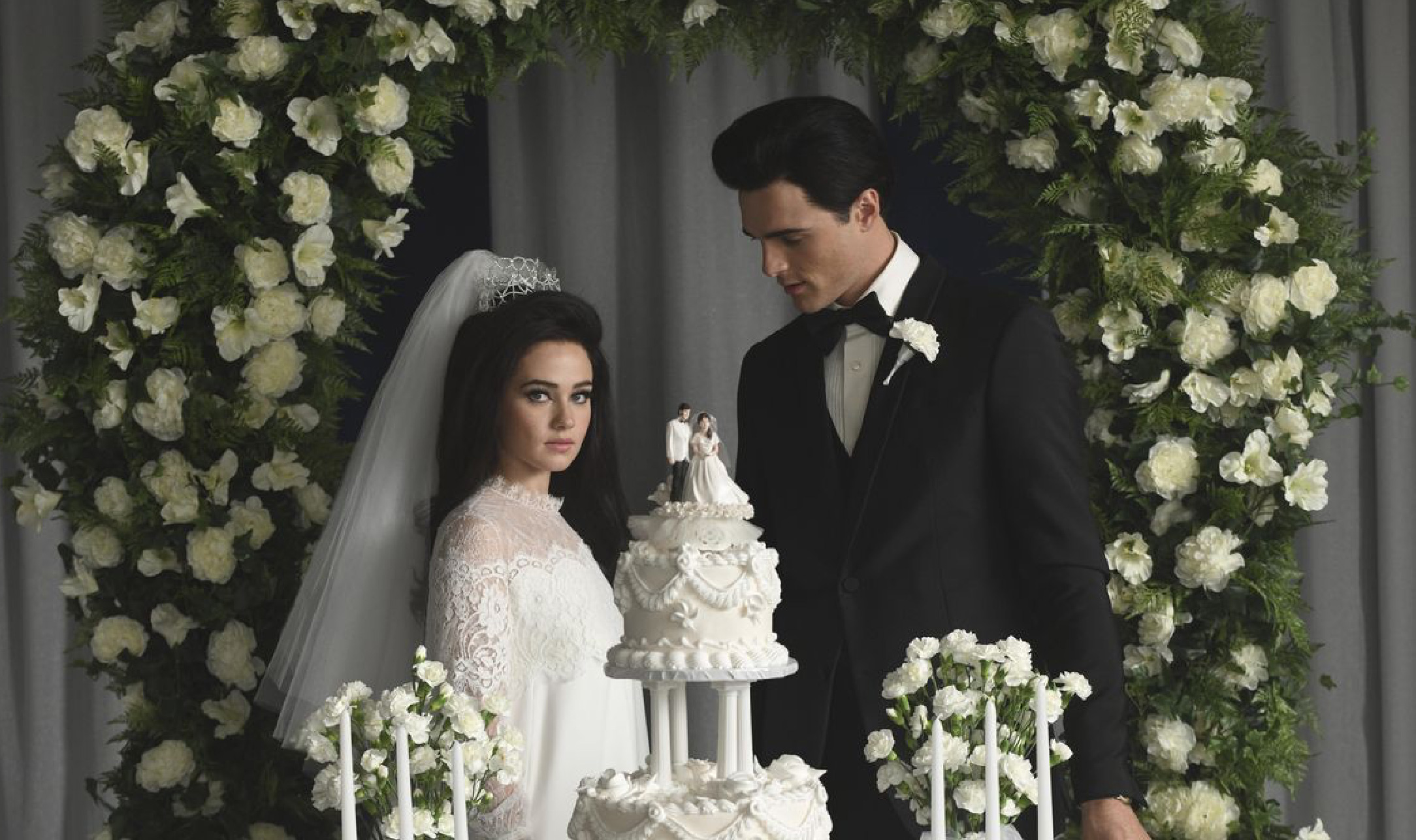
In recent years, Coppola has collaborated with Stacey Battat on all wardrobe-related aspects of her films. Costume design plays a crucial role in Coppola’s work, as clothing and accessories serve as visual codes that provide detailed information about characters, social status, and the era in which the story unfolds. She has praised Battat, particularly for her ability to create historically accurate costumes that still appeal to a modern audience. From fabric selection and design to color choices, Coppola and Battat conduct extensive research on fashion trends relevant to the time and setting of each film. While working on Priscilla, Battat designed at least 120 costumes for lead actress Cailee Spaeny, who portrays Priscilla Presley. Battat and Coppola also collaborated with designers such as Chanel and Anna Sui, as well as independent labels like Eòlas, to create distinct looks for the character. The main challenge, beyond ensuring the accuracy of shifting fashion trends from the 1960s to the 1970s, was visually capturing Priscilla’s transformation—from a teenage girl to a woman coming to terms with her own reality.
As a female director, Coppola possesses a unique sensibility in crafting the atmosphere of her films. Her approach prioritizes visual storytelling over dialogue or exposition, creating an experience that feels deeply personal and emotionally resonant. She meticulously builds atmosphere through film stock selection, set design, costumes, and color palettes, ensuring that every visual element conveys a specific emotional tone. The intensity of her color choices in each scene is not merely a visual decision but a deliberate tool for shaping the audience’s emotional engagement. This distinction defines Coppola’s cinematic style—not just as an exercise in formal aesthetics but as a medium for evoking empathy.