Peter Saville, Music, and Artistic Freedom
Peter Saville spent his teenage years in an environment that offered little opportunity to explore the wider world of art. During his school years in Manchester, he was more interested in drawing than in numbers. His art teacher suggested he consider studying graphic design. He didn’t quite understand what that meant, but the idea of earning a living from something he already enjoyed doing in his spare time was convincing enough.
After school, he often browsed record stores. Album covers became a small window into another world. In the mid-1970s, Saville had never set foot in a contemporary art museum. But he knew who Roxy Music was. He understood that a logo or visual could carry a kind of magic.
When punk exploded in 1976, Saville was attending Manchester Polytechnic. He witnessed firsthand how youth culture was shifting. Through music, through clothing, through flyers for underground parties. Punk wasn’t just noise. It was a burning of symbols. Traditional design was dismissed as outdated, cut up, reassembled with cheap glue. Jamie Reid, the Sex Pistols, anti-commercial posters. But after that came the question: what now?
Saville began looking for answers by turning to the history of graphic art. He was drawn to Malevich, to Bauhaus grids, to Swiss lines and typography. He wasn’t nostalgic. He was looking for a structure that could respond to the new emptiness left behind by punk. He began quoting Jan Tschichold, a Swiss designer and one of the pioneers of modern typography.

His encounter with Tony Wilson, a local TV journalist and promoter, altered his path. Wilson asked Saville to design a poster for a club night called The Factory. Saville accepted and approached the task with full seriousness. This wasn’t a side job. It was a chance to test out a new visual language. Before long, The Factory evolved into a record label, Factory Records. Saville became the go-to designer, though he was never formally hired. There was no contract. No fixed salary. Just project after project, trust, and total freedom.
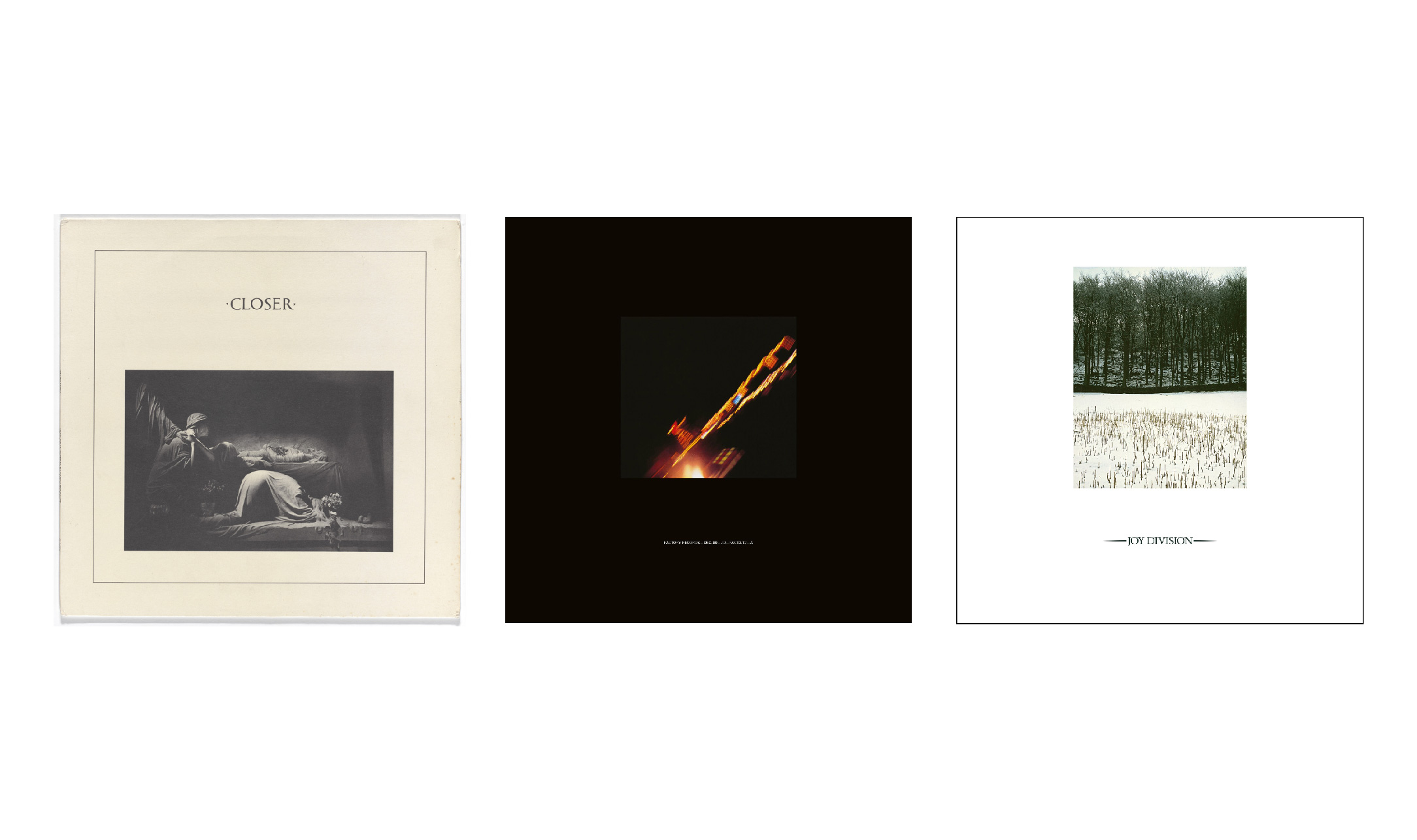
One of his early works for Factory was the cover of Unknown Pleasures by Joy Division. The band had handed him an image of pulsar signals from CP1919, sourced from an astronomy encyclopedia. Saville added nothing. He simply inverted the colors, making it white on black. He printed it without the band’s name, without an album title. Nothing explained what was inside. Just form, waves, rhythm—none of it begging for attention.
When Ian Curtis died and Joy Division disbanded, Saville was tasked with designing the cover for Closer. He selected a photo of a funerary sculpture by Bernard Pierre Wolff. Marble figures, silence, death. He made this choice before Curtis’s death, but the album’s release coincided with the tragedy. Many assumed the cover was a tribute, but it wasn’t. Still, the timing added an unintended echo.
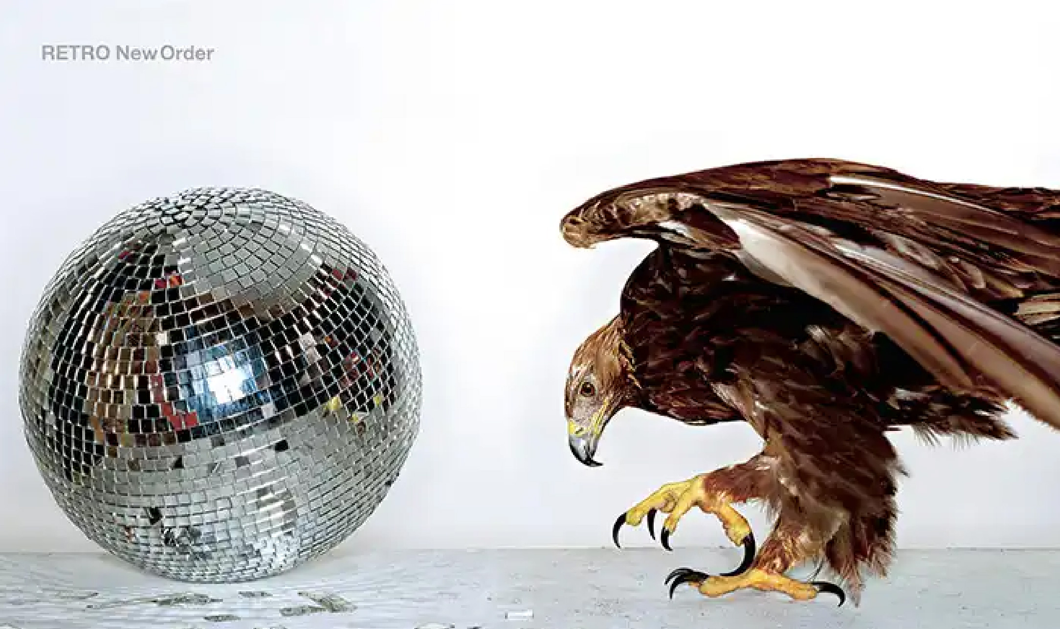
New Order emerged from Joy Division’s remains. But unlike their predecessor, the band had no charismatic frontman. No one steered the visual direction. They weren’t interested in discussing artwork. They gave no input, only deadlines. Saville worked unsupervised. New Order’s covers were never approved by the band. Sometimes they saw them for the first time in the record shop.
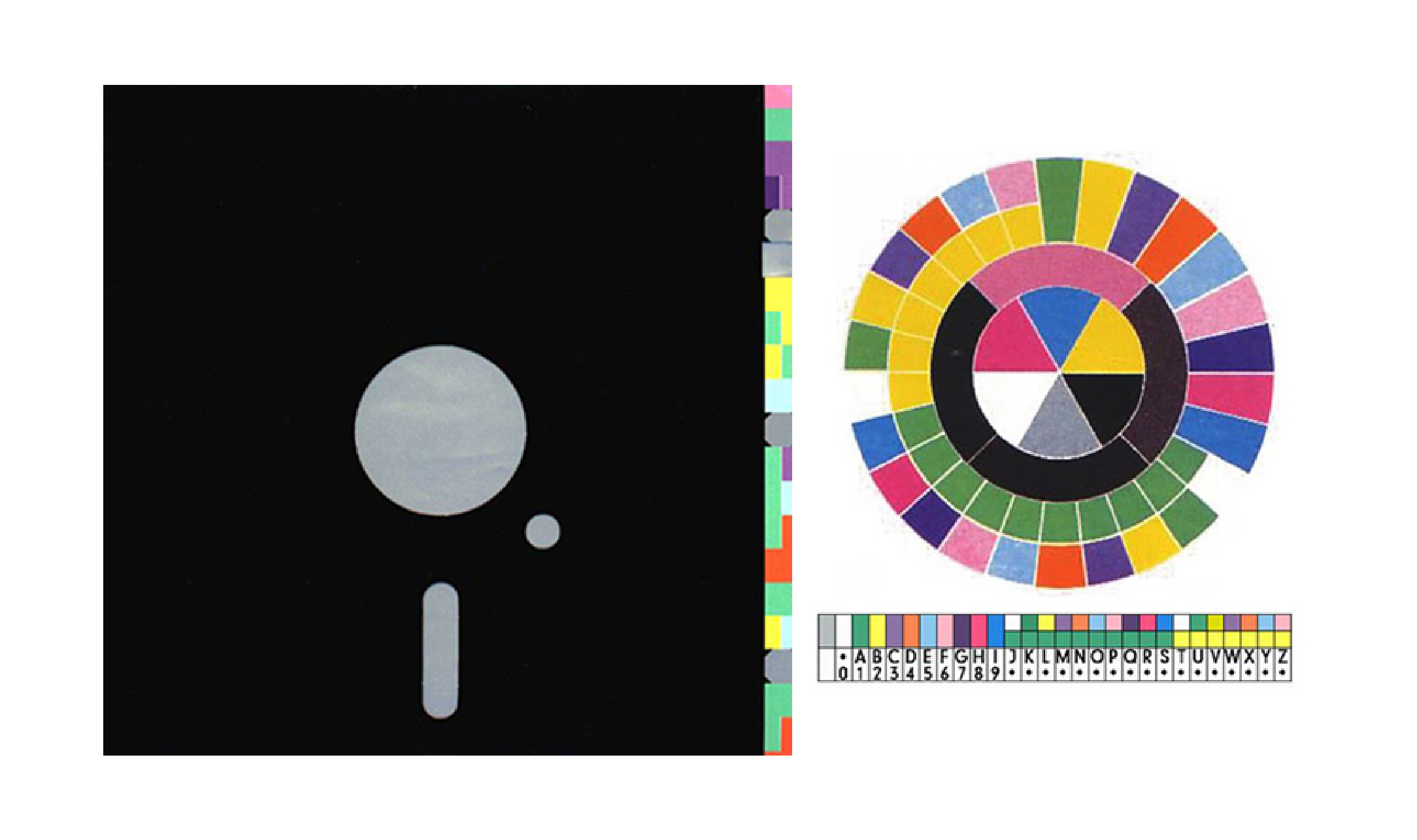
Blue Monday is an extreme example. The sleeve resembled a floppy disk. Full of die cuts and design quirks, it was expensive to produce. The cost exceeded the retail price. Factory Records lost money on every copy sold. But no one in the design department cared. At least not Saville. For him, how an image spoke to the moment mattered more than sales figures.

“The Factory Records covers were not about making people buy the records. They didn’t even try to make people buy the record. They existed independently to the music, and therefore people’s relationships with them were quite different. The people who liked the covers or became interested in the covers saw them as possessions – they learnt through them, things they maybe didn’t know before,” Saville said in an interview with Roman Candle magazine.
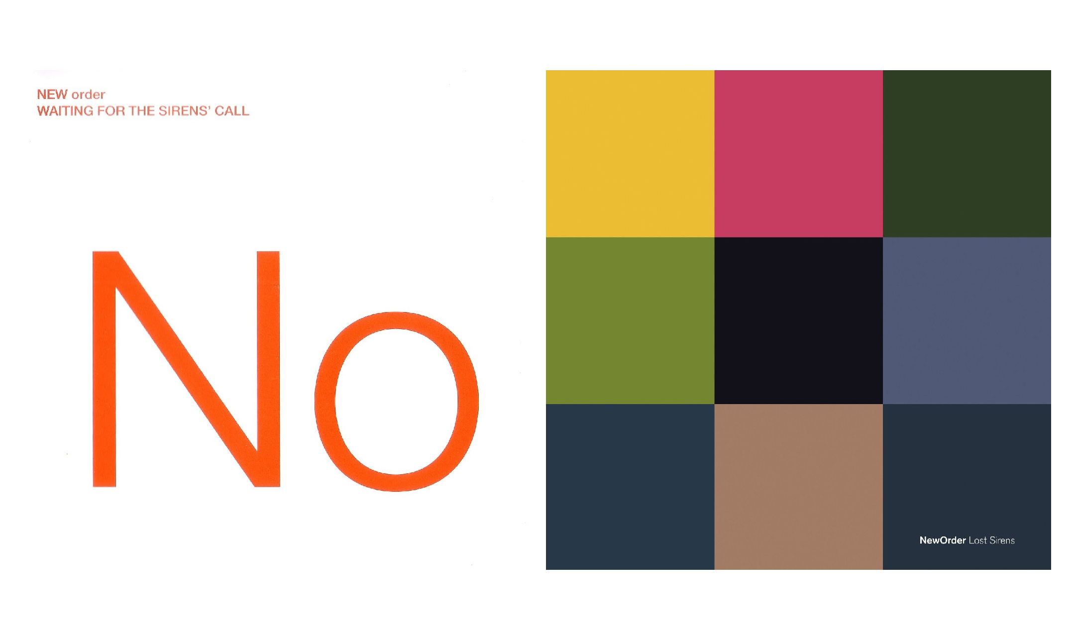
He drew references from fashion, art, and museums. He followed the undercurrents, trends still too subtle to be marketed. He felt that New Order’s albums gave him space to experiment. Two or three times a year, he could channel his thoughts into a sleeve. No client asked, “Why does this matter to us?” There were no bureaucrats. No ad agencies. Just him, time, and the printing press.
Saville didn’t create a style. He created a language. Within a decade, that language grew, shifted, and moved beyond music. He inspired people like Raf Simons, Jonathan Ive, and Wolfgang Tillmans. They’ve cited him as a starting point. Not because his work explained things, but because it opened something.
When asked why those early designs have endured, Saville simply shrugged. He didn’t make them for the future. He made them because he had something to say at the time. He never wanted to work in a world where design was just decorative support for promotion. He wanted to say something through images. During that decade, he did.
Afterward, he struggled to fit into the conventional design industry. He tried advertising, consultancy, institutional projects. But the kind of freedom he had at Factory never returned. He once said that graphic design isn’t about the designer—it’s about other people. But for the sleeves he made at Factory, the design was about him. Not as ego, but as a form of inquiry.