On Walmart’s Brand Refresh: Small Changes, Big Impact?
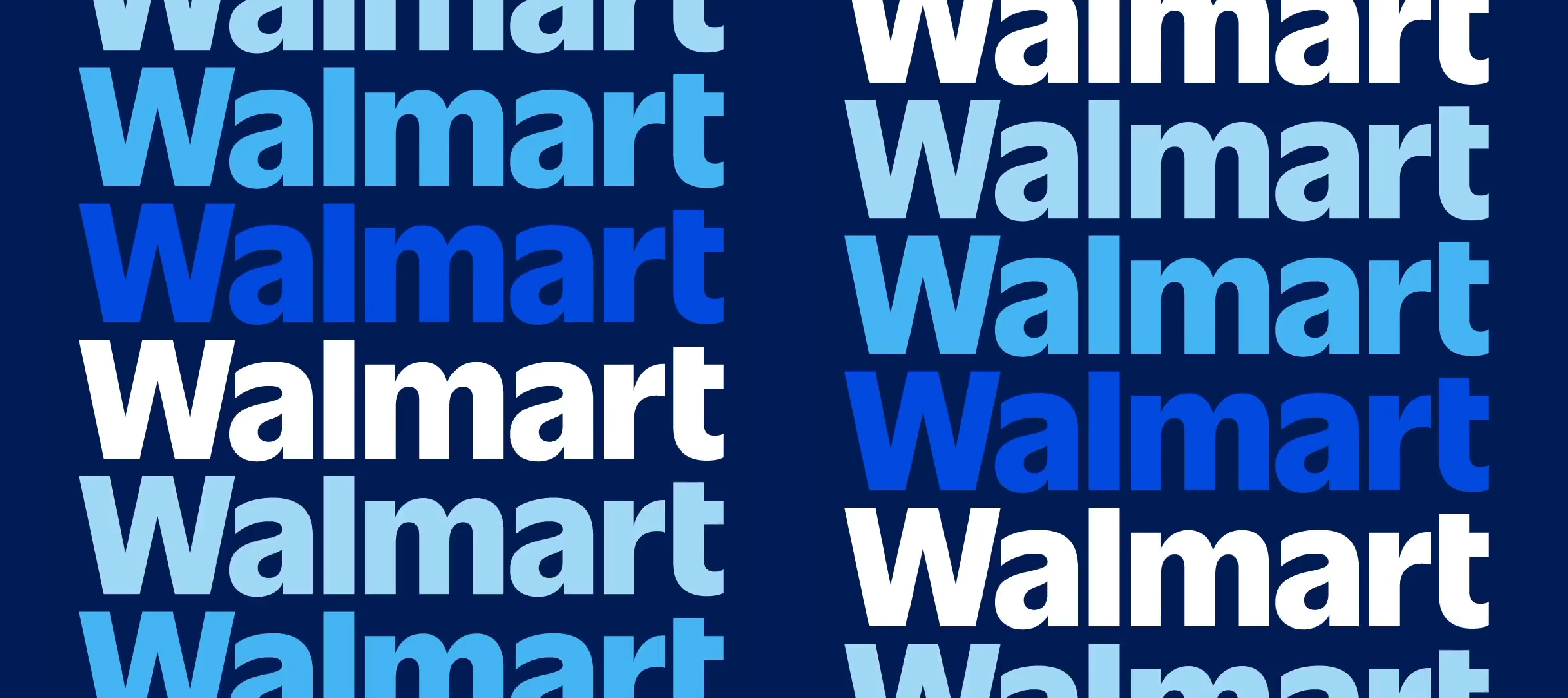
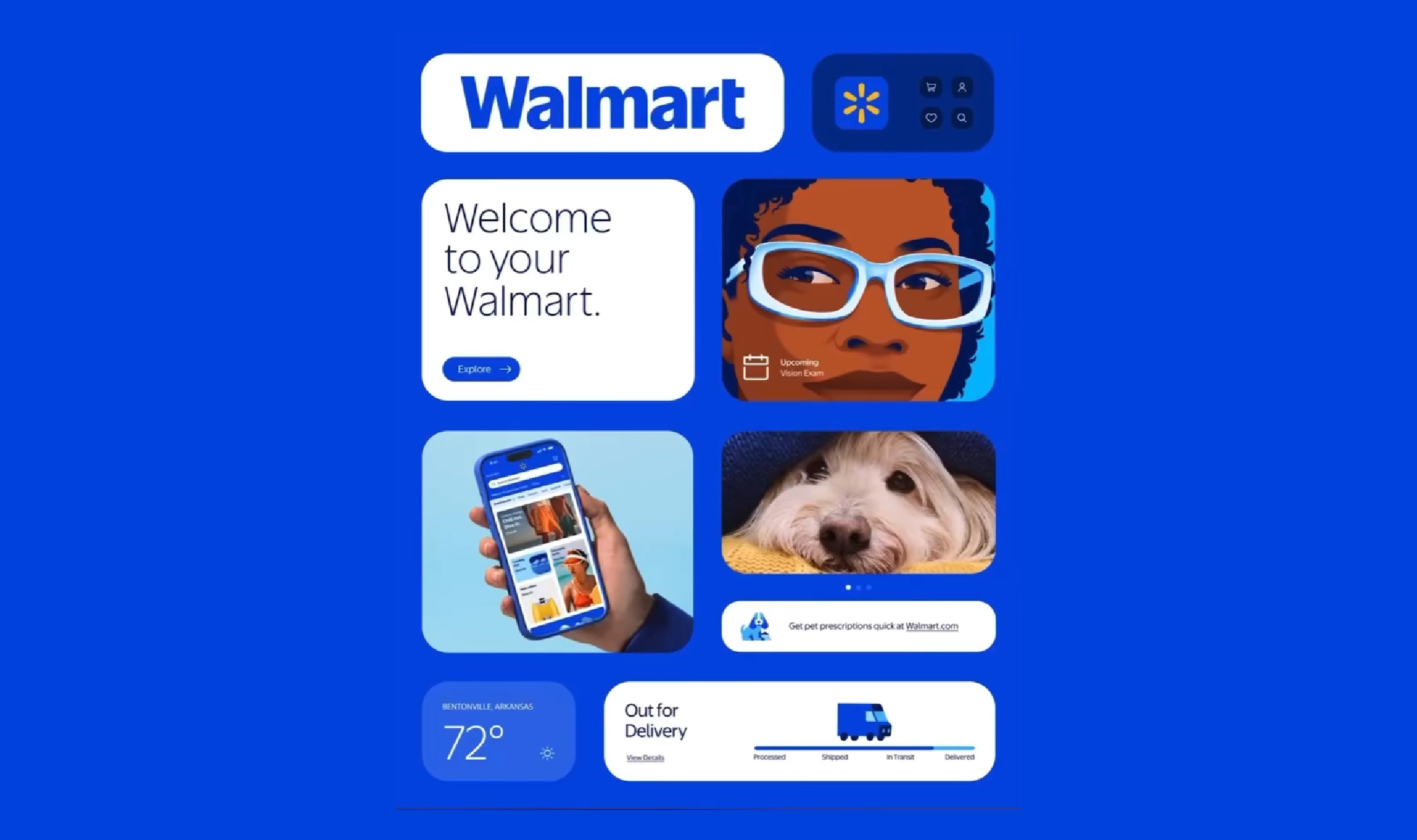
Last month (01/2025), the major American retailer Walmart announced their brand refresh that looked a little too familiar to customers. This new brand identity features a more vibrant blue, a richer yellow, and a new typeface. Reactions to the rebrand remain largely divided. Is the rebrand a cleverly calculated move that maintains so much of the existing branding or timid in charting new waters?
On their corporate website, Walmart states, “Walmart is excited to announce a comprehensive brand refresh that reflects its evolution as a people-led, tech-powered omnichannel retailer. From its humble beginnings in Bentonville, Arkansas, in 1951, Walmart has grown into a global leader dedicated to helping people save money and live better.” The retailer has teamed up with creative agency Jones Knowles Ritchie (JKR) in the design of this new brand refresh.

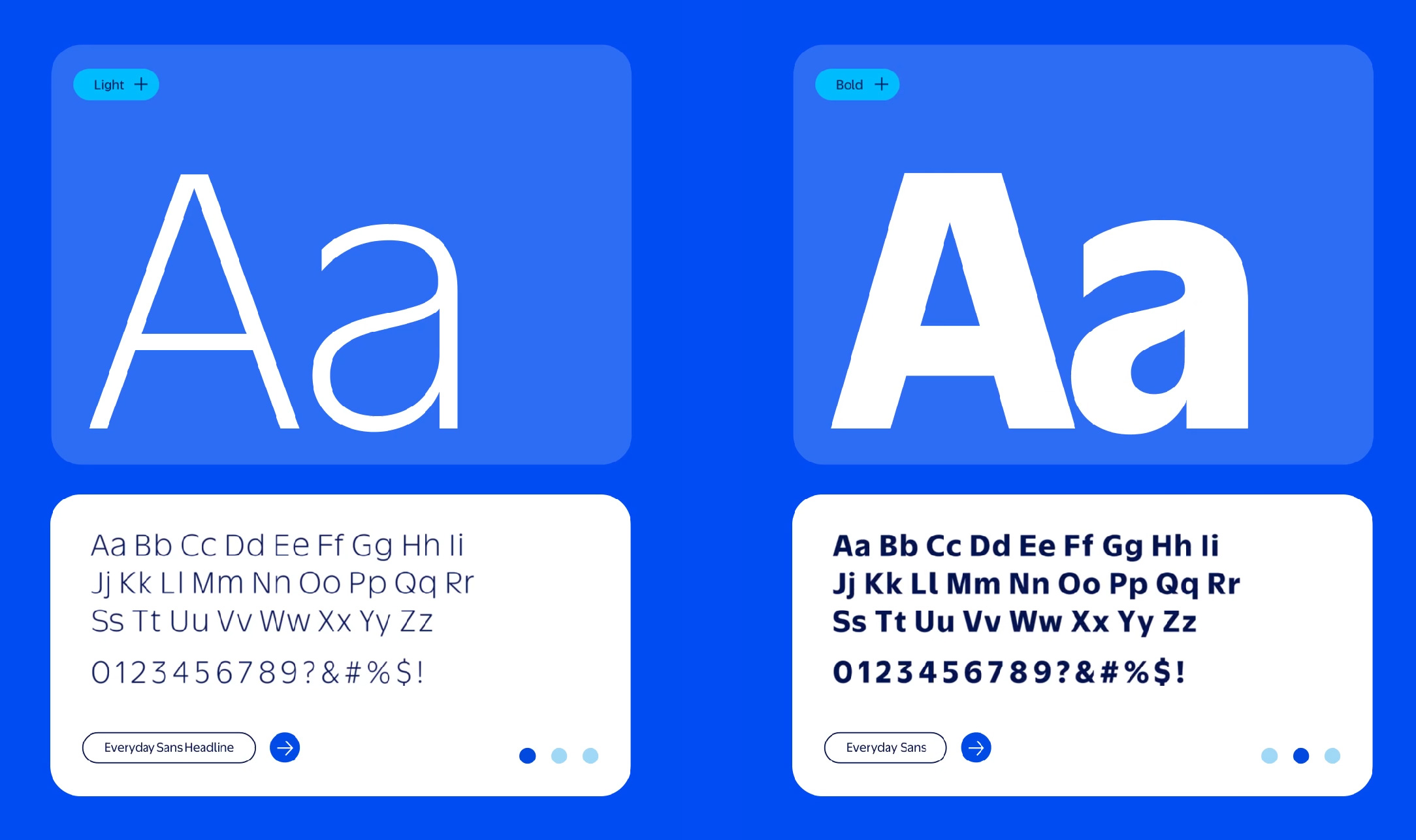
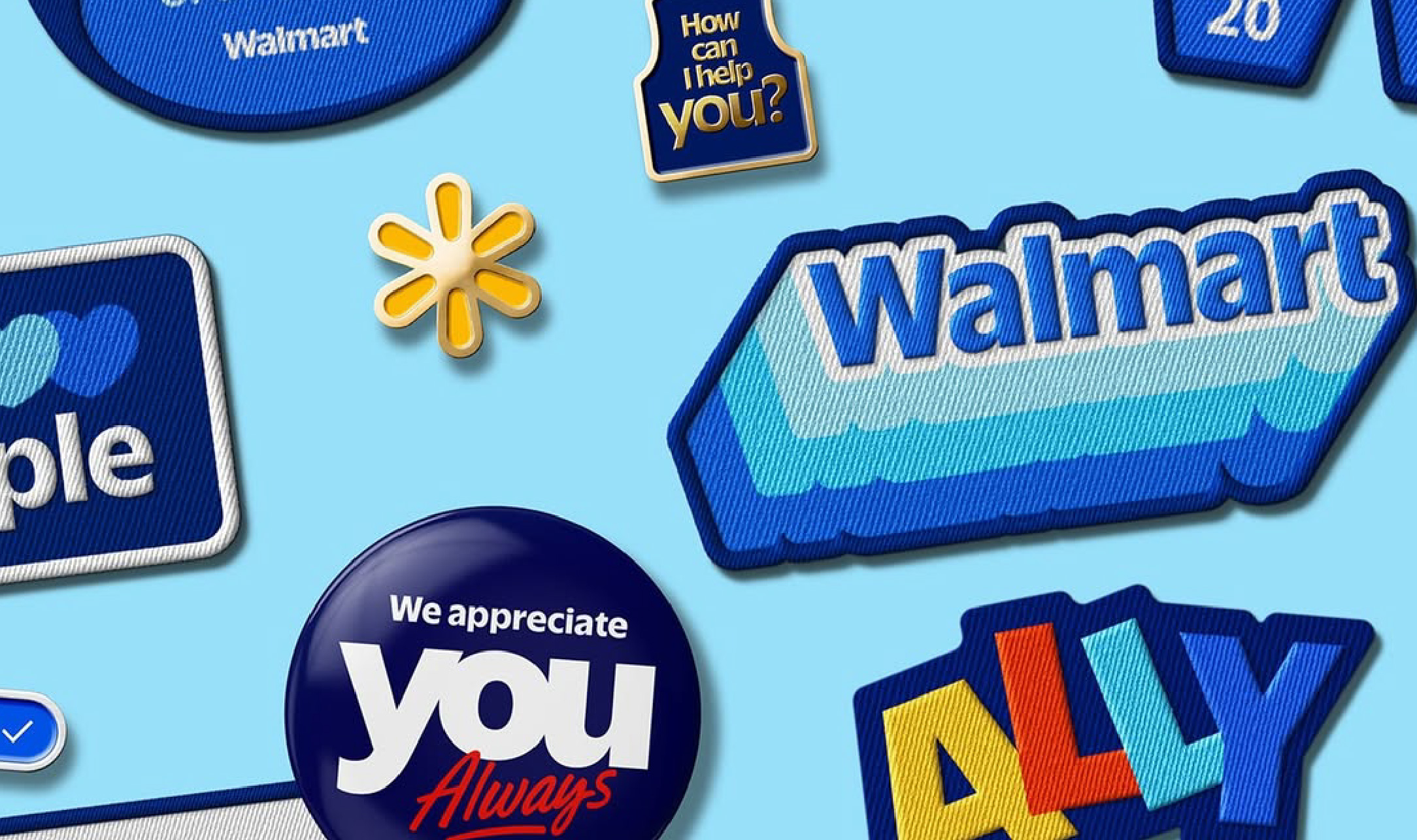
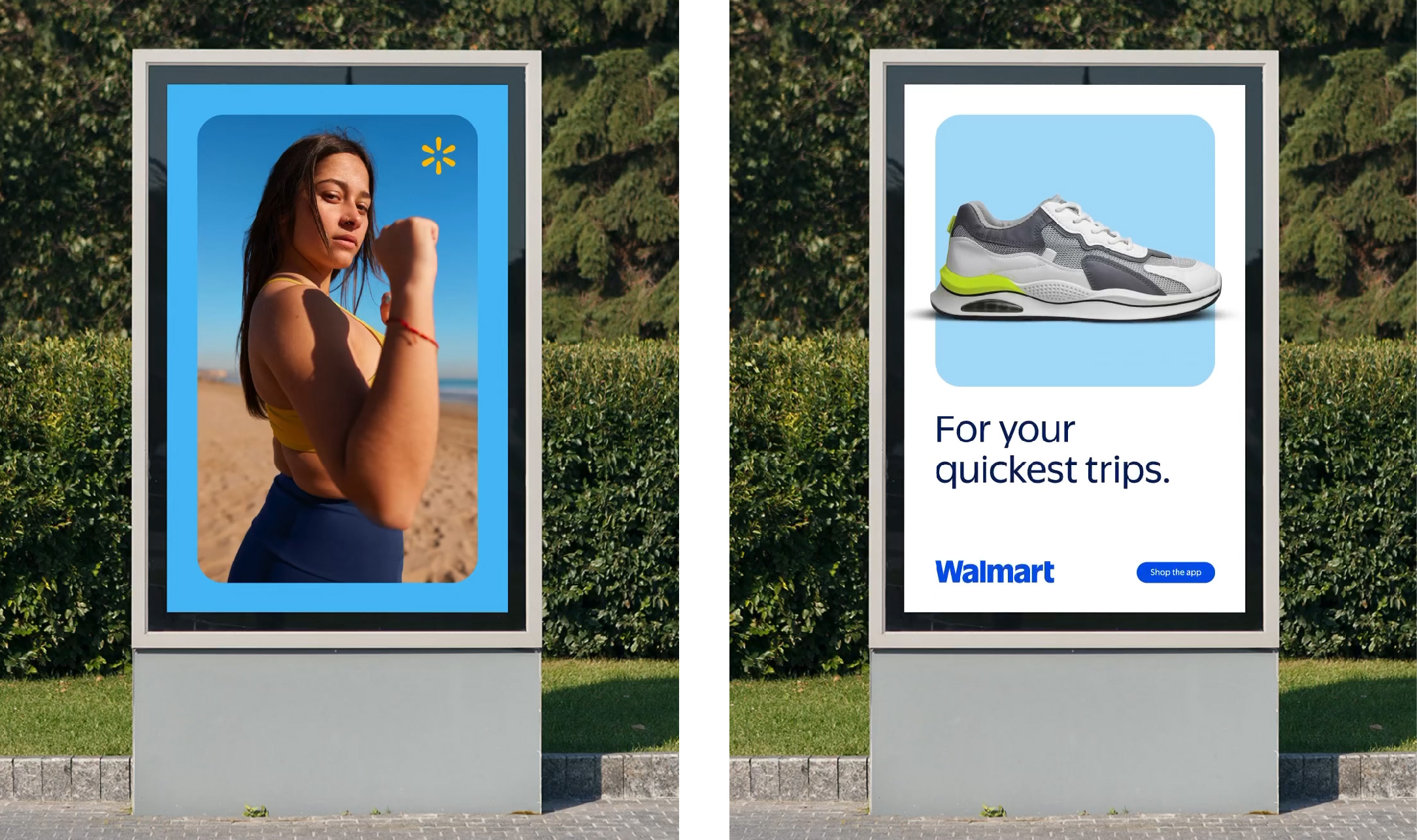
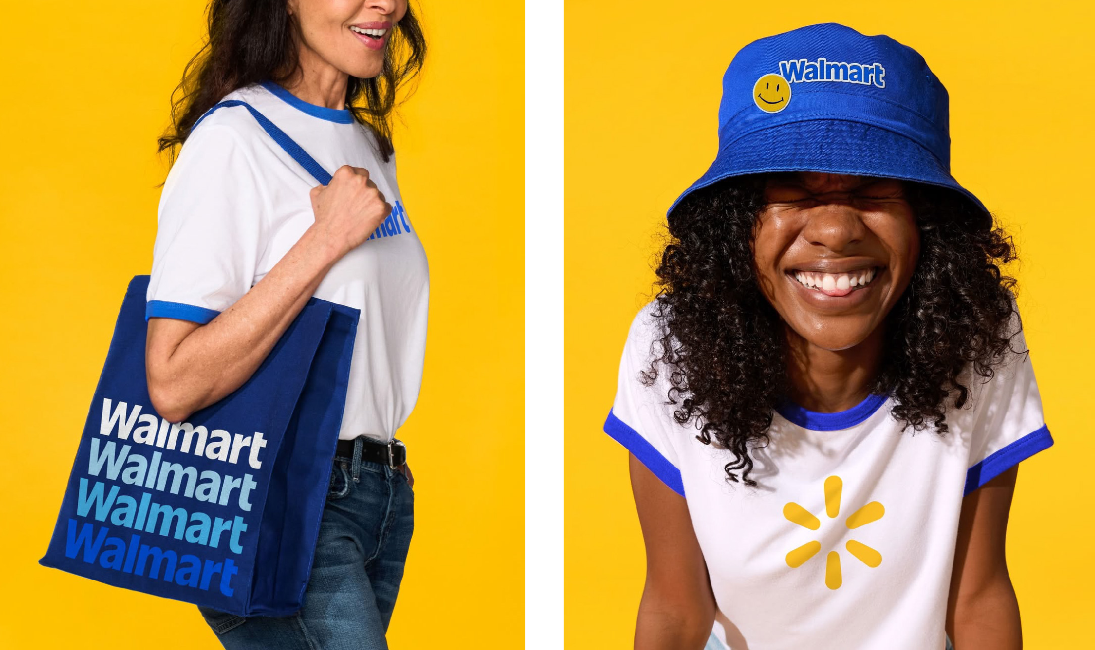
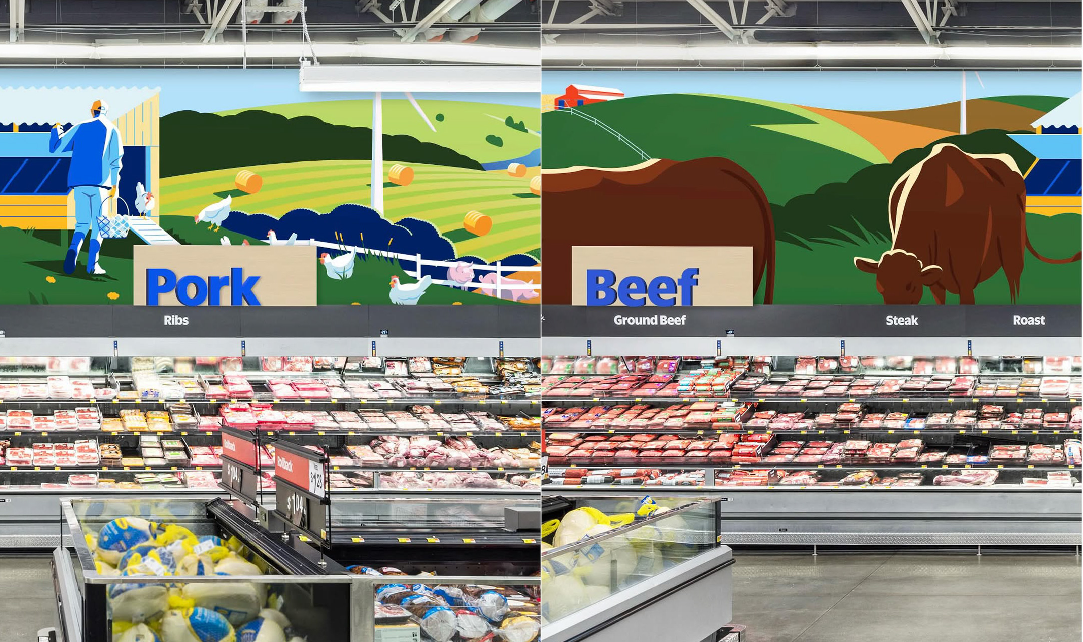
On the surface, the changes brought on by the rebrand seemed fairly minimal to many, especially if one solely focuses on the logo; changes in the color tones (using what they dub as True Blue) and a rounder shape on their signature “spark” logomark. For the logotype, the JKR team took cues from the trucker hat worn by Walmart founder, Sam Walton, by using the same typeface: Antique Olive. The changes have clearly been oriented towards optimizing the brand identity for digital platforms, in line with their goal of reflecting Walmart as a digital first, “tech-powered omnichannel retailer.” Of course, the rebrand doesn’t stop at the logo; there’s the brand voice, layouts, brand operating system, iconography and more. It’s difficult to judge an entire brand refresh by the logo alone. But, these aspects seem largely overshadowed by the response to the new logo.
The Walmart rebrand faced the same struggle all brand refreshes must tackle; how much of the old do we keep and how much of the new do we implement? To the larger internet population, it seems Walmart was not able to keep the balance and veered too much to the prior, resulting in a mostly negative response from the general public. Forbes contributing writer, Callum Booth, writes, “Of course, one explanation is that the public simply don’t like the redesign, but there’s something deeper going on with the reaction to the new Walmart logo. In broad strokes, this can be split into two rough parts: a fear of change, and a belief in expertness.” He believes that the reason consumers see the change as unnecessary could be due to, either, the populace’s attachment to things as they are, preferring the existing identity, or, as Booth puts it, “variations of disbelief about the company actually paying people to create the new logo. This is a prime example of the online world being overly confident in its own correctness.” Due to the seemingly minor changes in the rebrand, many online, especially those inexperienced with brand design, find it frustrating that a rumored budget of $1.25 million dollars resulted in what they view as something they could have done themselves, referring to the Dunning-Kruger effect.
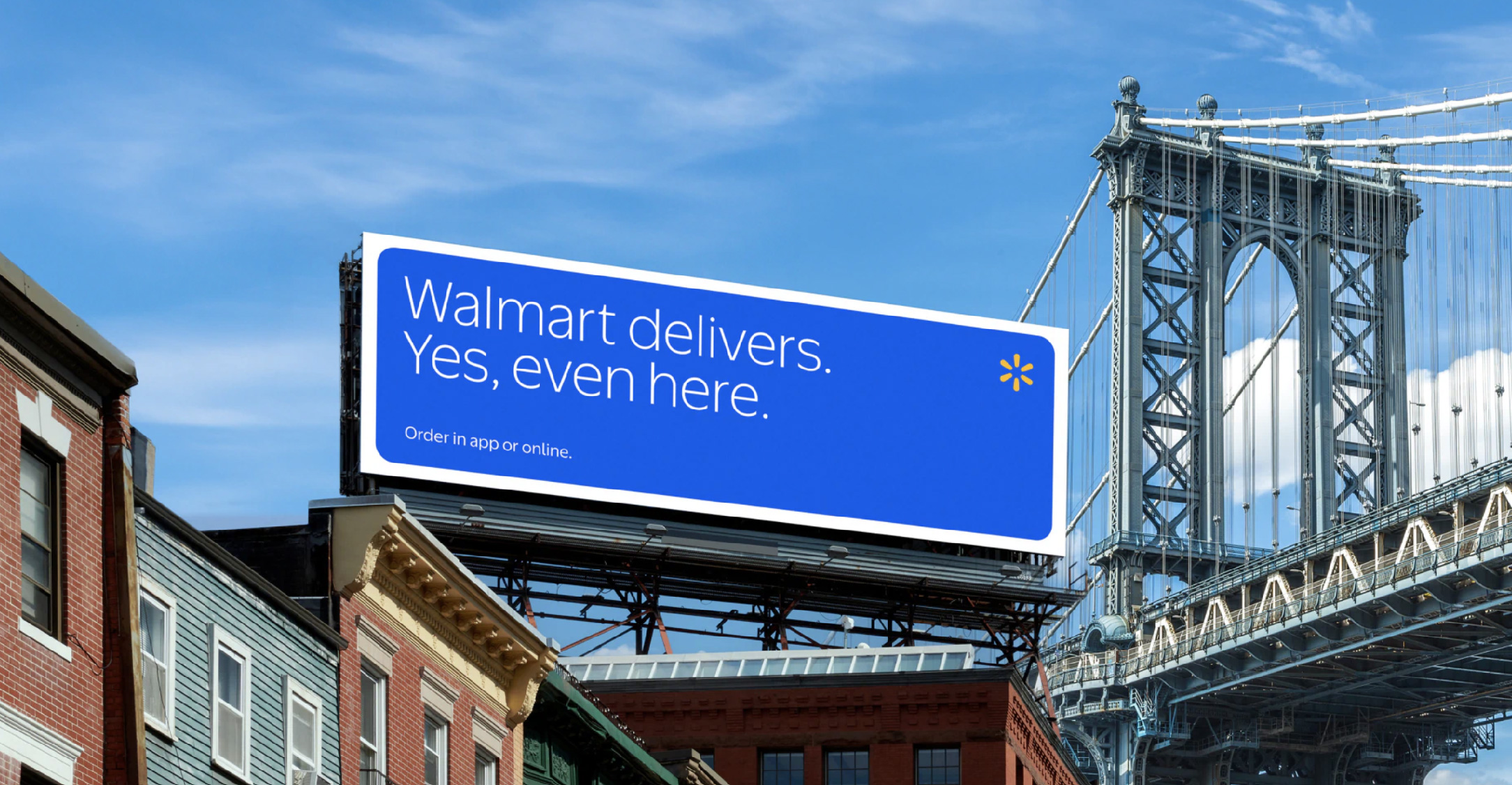
While the changes implemented do lend itself to a more contemporary impression, by maintaining so much of the original identity, the rebrand leaves audiences wanting more. No rebrand is done carelessly. Even Walmart’s somewhat conservative approach to their rebrand is not without purpose. However, Mark Wilson puts the general frustration around this rebrand best in his article for Fast Company, “Walmart’s bluer new brand is its biggest update in nearly two decades” stating, “...I also can’t help but wonder if Walmart is underestimating the taste or creativity of its own audience, that the imagery is uninspired and drab and misses the opportunity to instill a shopping trip with a bit more of something than a slice of visual Wonder Bread.”
