On Brat’s Best Recording Package Win at the GRAMMYs and Accessible Anti-design
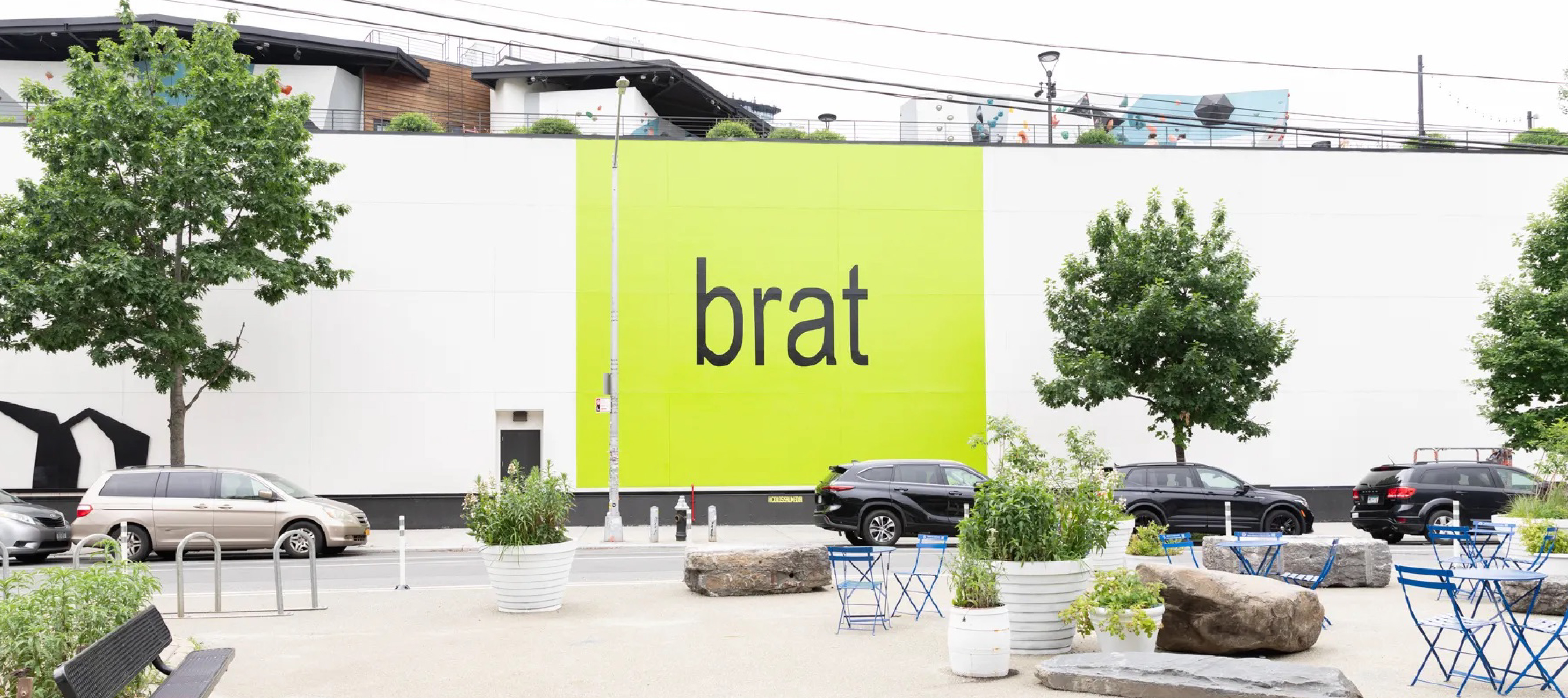
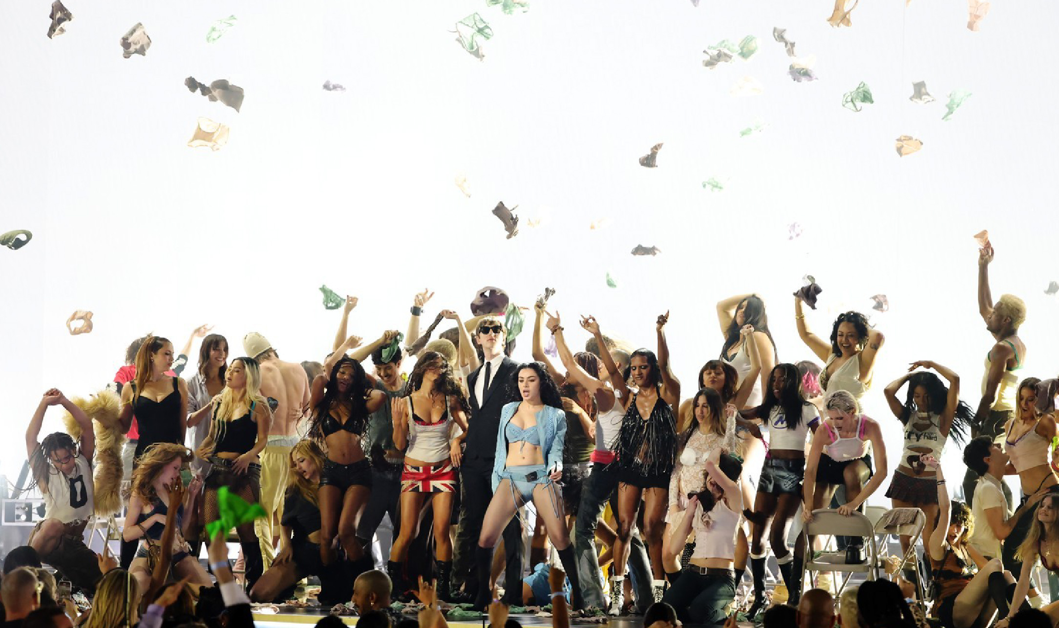
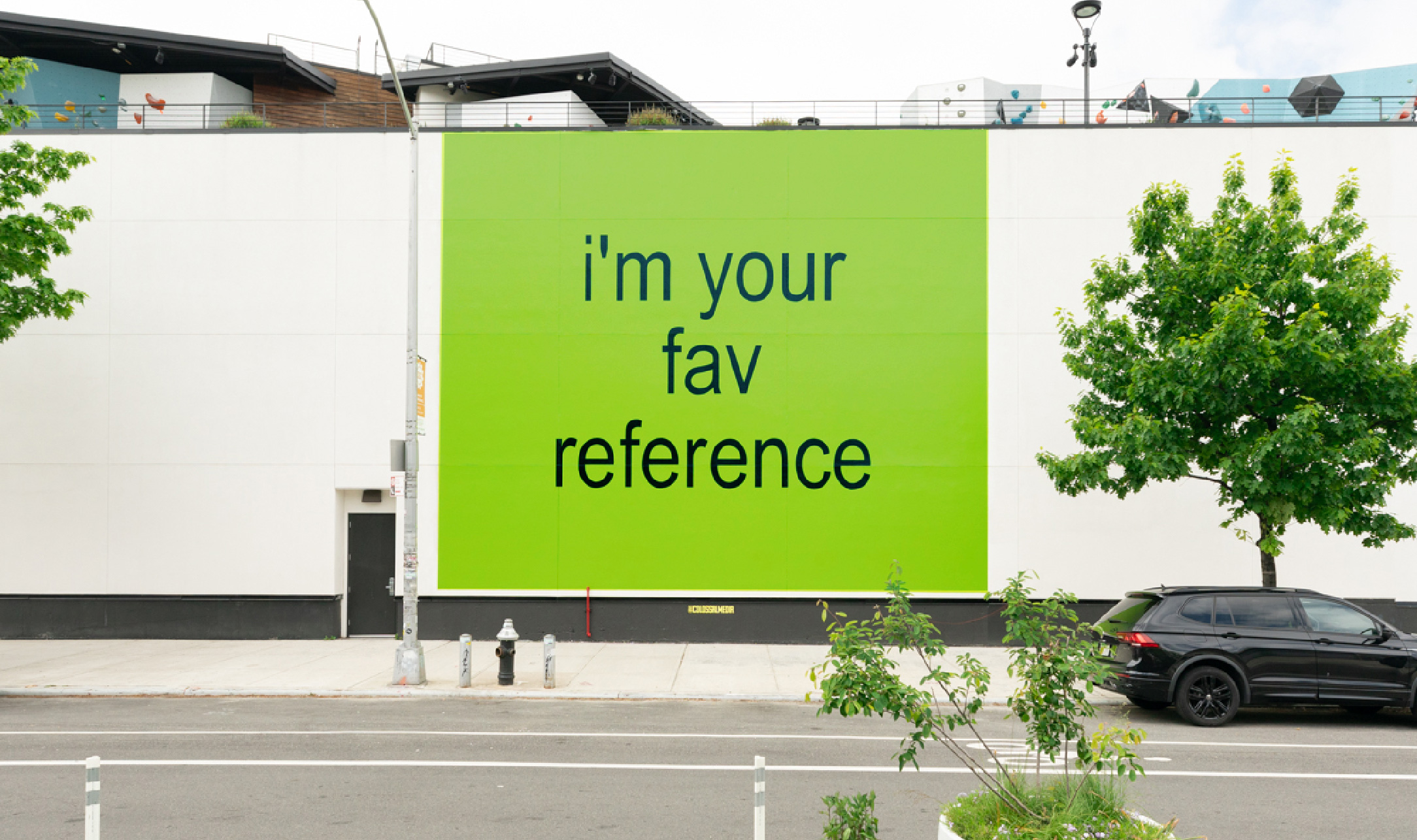
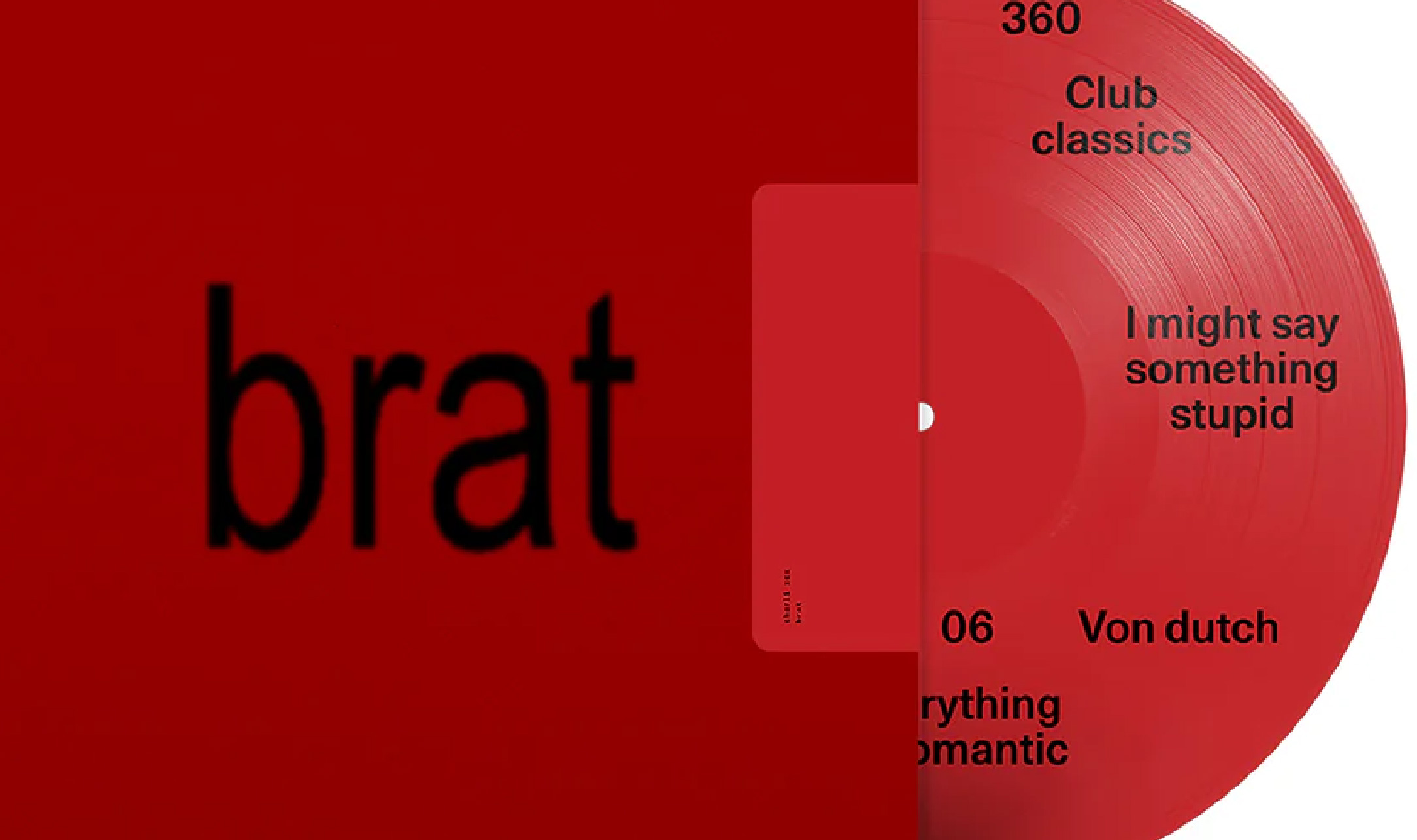
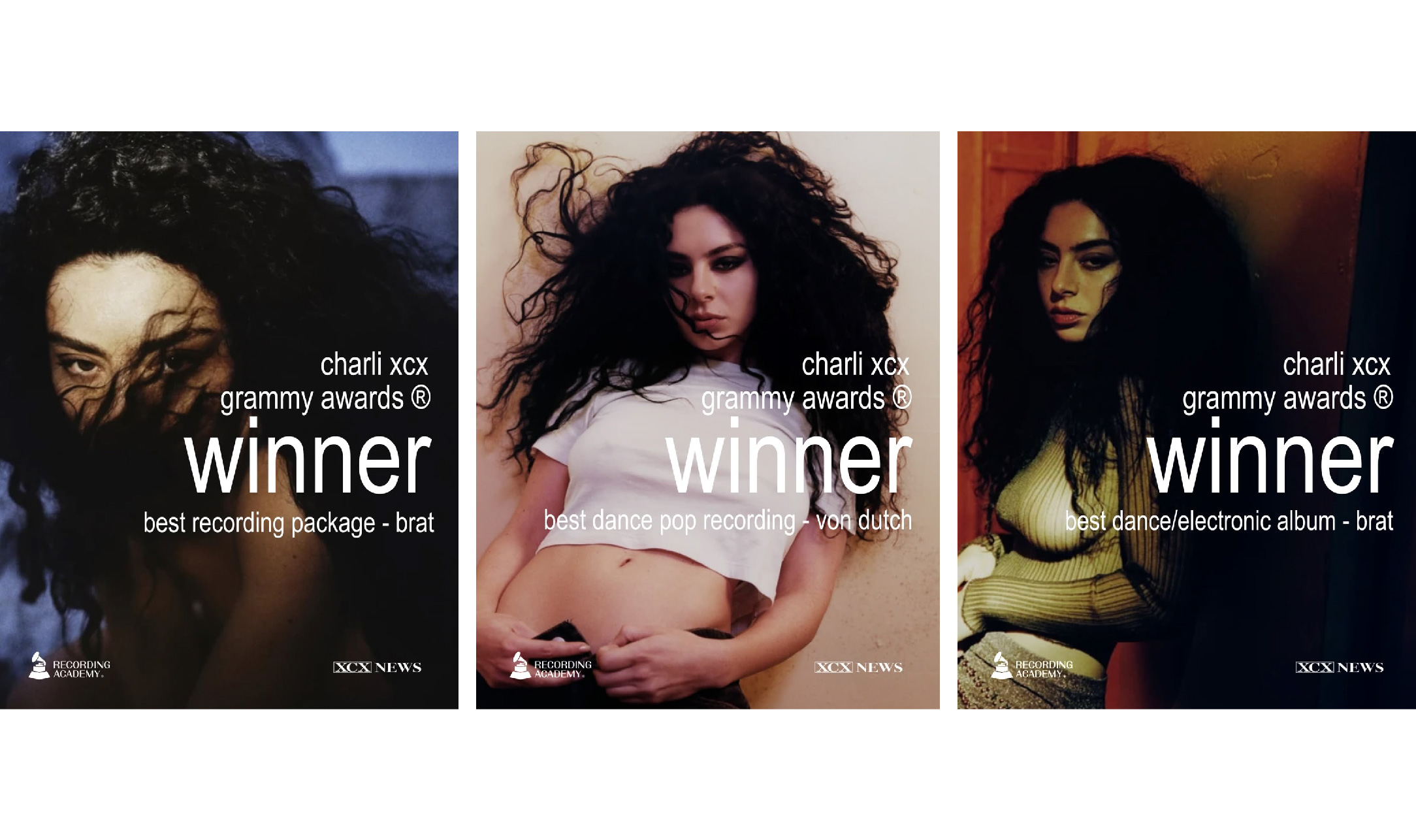
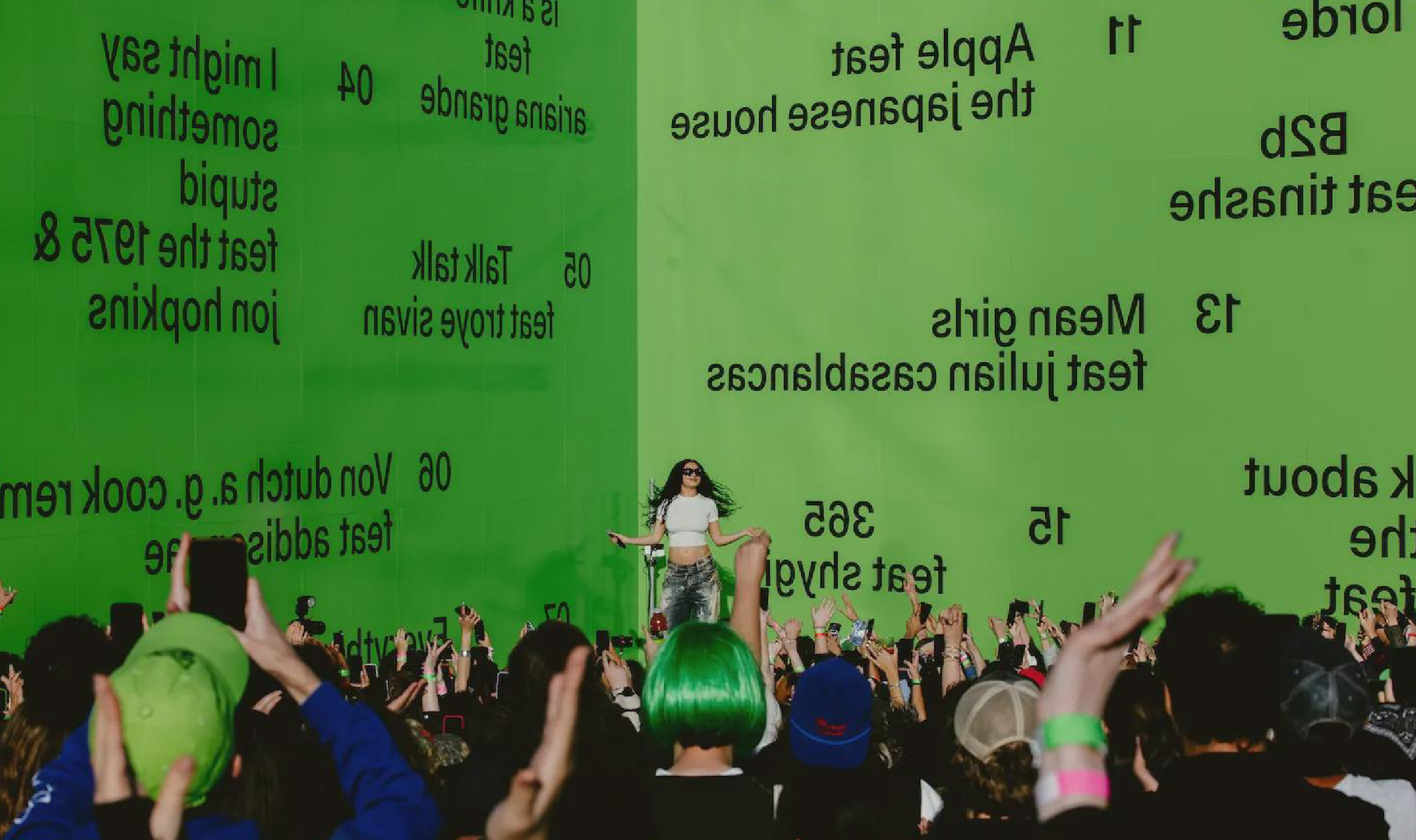
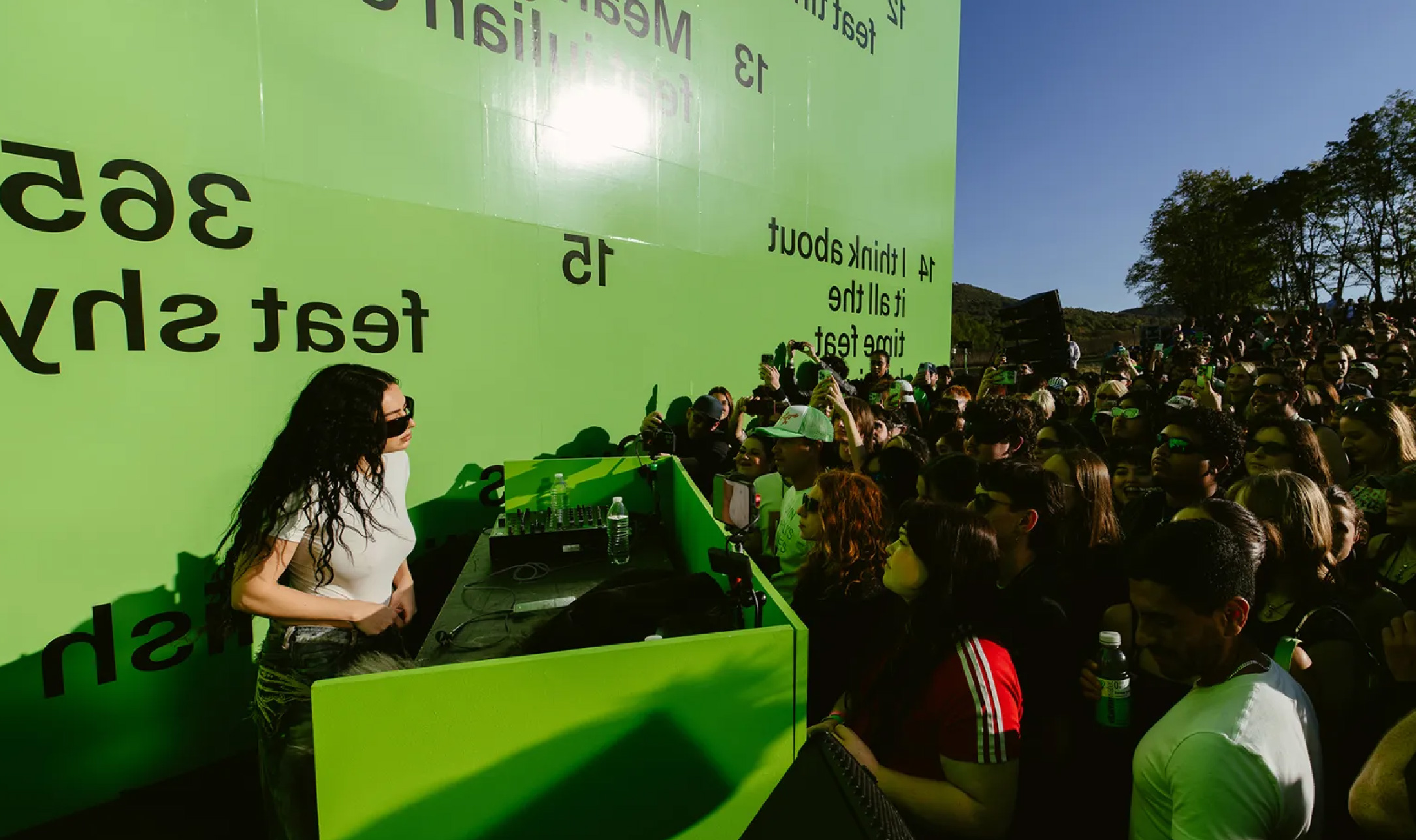
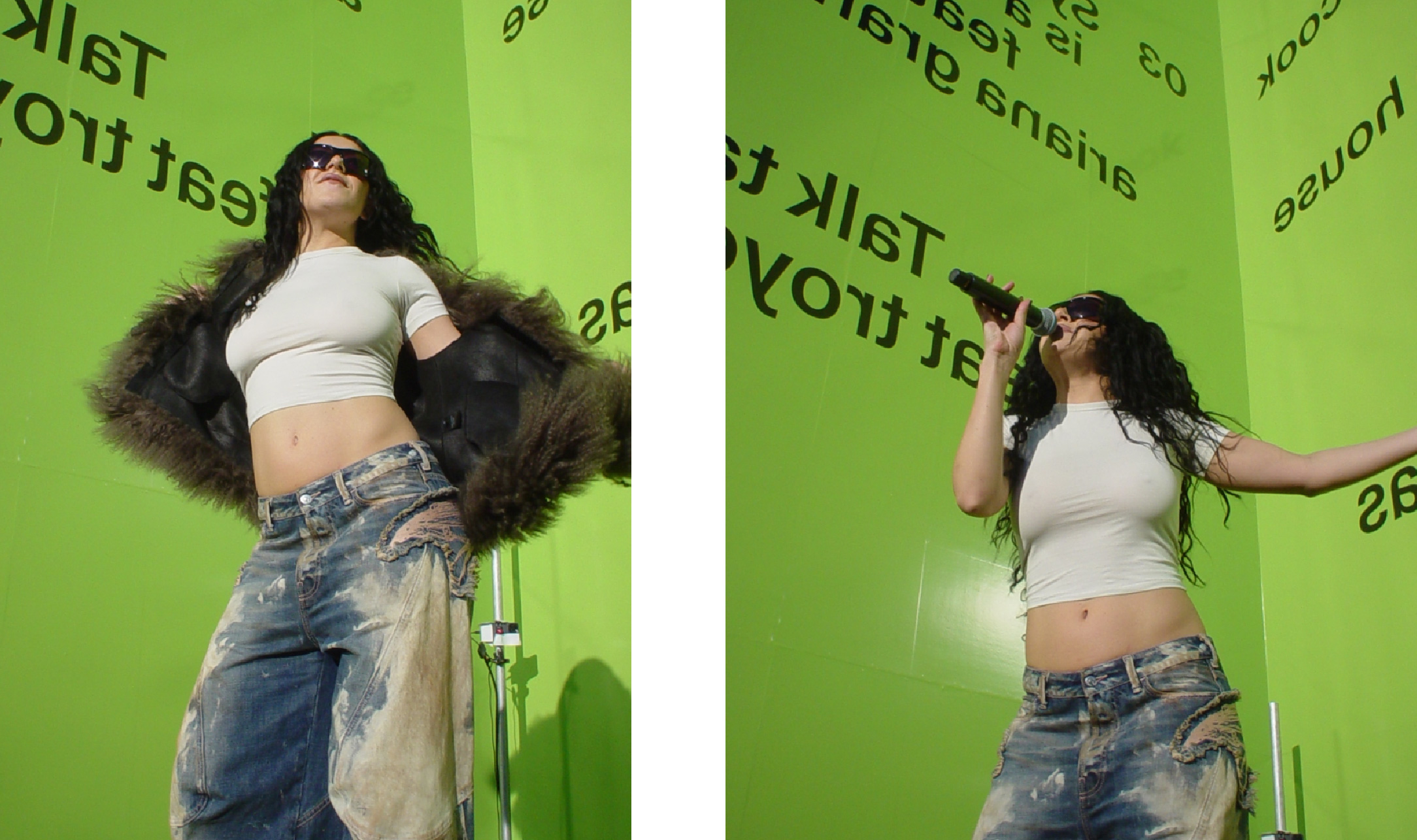
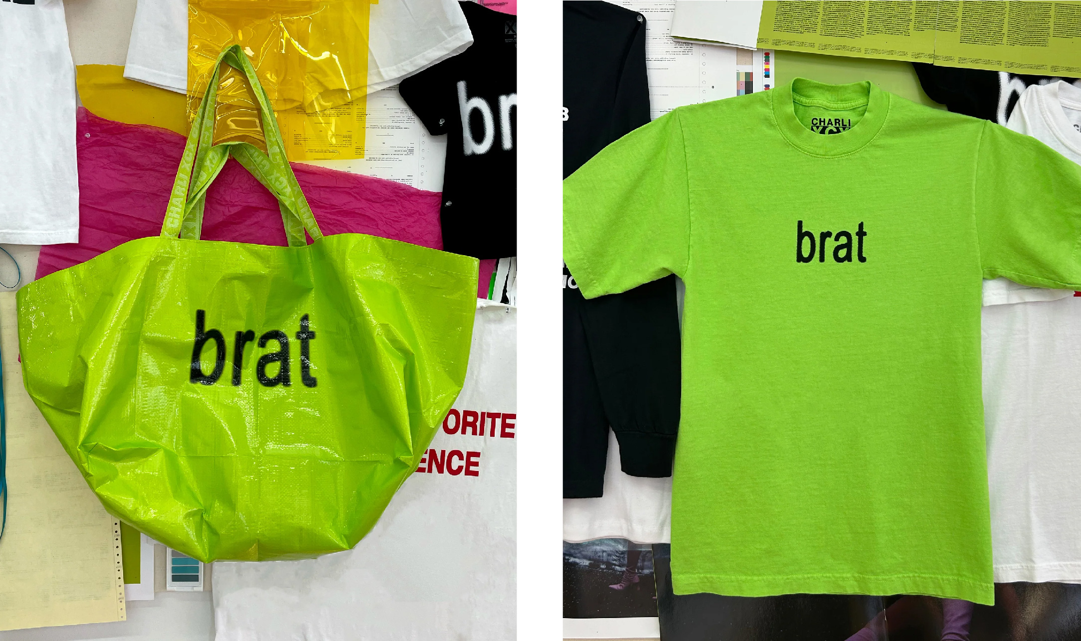
Last week, the world tuned in to watch the 67th GRAMMY Awards. The night was full of big wins and glamour. Pop’s top party girl, Charli xcx, took home three awards that night; Best Dance Pop Recording, Best Dance/Electronic Album, and Best Recording Package. Brat was everywhere in the summer of 2024, with lime-but-not-quite-neon-green adorning screens, billboards and the highly documented “brat wall”. The somewhat off-putting green and slightly pixelated, lowercase Arial font of the cover received both praise and criticism alike, sparking further interest and discussion into album cover art and design.
Although the category has existed since the awards’ inception, the Best Recording Package category at the GRAMMY Awards has always been a relatively understated category and often falls into the shadow of the bigger awards of the night, like Record of the Year and Album of the Year. It is one of three categories at the awards dedicated to highlighting the visual aspect of music. Notable winners of the category include The Beatles’ Sgt. Pepper’s Lonely Hearts Club Band (1967), Cindy Lauper's She’s So Unusual (1963), Björk’s BiophilliaI (2011), and more.
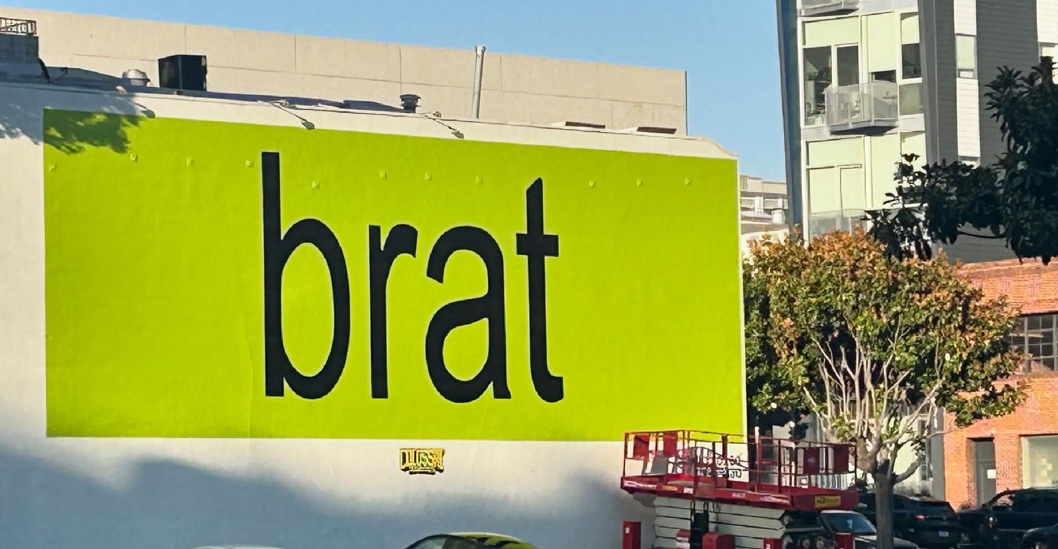
When the cover art for Brat was initially revealed, both Charli xcx fans and design enthusiasts alike were divided. Many lauded the singer for going with an album cover that was both minimalist and confrontational, others dismissed the cover art as lazy and garish. The fluorescent green cover walks the line between intentional, clever anti-design and a perceived nonchalant indolence. This very dichotomy embodies the album’s message. Charli xcx’s creative director, Imogen Strauss, explained to Architectural Digest, “being brat can mean so many things. At its core it’s bold, it’s a little messy.” On her TikTok, Charli herself described a brat as a mix of “a girl who is a little messy and likes to party,” “say dumb things sometimes,” “feels herself but has a breakdown” and “honest, blunt, volatile.”
Brat is also a unique to Charli’s discography as one of just two off her album covers to not feature her likeness, the other being her EP, Vroom Vroom (2016). Charli explained in her Apple Music interview with Zane Lowe that the initial motivation behind the stripped down cover was to cut costs. “Where the actual, first idea of doing a text cover came from was to save money, because I was like ‘this album is not going to appeal to a lot of people. I think I was like ‘I’ll do a press shoot, and then maybe we just save on the album cover and maybe it’s like cool,'” she elaborated.
However, this does not diminish the incredibly thoughtful vision Charli had for the cover art. In December, 2024, Charli revealed her manifesto for Brat, the overall album and the album artwork specifically, dating back to the summer of 2023. She wrote, “The artwork for Brat will be obnoxious, arrogant, and bold. Some people will hate it. It will be heavily text-based, either font on a plain background or painted on a wall or disregarded object.” The design process is also more extensive than one might expect. Brent David Freany, designer and founder of the creative tech company behind the album design, Special Offer, Inc., revealed toThe New York Times that they considered 500 different shades of green as the shade, “needed to be something that couldn’t really be associated with anything else. The directive was: I don’t want this to feel like it has any taste. I want it to feel off-putting and kind of garish. Everything I started seeing in the city that was green, I started taking a photo of. If it was a sign, a traffic cone, a car, the background of an image in The New York Post.” The slightly pixelated text in that Arial-based font taps into the myspace internet era, reminiscent of designing at a small scale and just enlarging it.
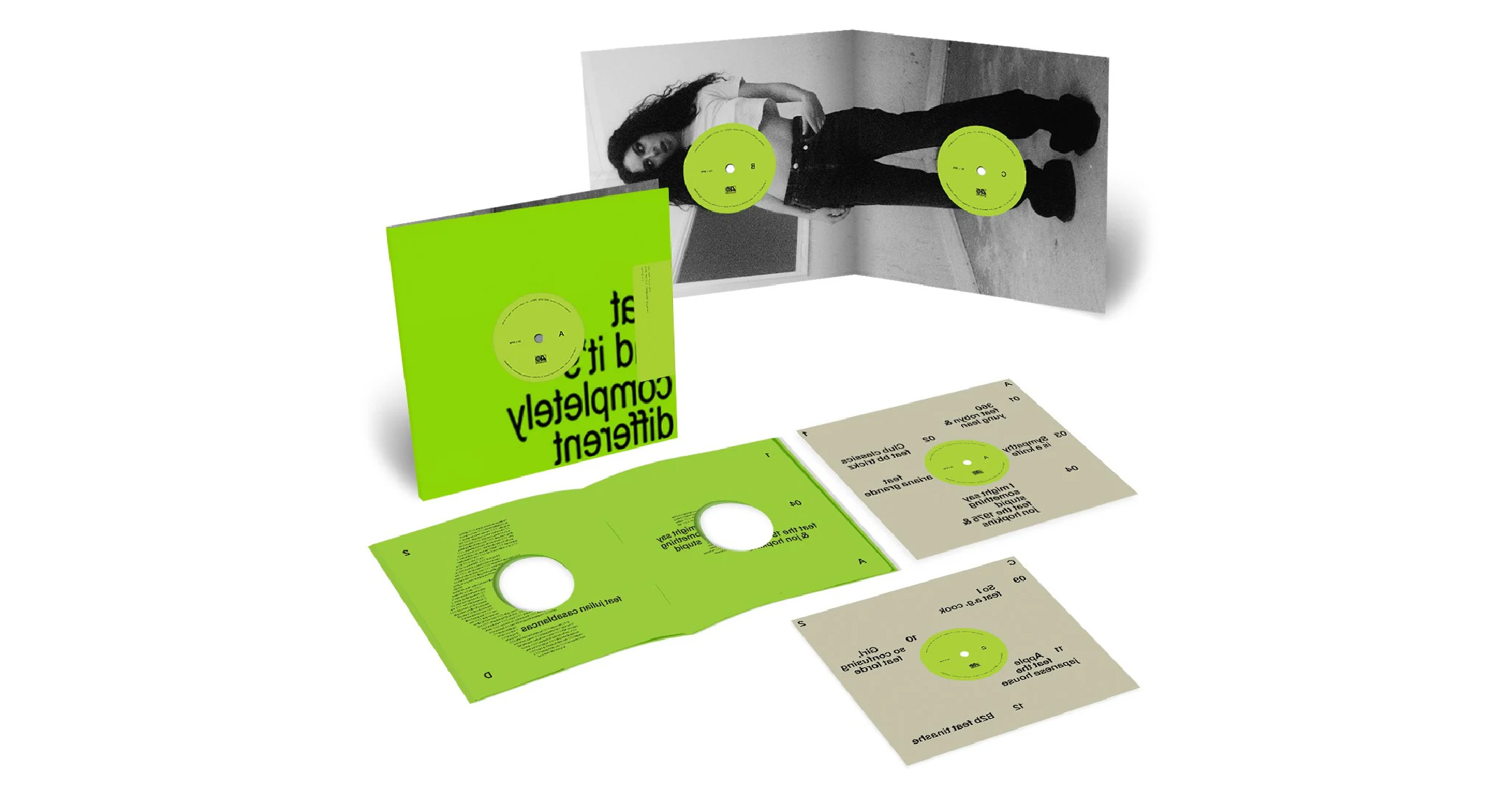
While the initial album cover design for Brat was certainly divisive, the impact of both the album and the album art design was undeniable. In the design’s simplicity also came its accessibility. Both fans and brands were quick to take part in making their own spin on the Brat album. Charli xcx and her team leaned into this memeability by creating bratgenerator.com, an online tool that let’s you generate your own brat-style message. Legendary designer Peter Saville responded to the artwork saying, “It’s a moment…You’re talking about a temporary, autonomous moment in pop culture suddenly informing a political campaign, and a major one — a political campaign of global significance,” in reference to the adoption of the “brat aesthetic” by the Kamala Harris 2024 Presidential Campaign. This unique anti-design approach lives on in the repackaged version of the album; blurry text in the same font simply outlining what the album is, “brat and it's the same but there's three more songs so it's not” with a white background, and for the remix album, with that now iconic green background and mirrored text, “brat and it's completely different but also still brat”.
Charli xcx’s Brat is masterclass in using design to subvert expectations. The simplicity of its design is not to be fooled with indifference. What Charli xcx, her team, and Special Offer, Inc. created worked so effectively because it was deliberate—coming from a place of true understanding of one’s fan base, persona, and niche. What we can learn from Brat is that great design does not have to be elaborate in its execution, but it must be done with purpose.
