Intermezzo: Visual Transformation of Sally Rooney’s Book Cover
written by Dhanurendra Pandji
If Sally Rooney’s previous novels explored relationship dynamics from a female perspective, Intermezzo marks a narrative evolution in her career. Following the success of Conversations with Friends, Normal People, and Beautiful World, Where Are You, her fourth novel shifts its focus to the relationship between two brothers and their struggle with grief. This change is reflected in the cover design, which differs from Rooney’s previous books: darker, more symbolic, and more masculine.
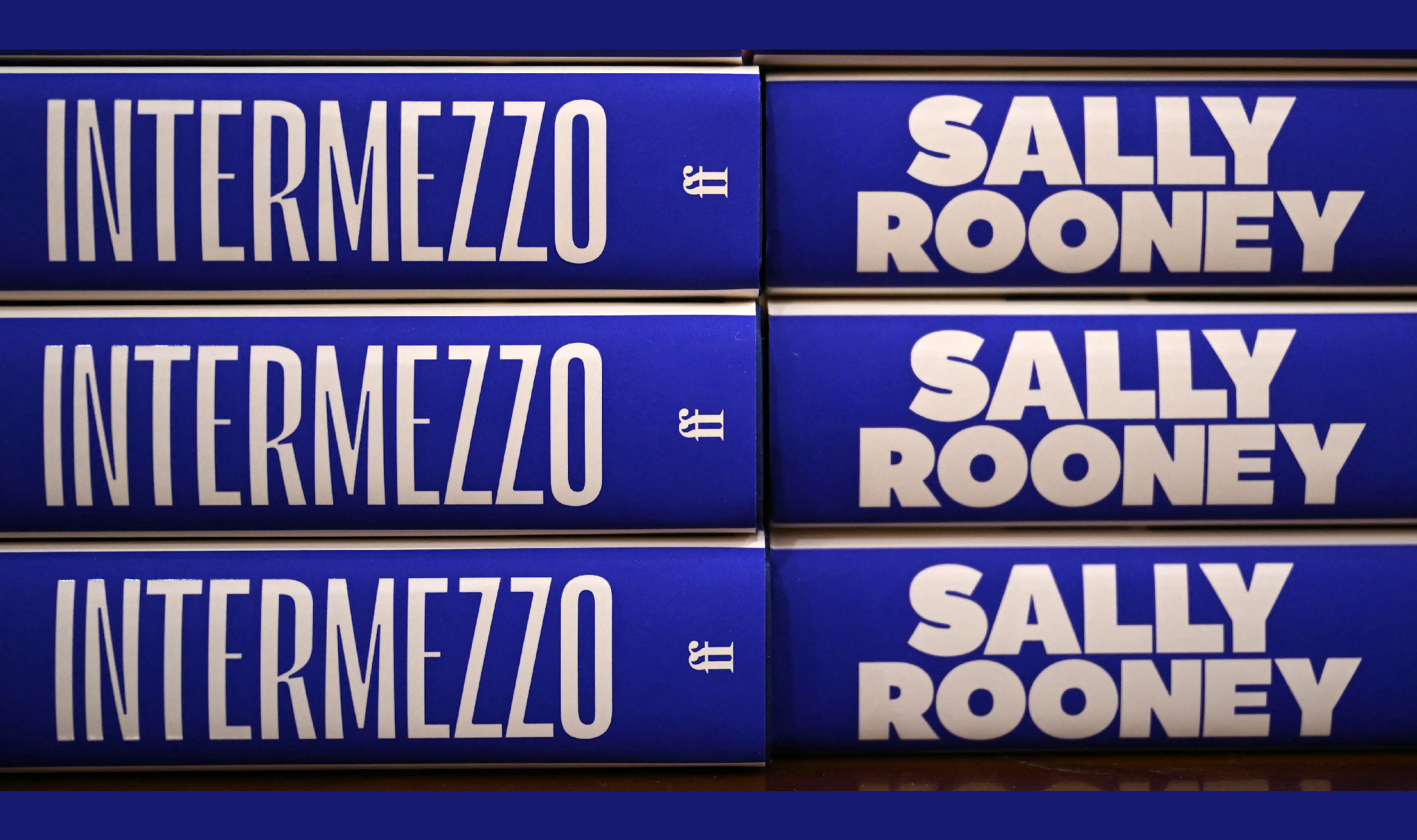
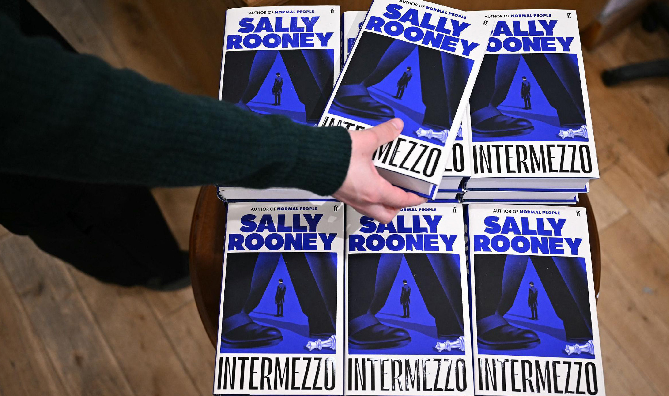
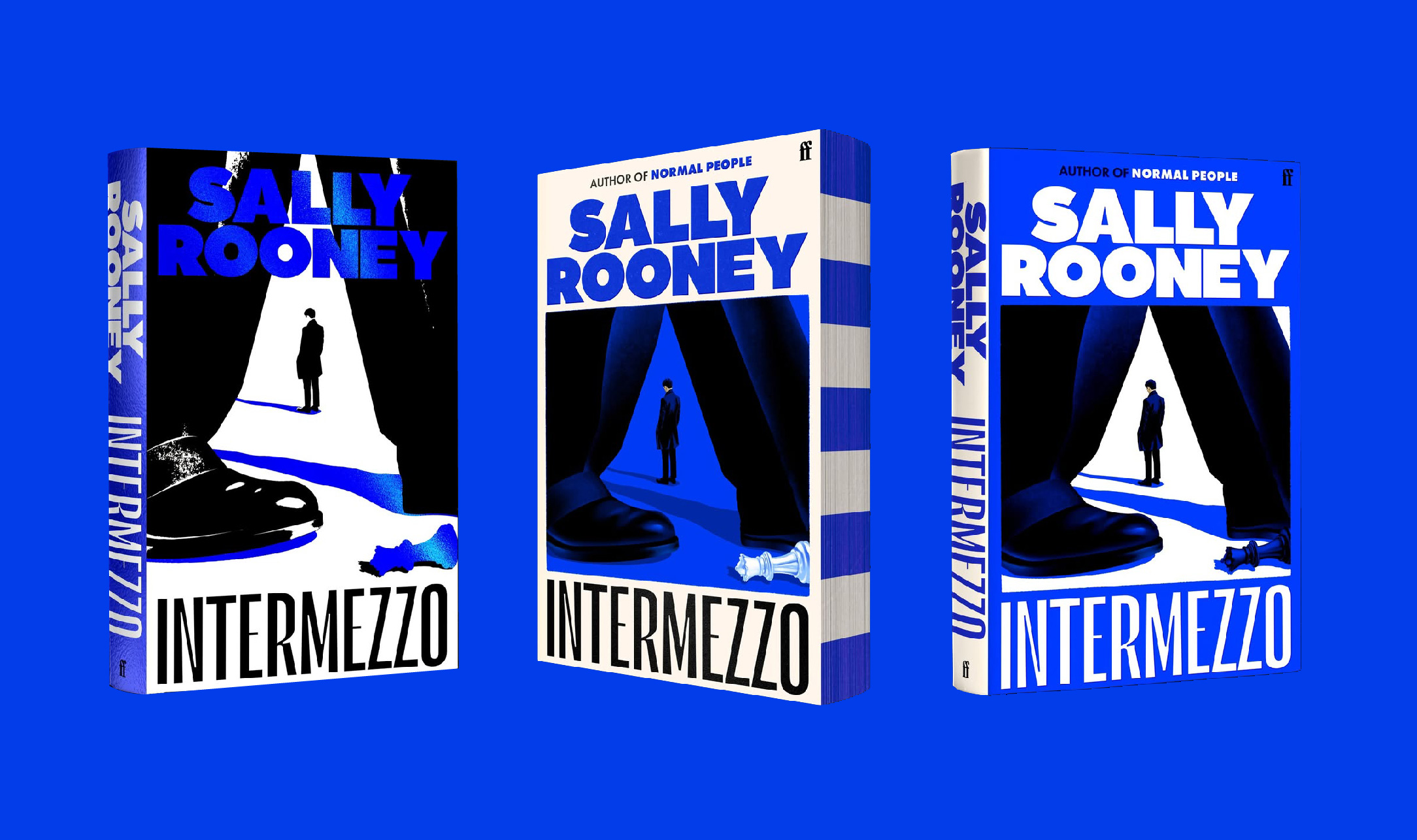
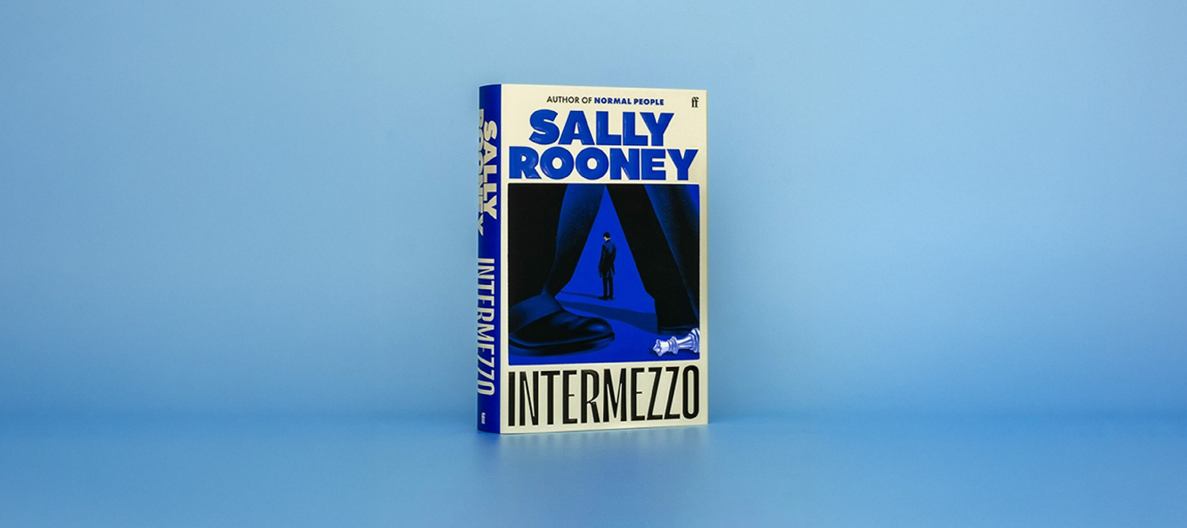
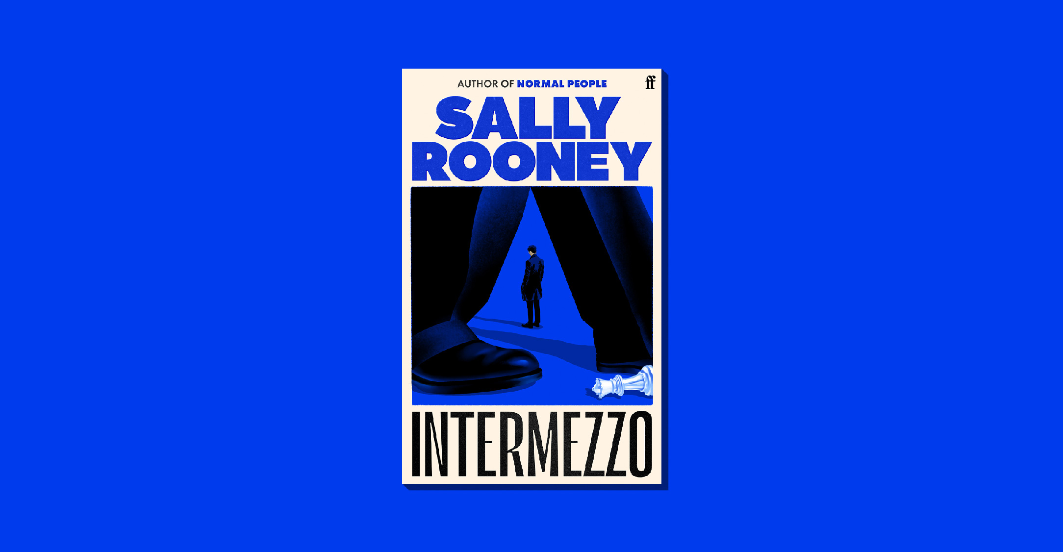
Intermezzo was released in the UK in September 2024 by Faber & Faber. The book comes with a straightforward cover design that, paradoxically, gives off a non-conventional impression. Kishan Rajani, an in-house designer and illustrator at Faber & Faber, was responsible for the cover. He incorporated three main elements against a white background. The author’s name, Sally Rooney, is displayed in Maax Display Ultra with a striking electric blue color. Below it, a square illustration features a man standing in the background, while another man’s legs frame the foreground, with a fallen chess piece near his feet. At the bottom, the book title is written in Le Murmure typeface, entirely in uppercase black letters.
In an interview with GQ magazine titled Behind the Design of Intermezzo, Sally Rooney’s New Novel, Kishan explained that the large text size and the choice of blue were intended to make the novel easily recognizable across different mediums, both online and offline. “We want to sell it everywhere, so it has to make sense both online and in person! That played a role in the lovely blue we came across – that’s going to look really lovely on a bookshelf, and also make an impact when you’re seeing it online.”
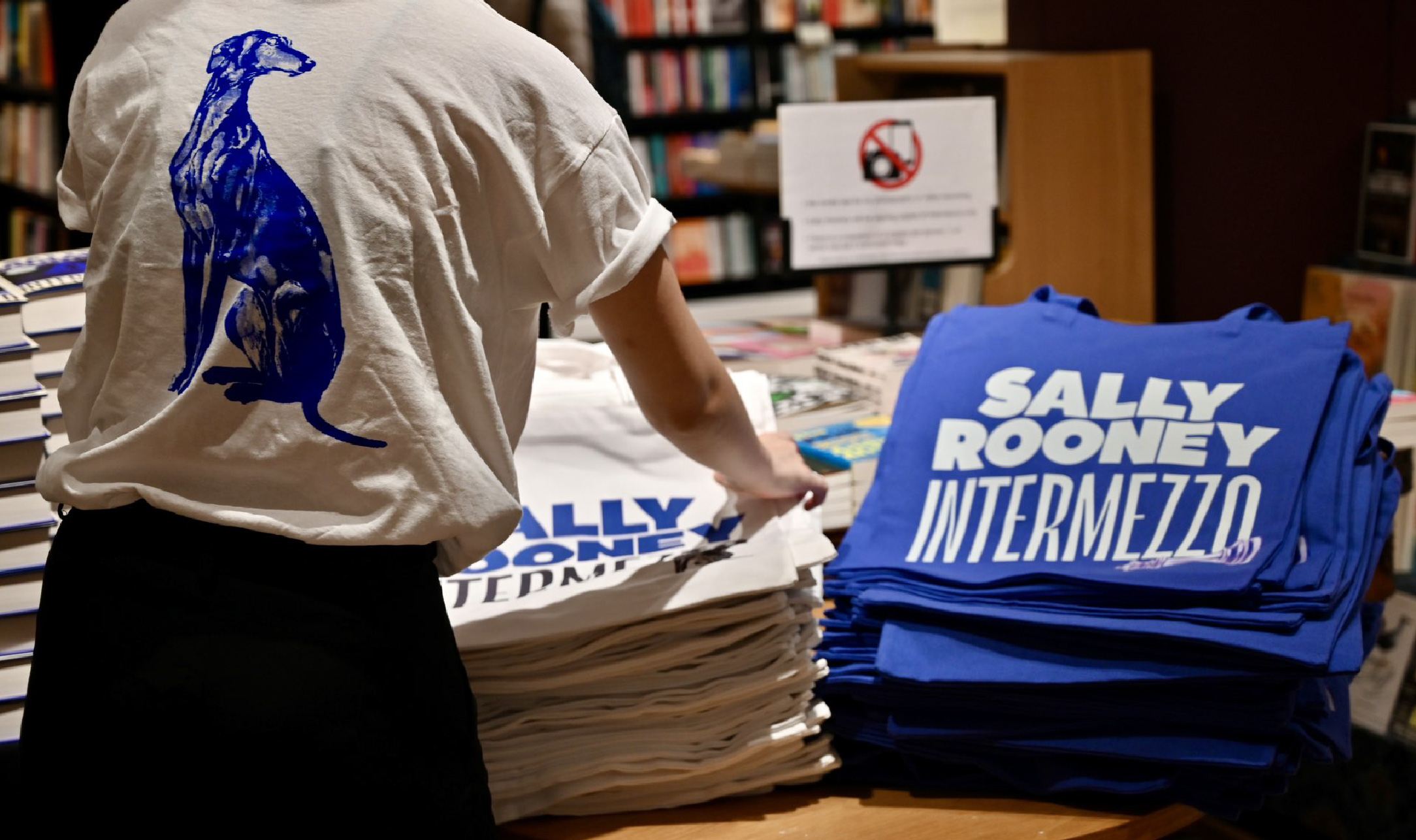
The title Intermezzo plays on meanings in both music and chess. In music, it signifies an interlude; in chess, it refers to an unexpected move. Both interpretations capture the essence of the novel. This wordplay is visually translated through the choice of the Le Murmure typeface, which has a playful character, creating a contrast with the more structured typography on the cover. “When I start a cover, I often start with typography because it carries so much weight in terms of messaging – within the title itself, but also the character of a font,” Kishan Rajani told GQ. “So when I was designing this, I came across the typeface quite early, and then we played with the illustrations.” The entire Intermezzo marketing campaign follows the same graphic standards. Posters, websites, and merchandise all adhere to the blue-white-black color scheme and the dual-typeface combination. The German hardcover edition, published by Claassen, also maintains the same core design established by Faber & Faber, featuring Maax Display and Le Murmure.
Regarding the illustration, Kishan highlighted the process of reading and selecting elements that best represent the novel’s themes. The two men depicted in the illustration are Ivan and Peter Koubek, two brothers from Dublin grieving their father’s death. Ivan, a socially awkward 22-year-old, is a chess prodigy involved in a romantic relationship with Margaret, an arts program director significantly older than him. Peter, Ivan’s older brother, is a lawyer entangled in a complicated relationship with Naomi—a much younger woman and a close friend of his former partner, Sylvia. Kishan portrays this narrative with a dramatic touch. The perspective suggests one man stepping over another, who stands with his back turned, head lowered, and hands tucked into his pockets. There is a sense of grief and secrecy. The composition subtly implies conflict—the two men face opposite directions, with differing proportions and body language that hint at dominance. Meanwhile, the white queen chess piece is misplaced, almost crushed under the larger figure’s foot. This piece, symbolizing Ivan, also plays a crucial role in the novel’s themes of power dynamics and romantic relationships. “It was about picking up on some of the plot points, and fine tuning what we wanted to give away and what we didn’t, and (making the design) open enough that people can take their own meaning,” Kishan explained.
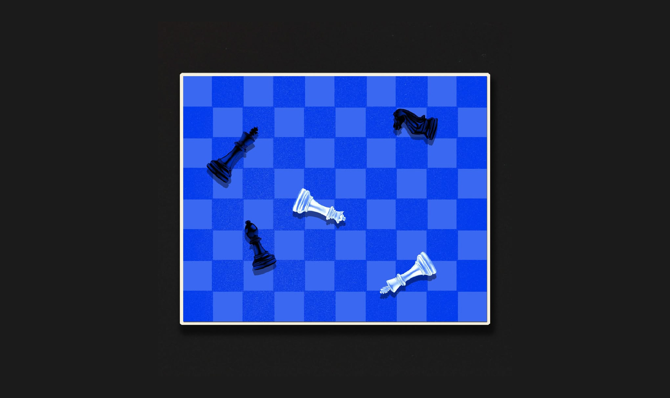
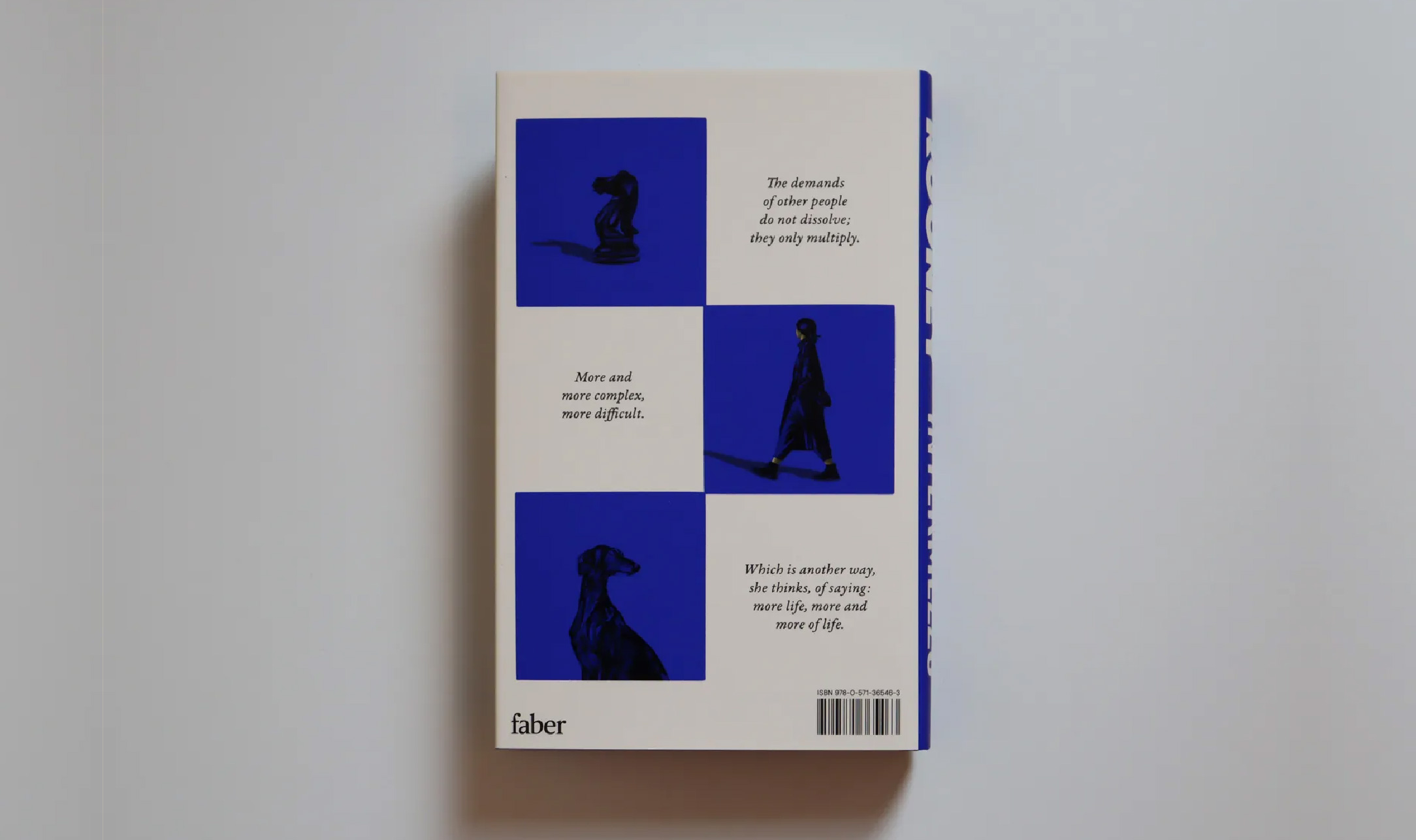
Turning to the back cover, we see a chessboard composition in white and blue. The white sections, blending into the background, contain an excerpt written in Garamond Premier Italic. The blue sections feature illustrations of a knight chess piece, a woman walking, and the silhouette of a dog—elements also chosen for the German edition by Claassen. Beneath the dust jacket, an indigo and midnight blue chessboard pattern further strengthens the book’s visual identity.
Comparing Intermezzo’s cover design to Sally Rooney’s previous novels reveals clear differences in character. Conversations with Friends features a golden-yellow background, with white illustrations and typography. While Intermezzo’s composition is text- and illustration-heavy, Conversations with Friends employs more whitespace, creating a more open feel. The hand-drawn illustration of two women also gives it a more feminine touch. The same applies to Normal People, which shares a similar layout and illustration style with Conversations with Friends. Meanwhile, Beautiful World, Where Are You has a pastel colors cover with organic shapes and flat illustrations, evoking a retro yet melancholic atmosphere.
At first glance, the use of color, typography, and illustration in Intermezzo aligns with the progression of Sally Rooney’s writing. The colors, typography, and illustration of its design reinforce the emotional complexity of the story. The cover successfully delivers a visual experience that is bold, elegant, and irresistibly intriguing.