
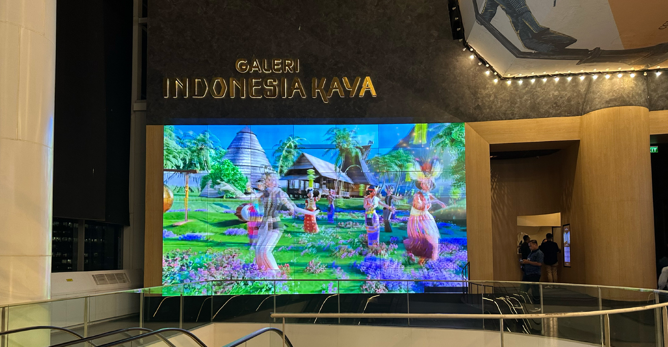
Indonesia Kaya’s New Face: Preserving Tradition and Staying Relevant
Indonesia Kaya was founded as a platform to foster public appreciation and education of Indonesian arts and culture. In response to the evolving landscape of branding, it recently unveiled a refreshed brand identity– supported by Bakti Budaya Djarum Foundation– and showcased their new look that harmoniously blends traditional Indonesian heritage and contemporary visual elements. To ensure a cohesive brand architecture, this visual update extends its programme ecosystem, including Galeri Indonesia Kaya (GIK), Taman Indonesia Kaya (TIK), and Rumah Budaya Indonesia Kaya (RuBIK).
Through the ADGI program, Evan Wijaya was chosen as the lead designer to embark upon this project. “I was one out of five designers or studios that participated in this program. It was run as a competition, where only one winner was selected. The remaining participants were Thinking*Room, Artnivora, Mata Studio, and SWG Design,” Evan explained in an interview with Grafis Masa Kini.
The design process began with an in-depth research that unravelled Indonesia Kaya’s vision, mission, and core values. Evan shared, “The main challenge was to build a brand architecture that could be applied across the entire program ecosystem, such as Galeri Indonesia Kaya, Taman Indonesia Kaya, and Rumah Budaya Indonesia Kaya.” He added that the mission to bring Indonesian culture closer to younger, more modern audiences was a key influence to the final visual direction.
Throughout his research, Evan was driven by a human-centered approach. He conceptualised Indonesia Kaya to be originated from the spirit of reviving a rich cultural heritage. Every form of art, story, and expression becomes a bridge that connects the past and the present, and always remains rooted in humanity as its core: “The preservation of culture and tradition is reliant on humanity; embodied through the roles of its guardians and heirs,” said Evan. Indonesia Kaya’s ecosystem– including GIK, TIK, and RuBIK– is unified by a shared belief in the performing arts as a vital medium for bridging tradition and contemporary expression.
This philosophy was brought to life through the new logo design, which places humanity at its core. Designed to resemble a gathering of people in one shared space, the logo subtly illustrates various interactions: some figures appear to be watching performances, while others are engaging and socializing. The letterforms appear expressive yet structured, elongated, and its elements flow amongst each other. “The characters in the logo were created to resemble a group of people coming together in one (shared) space— as they interact, perform, watch, and chat together,” Evan explained.
Evan’s logo and typography were implemented throughout Indonesia Kaya’s communication channels, designed to (reference and) resemble local Indonesian scripts that enriched the archipelago’s cultural wealth. Its visual patterns were based on traditional wastra motifs that were arranged in a modular structure, which created a visual system that is rich yet flexible enough to be used across various applications. Its main color choices such as "Kunyit Emas" (tr. golden turmeric), "Putih Kusam" (tr. muted white), and "Merah Lembayung" (tr. crimson red) symbolises the harmony between modernity and tradition. Together, all of these elements are designed not to just be pleasant to the eyes, but as a carrier of stories: each detail carries a cultural narrative and nuance that is visibly recognizable. Therefore, the design is visually strong enough to stand on its own– without the need for further explanation. The logo also serves as a visual representation of the public spaces facilitated by Indonesia Kaya, envisioned as places for people who want to preserve culture, especially within the field of performing arts.
Beyond its logo, Evan Wijaya also collaborated with wacanatype to design a custom font named Aksana– as an extension of the main visual identity. Aksana was created to celebrate the meaning and richness of Nusantara’s visual culture through distinctive letterforms. Inspired by various local scripts from across Indonesia, this typeface aims to present a harmony between traditional culture and their modern counterparts. “Aksana embodies the spirit of celebrating the visual diversity and meaning of Nusantara’s culture through distinctive letterforms,” added Evan.
According to Evan, this update is not just about introducing a new aesthetic but is an attempt to ensure cultural relevance, particularly for the younger generations. “I think this is a good way to keep the brand relevant for future generations, because they are the ones who will carry on the legacy of our ancestors,” he said. For Evan, this brand refresh is not merely a cosmetic change but a strategic effort to ensure that cultural heritage remains relevant and close to the public, especially amongst young people.
Indonesia Kaya’s revamp of its visual identity is a strategic step to address the challenges of our times. In an era where the younger generation holds the key to carry– and continue– tradition, a visual identity that speaks in a language they understand becomes crucial. With a fresher look and a more adaptive approach, Indonesia Kaya becomes a bridge between heritage and future expressions–presenting culture in a way that while becoming wmore accessible to wider audiences.


