Global Village Coffeehouse and the Commodification of Cultural Symbols
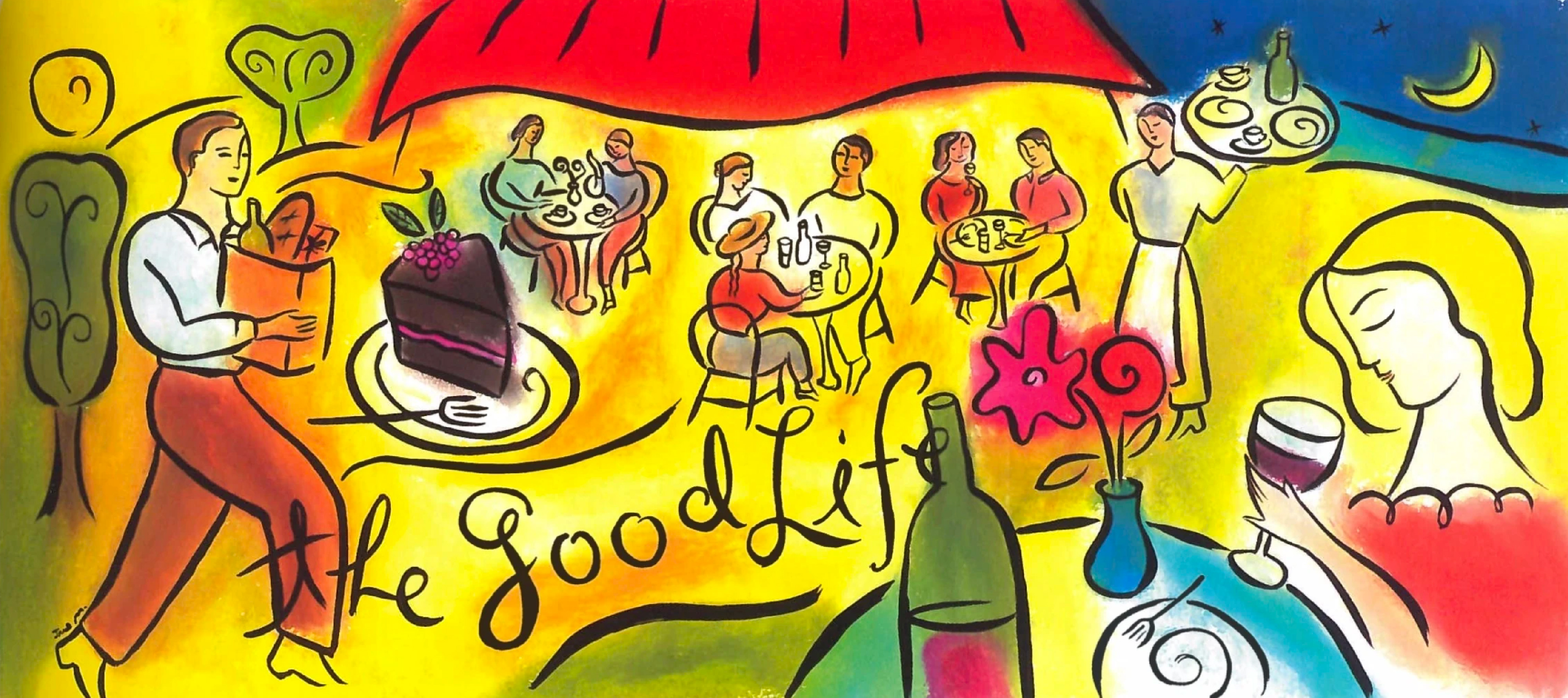
There may not be much left of the 90s, but the remnants of its cafes, restaurants, and antique shops stand strong. They stand in contrast to the austerity in today’s architecture with their intimate yet kitschy aesthetic. Or go online and look up an illustration of a coffee cup: there is a popular image that uses wavy lines to emanate a hot steam seeping out— this unusual detail evokes a sense of familiar warmth. And who could forget the famous Microsoft Word clip art from the 90’s? Its signature hand waves, smiling suns, random spirals, and half-finished tribal motifs have been widely used on our school brochures or community flyers. These collections of oddities are birthed out of a design phenomenon known as Global Village Coffeehouse.
Global Village Coffeehouse, or GVC, is a visual and interior design aesthetic that was developed from the late 1980s to the early 2000s. The term GVC became somewhat popular among graphic designers, design researchers, and visual communication practitioners to describe a style that merged bohemian, folk, spiritual, and eclectic motifs, which were vastly used across cafes, coffee shops, and global lifestyle brands, especially in cosmopolitan cities. The use of “global village” was coined by Marshall McLuhan to describe the world’s “shrinkage” due to the rise of communication technology, and referred to this renewed existence as living under a single "global village." In design, it reflects an increasingly popular practice of romanticising the adoption-and-merging of visual cultures from different parts of the world. Meanwhile, “coffeehouse” is a reference to the popularity of independent urban cafes in Europe and America— an ode to the beginnings that led to GVC’s style evolution.
GVC emerged as a response to the tech boom and the rise of digital design in the 1990s. In an essay based on design magazine articles from the 90s, Evan Collins mentioned that the rise of GVC was tied to the era’s turbulence: economic recession, political climate shifts, the rise of environmental movements, and also a shared embarrassment over the excesses in taste that defined the 80s. GVC offered an alternative to minimalist computer graphics styles like Pacific Wave and Memphis Design, emphasizing organic elements, hand-drawn touches, and human connection.
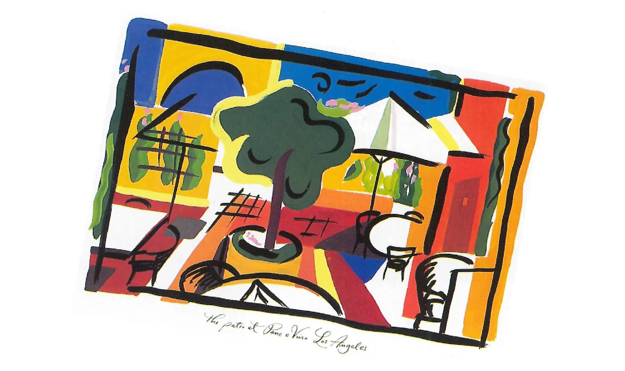
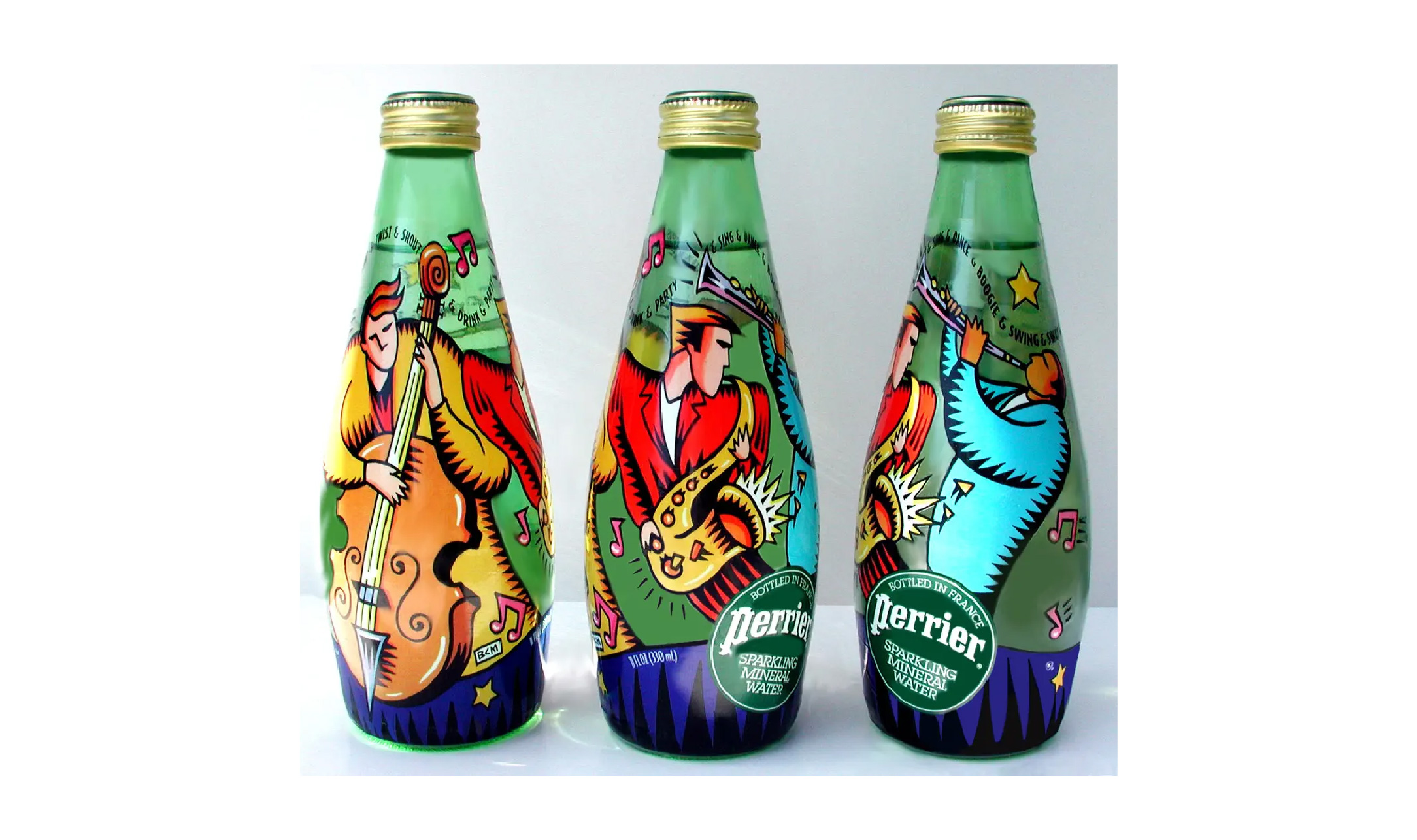
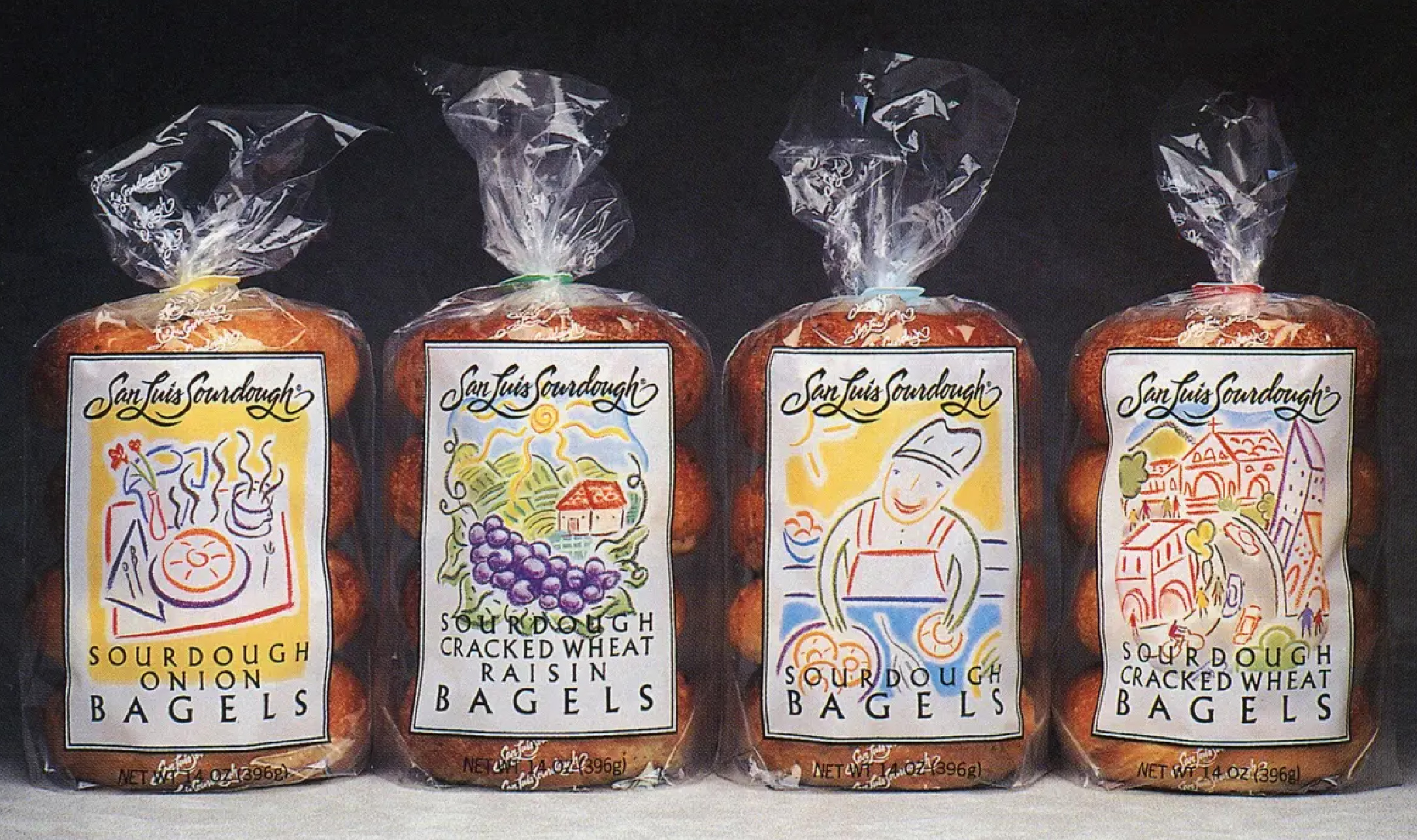
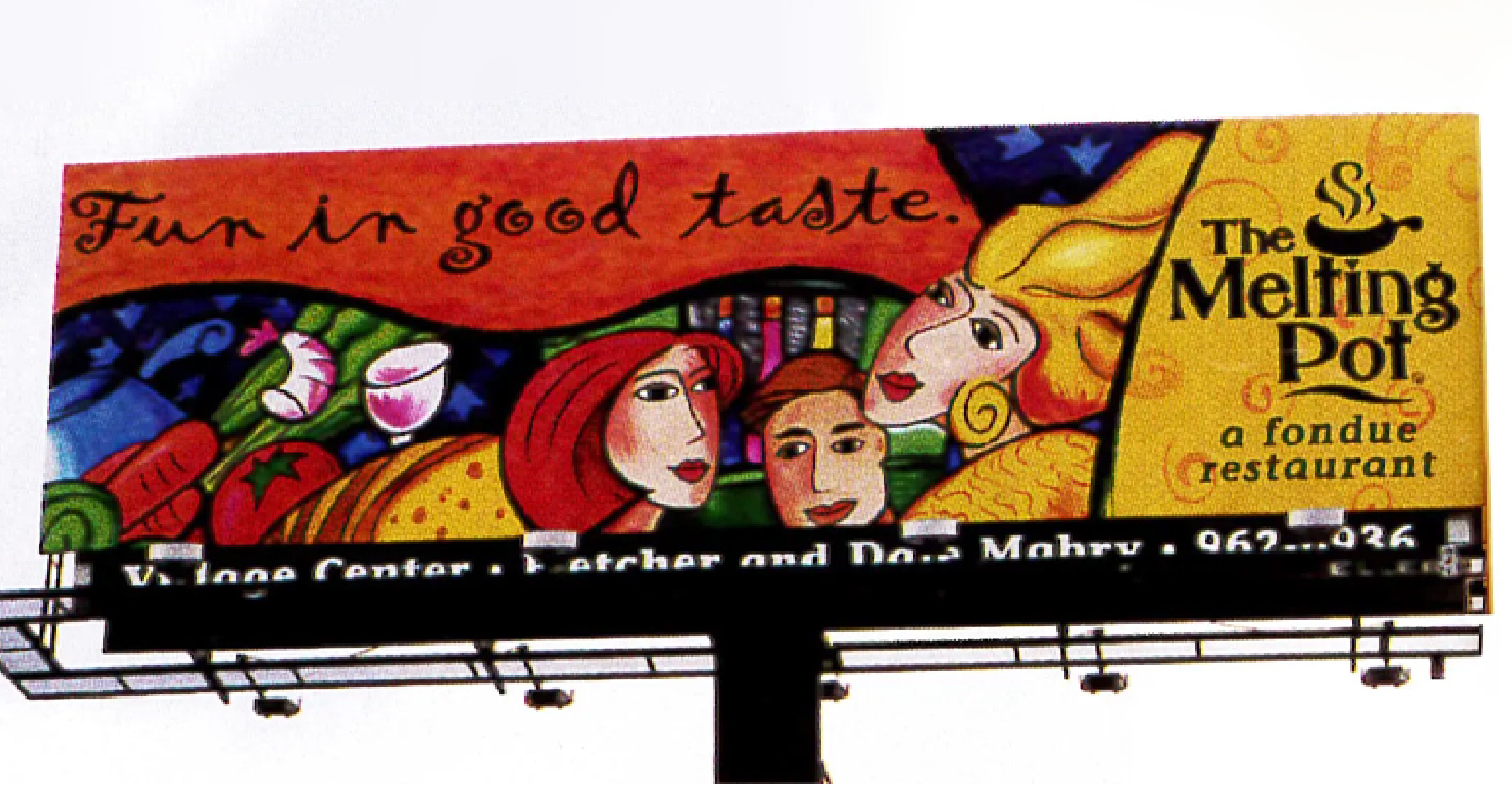
Visually, this style is characterized by earthy color palettes such as browns, olive greens, brick reds, faded blues, and clay yellows. They are used against the grains of textures, tribal motifs, imperfect hand-drawn lines, and organic ornaments with signature iconographies such as aroma swirls, spirals, compasses, globes, suns, moons, hand symbols, eyes, and simple human caricatures. Other striking components that are occasionally used include woodcut illustrations, broken lines, and quick sketches. The overall composition of GVC design is influenced by Keith Haring’s bold outlines and moving figures, reflected in the layering of backgrounds that do not align with its outlines— creating a nod to Haring’s raw and unpolished aesthetic. On some occasions, the Kokopelli symbol, a fertility deity from Southwestern Native American traditions, is used as a core asset to represent music, creativity, and vitality. And its accompanying use of other tribal motifs— extracted from petroglyph art and ancient symbols— signify the inherent cultural appropriation in GVC’s design.
The random use of cultural symbols has sparked criticism from academics for its cultural extraction: Western corporations that use GVC are essentially co-opting the design aesthetics of marginalised communities for commercial gain. Ruben Pater, of Politics of Design, stated that cultural appropriation comes at a cost for marginalised groups who often see the sanitisation of their sacred, ancient, unique or otherwise culturally significant practices to be stripped of its context and used for the motives of profit.
GVC has a reputation of co-opting and benefiting from the aestheticisation of the environmental movement of the late 1980s, as well as replicated the stylistic trends across various global art movements, including Chagall, Vienna Secession, Cubism, Art Deco, Fauvism, and works by artists such as Matisse and Picasso, for their commercial use.
They have also appeared in music and popular culture, which include the album cover for “We Can’t Dance” by Genesis, “Disappearing Earth” by Dave Hewson, and “Shimmering, Warm and Bright” by Bel Canto. Songs associated with GVC include Paul Simon’s “Under African Skies,” Enya’s “Storms in Africa,” Deep Forest’s “Sweet Lullaby,” and Sting’s “Desert Rose.” This music carried themes of global connection, spirituality, and wanderlust (for the exotic). Music videos such as “Show Me Your Soul” by Red Hot Chili Peppers and “Runaway” by Janet Jackson also featured GVC visuals with tribal motifs and ‘tropical’ backdrops.
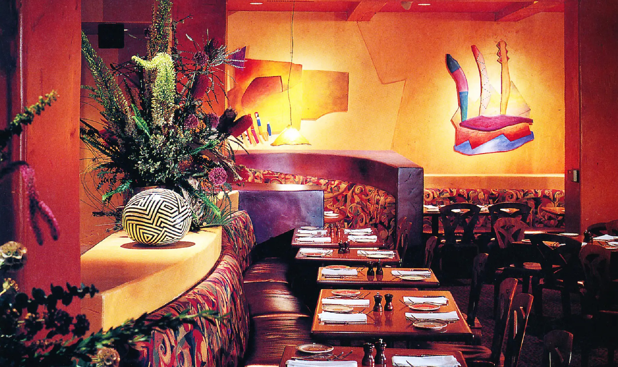
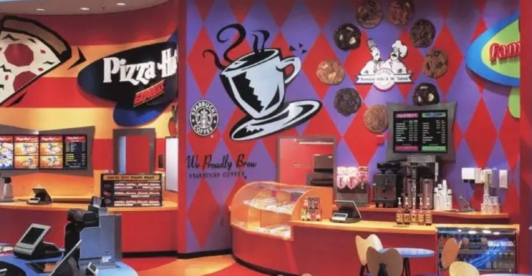
By the late 1990s, GVC began to be displaced by the trend of Y2K that is futuristic, minimal and clean— claimed as the aesthetics of the Gen X Soft Club. The urban demographic are more drawn for something perceived as more “authentic, organic” and less ornamental in their design, resulting in the birth of Mission School and Industrial Americana. Many began to view GVC as an overly decorative aesthetic that uses cultural symbols carelessly. However, its traces remain in the ambience of restaurants and cafes, as well as food packaging, coffee merchandise, and festival designs.
To this day, GVC is only recognised as a relic of the past, as indicative of the mainstream aesthetic that plagued the 90’s. This showcases the inseparability of discourse in design with cultural studies, as it brings depth into analysis. Upon doing so, it is not about a mere assessment of its appearances and visuals, but rather an acknowledgment of the nuances in design itself and how its practices are enmeshed in cultural contexts and the politics of representation.