Looking Back at Bangkok Design Week 2025, Bringing Design Back to the Public Through Everyday Aesthetics
Source/Author: Ellen Wang, Golden Pin Design Award, Taiwan
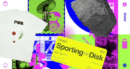
Bangkok Design Week 2025 responded to contemporary design discourse by bringing what already exists in public space to the foreground. Straw police figures, public buses, road signs, “welcome child” stickers on street vendors’ carts, blue pipes, objects that fill Bangkok’s streets yet are rarely recognized as design. These elements were selected as the core visual language by Pink Blue Black & Orange (PBBO), a Thai design studio appointed to develop the event’s main visual identity.
What set this project apart was the decision to open the entire process to the public. The design process itself was made visible and transformed into an exhibition accessible to everyone, becoming a living experiment in how design can return to everyday life and move from local context toward global understanding. The visual identity did not stop at promotional material. In this context, design was positioned as a way of thinking that continues to evolve.
This visual language marked a clear shift from previous editions. For several years, Bangkok Design Week had been known for visuals that felt neat, abstract, and easily read as “international.” In the 2025 edition, PBBO chose a different path. The visual system they built appeared dense and busy. It echoed Bangkok’s urban landscape itself, layered, intersecting, and shaped by improvisation.
This approach emerged from observing how people in Thailand navigate daily life. Many problems are solved through adaptation and patchwork solutions. Assembled furniture, temporary fixes that last for years, objects that remain in use despite never being formally designed as products. PBBO read these conditions as a form of collective ingenuity. From there, design no longer created professional distance, but was pulled back into lived, everyday experience.

The visuals of Bangkok Design Week then spread throughout the city. Stickers of smiling children offering a sawasdee greeting appeared on shop doors. Banners carrying Buddhist talisman imagery surfaced in public corridors. Local humor appeared without explanation. Citizens were not confronted with visuals that demanded interpretation and created distance. Instead, design emerged from images they already recognized and encountered daily.
In recent years, Bangkok Design Week visuals were often praised for feeling global. Yet that praise also left a gap. Minimalist and abstract aesthetics did not always grow out of the everyday visual experiences of the city’s residents. When Thailand’s Creative Economy Agency set the theme “Design Up + Rising,” PBBO was chosen for its ability to translate overlooked everyday creativity into a visual language that could be recognized collectively.
“Design is often perceived as something distant, something luxurious or decorative, with little practical relevance to everyday life,” PBBO said in an interview with Ellen Wang. “What we want to show is that design is actually very close to life. It’s about creative thinking, like those improvised pieces of furniture you see on the street.”
They instead view design as a way of thinking born from limitation. From this perspective came the decision to make process part of communication. Working within tight deadlines, PBBO released the key visual in stages, beginning with black and white line drawings, followed by high saturation colors, and later versions layered with texture and spatial depth.
This maximalist approach also reflected Thailand’s cultural condition. The public was invited to observe how a visual language grows within a society shaped by long interactions among European, Chinese, Islamic, and local traditions. Within this visual universe, everyday symbols appeared as markers, straw police figures, public buses, nasal inhalers, references to local eateries. Humor functioned as an entry point. It made the visuals feel familiar and easily shared. In this context, humor operated as a form of cultural attraction that worked without translation.
“We’re not afraid of bold colors, unusual elements, or things that might look strange. That sense of fearlessness comes from living in a highly diverse environment,” PBBO explained.

PBBO’s decision did not stop at the visual identity. During Bangkok Design Week, they curated an exhibition that revealed every stage of the work. Research, sketches, proposals, and applications in public space were presented as a continuous sequence. Visitors could follow the transformation from line to color, from flat surface to installation.
The exhibition space invited public participation. Coloring walls allowed visitors to reinterpret the key visual. Street elements, amulet stalls, lucky number rituals, blue tarps were recontextualized within the exhibition. Magnifying glasses were provided to encourage visitors to examine overlooked urban details, similar to closely inspecting an amulet.
PBBO recognized that not everyone shares the same emotional connection to these objects. Still, they chose to invite the public in. These objects were positioned as part of a shared identity that did not need refinement to be considered worthy of display. “We want people to realize that these things are very unique and valuable. They belong to us, and they don’t need to be hidden or downplayed,” they said.
Understanding was further expanded through interview videos that brought together perspectives from designers and international cultural observers. Many visitors left with renewed sensitivity toward their own visual environment, toward design energy that had long existed without a name.
From the beginning, PBBO had no intention of adjusting Thai design to fit global aesthetic standards. They chose instead to amplify local visual language with honesty. This approach allowed the project to travel further. Its influence extended into commercial spaces such as Siam Center, where PBBO continues to apply its everyday oriented design language. Bangkok Design Week 2025 also received the Good Design Award from Japan and the Golden Pin Design Award in Taiwan.
This project shows that design capable of global resonance often emerges from the courage to remain grounded in local context. In Bangkok, street objects long overlooked have become the starting point for a visual language understood across borders.


