Tracing Bauhaus and Brutalism in the Title Design of The Brutalist
Designer: Sebastian Pardo
Scope: Title Design
Client: The Brutalist Film
The Bauhaus movement is a monumental pillar in the history of design and architecture, much like the Brutalist movement that followed. With its combination of simplicity, practicality, and beauty, Bauhaus broke down the barriers between fine art and design craftsmanship—while simultaneously responding to the social and technological shifts of the early 20th century. Bauhaus introduced critical elements in design such as typography, the use of simple geometric forms, and a minimalist yet functional approach. These principles provided a solid foundation for Sebastian Pardo, the designer behind the title sequence of The Brutalist (Brady Corbet, 2024), to craft a title design that not only supports the visual narrative but encapsulates the graphic essence that serves as the lifeblood of the film.
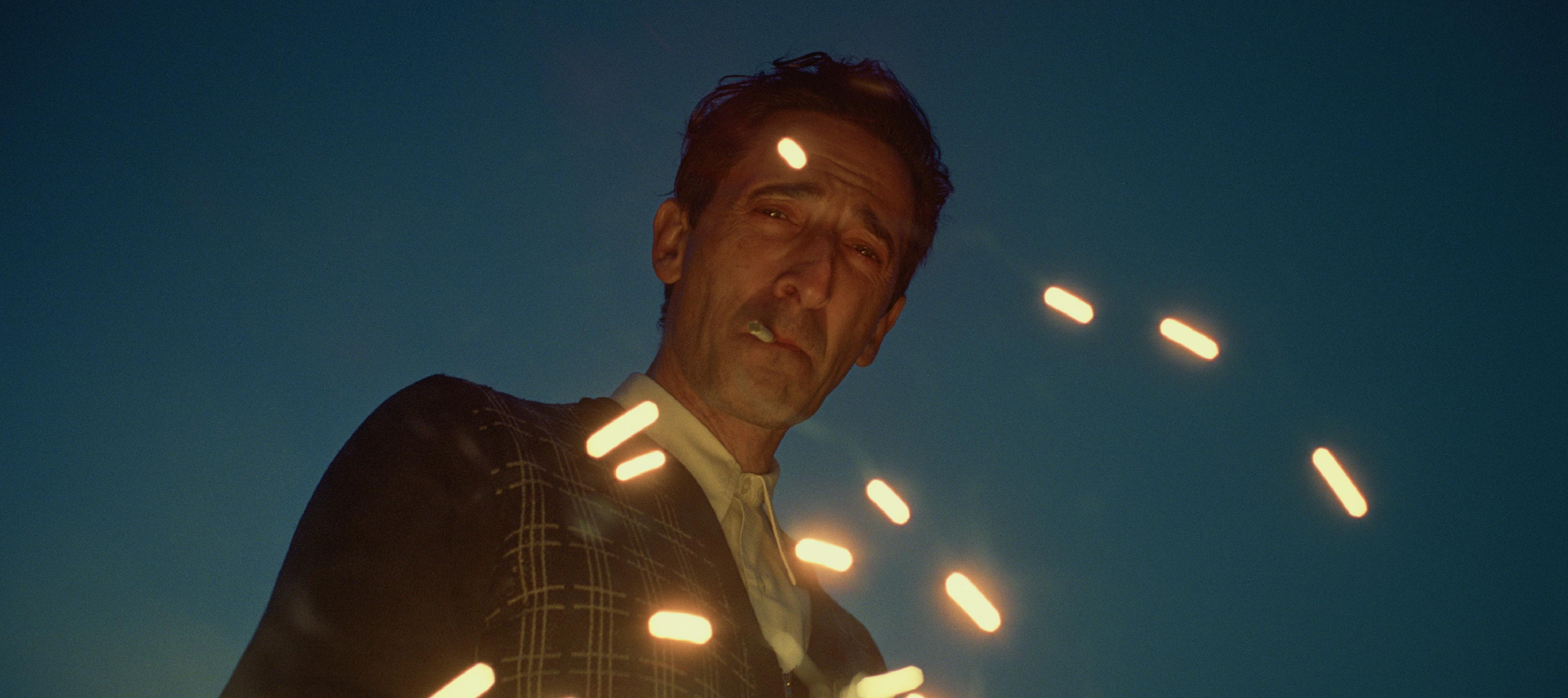
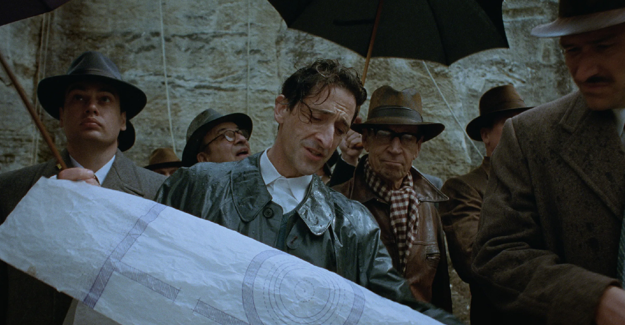
Produced by A24 and a recipient of multiple 2024 Golden Globe awards, The Brutalist chronicles the life of visionary architect László Toth (Adrien Brody), who flees post-war Europe. Arriving in America, László works to rebuild his life, his career in architecture, and his marriage. Directed by Brady Corbet, the film gained attention even from its teaser release, where the title font flows seamlessly with the narrative in the video. Every typographic element was meticulously designed by Sebastian Pardo, co-founder of the independent production company MEMORY and a film title designer. Prior to The Brutalist, Pardo had also designed title sequences for works by directors such as Barry Jenkins, Sean Durkin, Antonio Campos, and Gia Coppola.
In an interview with writer Stephen Saito for the article “Sebastian Pardo on the Bold-Faced Type of ‘The Brutalist’,” Pardo shared his explorations of Bauhaus principles. Bauhaus design, known for its simplicity, birthed clean yet bold typefaces like Futura and Gill Sans. These design elements became the foundation of Pardo’s creative journey in designing the titles for The Brutalist. Through a lengthy process, Pardo developed a design that embodies Bauhaus’s minimalism and Brutalism’s experimental nature, introducing surprises through variations in font weight, size, and spacing. At the core of its story, The Brutalist emphasizes a design and architectural style rooted in functionality. Pardo noted that one of the biggest challenges was balancing the minimalist and maximalist elements that aligned with Brady Corbet’s vision for the film. “Brady has a strong internal compass for maintaining balance between simplicity and complexity,” Pardo explained. He further shared that large, bold elements were ultimately reserved for the closing credits, as they felt “too big” for the film’s opening sequence.
Bauhaus is renowned not only for its typefaces but also for its innovative layouts. In The Brutalist, Pardo employed elements such as lines, negative space, and geometric shapes to create compelling visual dynamics. He drew inspiration from internal Bauhaus documents, which often featured unique layouts even for mundane memos. “Back then, they used typewriters and created visual effects solely through layout arrangements,” he explained. In the film’s credit design—which audiences in Indonesia have yet to see due to an unannounced release date—he applied a similar approach to bring the text to life and inject visual energy into repetitive elements like the list of executive producers.
Since the teaser release of The Brutalist, Pardo’s title design has received widespread praise. Positive responses from the film and design communities have not only reinforced Pardo’s reputation as a title designer but also proven that title design can serve as an integral element that elevates the cinematic experience. Through The Brutalist title sequence, Pardo successfully encapsulated the film’s overall aesthetic with typography that is both straightforward and bold—emphasizing the tangible power of design. The title design also features expansive spacing, placing white blocks in geometric graphics that strengthen the Brutalist atmosphere. Carrying the Bauhaus legacy, the typographic layout dominates the space by combining widely spaced fonts with tight, bold lettering. The use of right alignment with ample empty space enhances the experimental nature of the title design, further enriched by basic geometric shapes that merge symmetrical and asymmetrical layouts. The typography and layout are reminiscent of the experimental and politically-charged designs of Soviet avant-garde posters. The teaser's credit roll becomes an essential component, meticulously designed rather than merely serving as a star-studded list of those involved with the film.
Observing the various implementations of The Brutalist’s title design is akin to witnessing a building stand solidly. With The Brutalist, Sebastian Pardo has forged a strong connection between the history of design, architecture, and cinema. Through meticulous attention to detail, he demonstrates how typography and layout can serve as a storytelling space and the face that encapsulates an entire film.
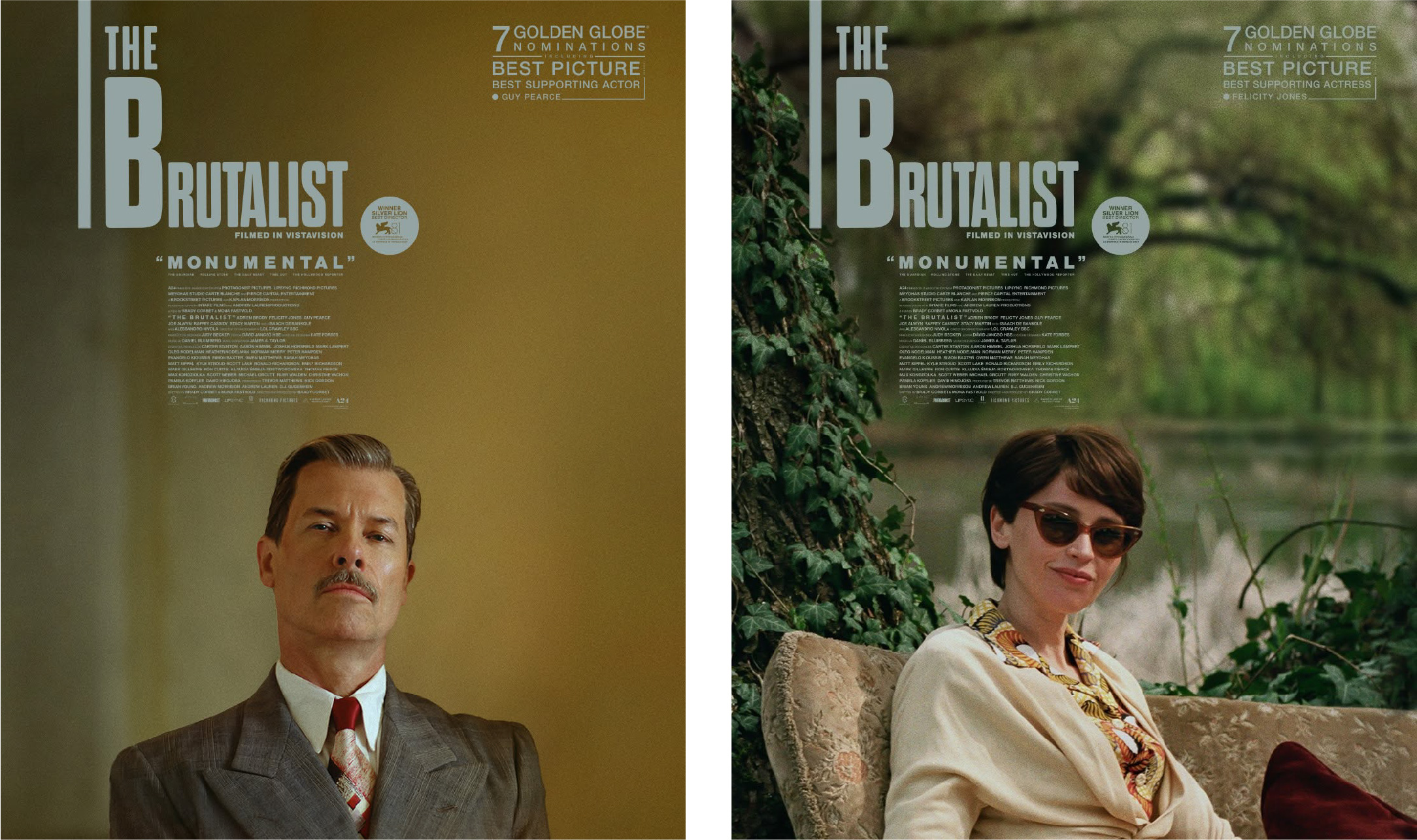
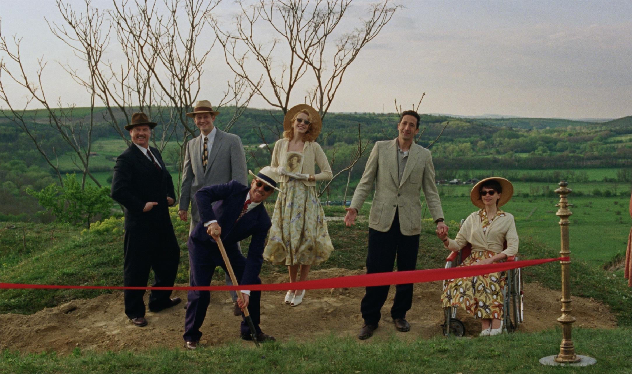
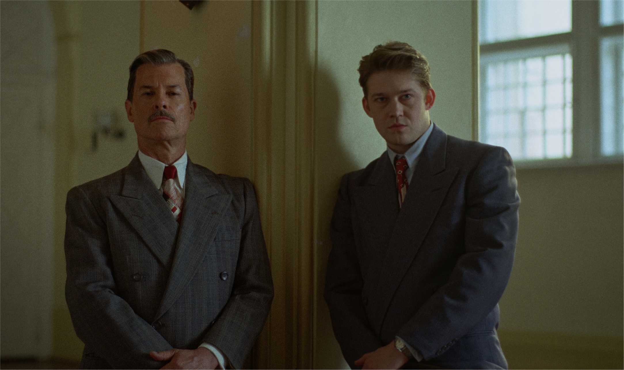
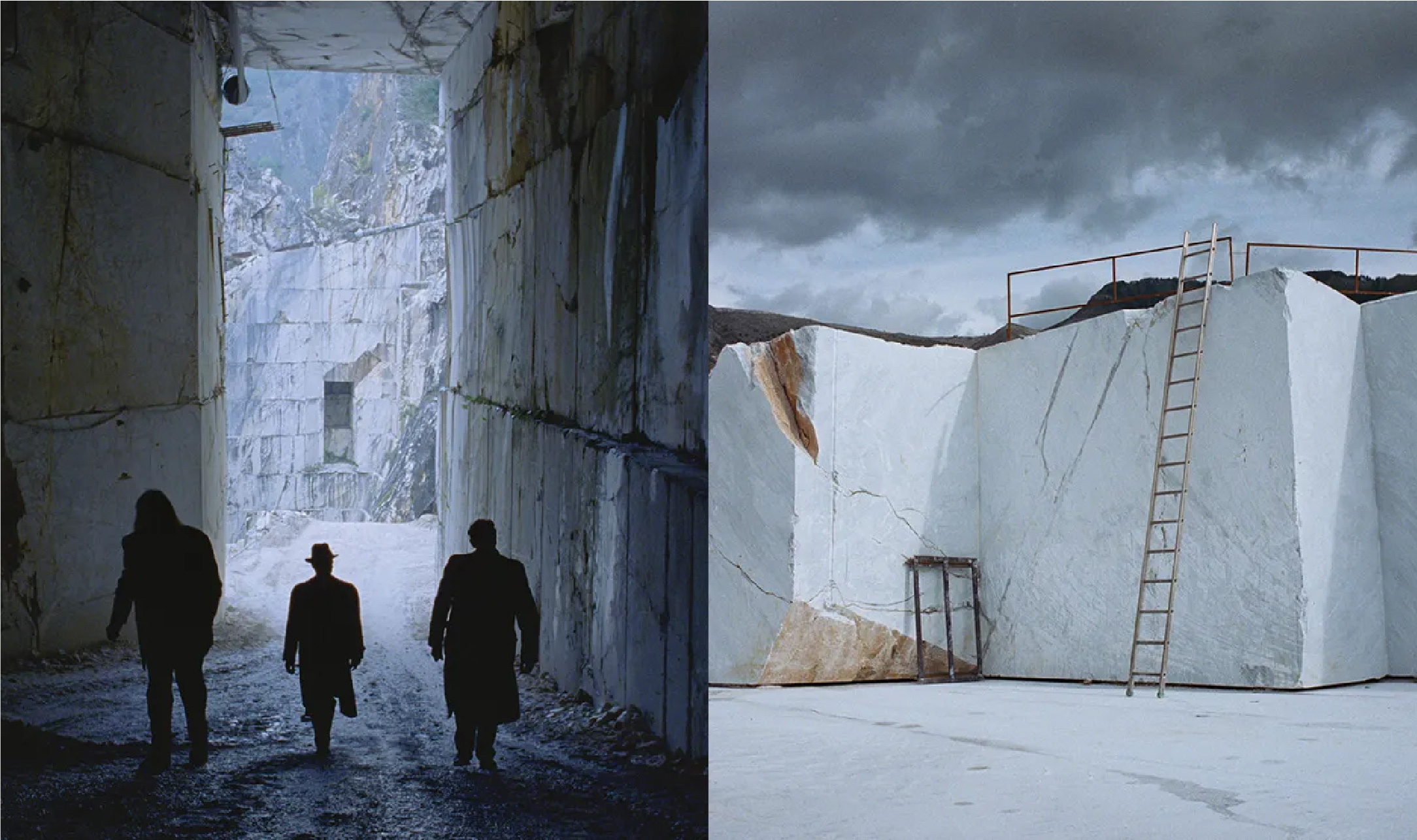
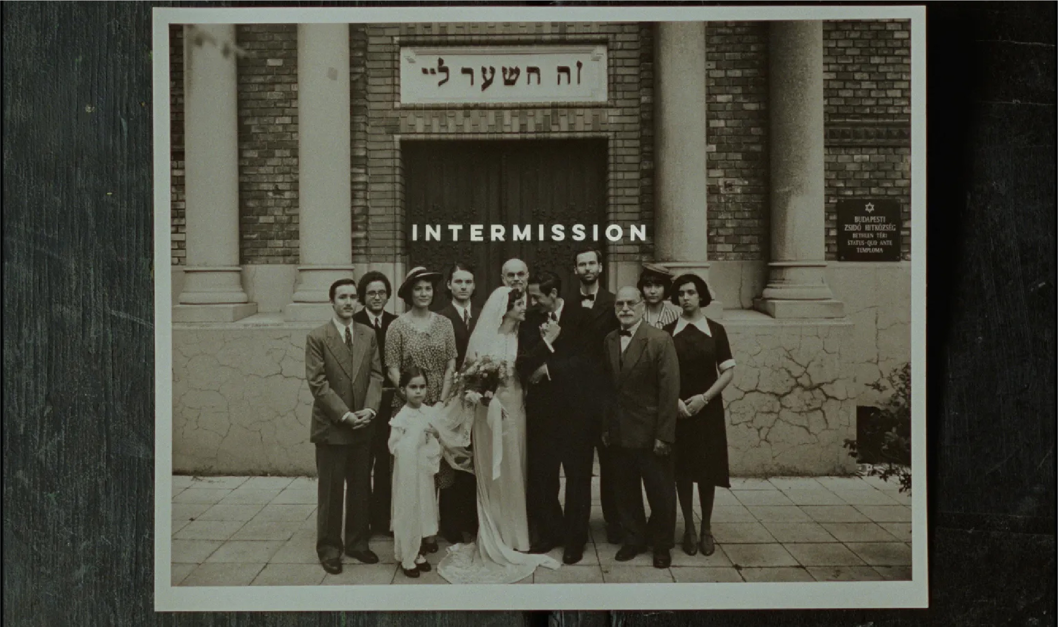
Image Source
https://www.imdb.com/title/tt8999762/?ref_=tt_mv_close
instagram.com/thebrutalistmov