Tokotype Gets Festive for GoPay with Rupa
Designer: Tokotype
Client: GoPay
Scope: Typeface Design
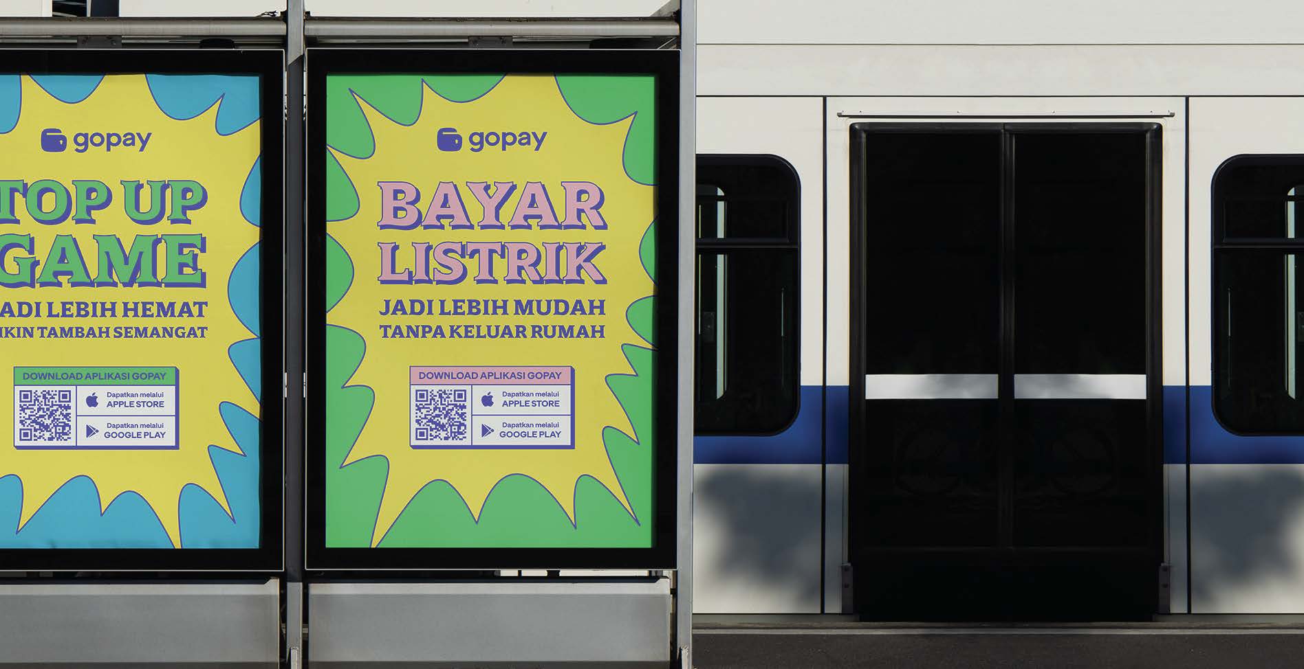
Tokotype is back again with their latest typographic work. This time, Tokotype presents Rupa Sans and Rupa Serif for their client GoPay. This font designed by Tokotype is to be used for both digital and print needs, from the app to promotional materials. Gumpita Rahayu, Design Principal at Tokotype, stated that Tokotype’s involvement with this project began when Gojek approached them back in 2022. “The Gojek team did directly approach us, but it wasn’t for Gojek itself but for GoPay instead. They wanted to create a new design system beyond the existing designs for Gojek,” Gumpita explained.
Gumpita explained that this design took a much more explorative and experimental approach. According to Gumpita, the two font families created are aimed towards a range of implementations. “Rupa Serif is for headlines and key visuals. [While] Rupa Sans is for sub-headers. Like an accompaniment. So, the two typefaces actually complete the other within GoPay's festive visual and illustration style.”

“The initial brief emphasized creating something in the Indo Pop style. That in itself is pretty relative to the visual style that’s trending today. Like a type that’s vernacular and traditional. But we felt that that can’t really be properly integrated well if the visual style is still modern. So, we were more subtle in our approach of creating something vernacular, nothing too extreme,” Gumpita elaborated on the direction and needs of the client. As a solution, Tokotype created a design that blends both a traditional and modern impression as well as an organic feel that is much more casual.
Tokotype added accents on the letters to imitate ink traps and the serif is made more curved to present an organic character. Aside from GoPay’s illustration style, for Gumpita, the design is also a response to GoPay’s color palette which is considerably bright and vibrant. “So, we created a typeface that can complete that. There’s no way you would pair such a festive visual style with a standard typeface approach. It would have no kick to it, not really the right fit.”
The font designed by Tokotype both pairs and blends a vernacular character with a look that’s more pop and current. Tokotype has tried to give and present a different visualization in presenting a vernacular character. On the whole, the font is aligned with the brand being formed by GoPay.


