A Modern and Distinctly Indonesian Character to the New Face of TMII
Designer: 6616 Creative House
Scope: Branding
Client: TMII
Established in 1975, Taman Mini Indonesia Indah (TMII) has been present in the public consciousness as a miniature as well as a recreational and educational park displaying the wealth and diversity of the nation. To raise the relevance of the space with current audiences, TMII has undergone a revitalisation which commenced in 2020. This process encompasses a physical revitalisation and culminated in a full rebrand beginning last May. Following a pitching process, 6616 Creative House was entrusted to undergo this TMII rebranding project.
Shafira Sahara, as 6616’s business director for this project stated that their process began through researching the positioning of TMII as a brand in the present day. From this research, the 6616 team found that a categorisation of TMII visitors can be used as a stepping stone to get a read on the public’s perception of TMII’s function as a public place. This process landed the 6616 team with the tagline “Taman Jelajah Indonesia” (English: Indonesia’s Explorative Park). Then, setting off from said tagline, the design process moved forward into visual exploration.
According to the head of art & design at 6616, Grace Patricia, they initially proposed two frameworks. The first was a complete redesign, letting go of the existing TMII identity. The second, a redesign developed from the existing TMII identity. The client chose the latter. The 6616 team improvised the old logo and transformed it into something simpler with cleaner lines and bolder shapes. The designed logo also functions as a flexible and adaptive vessel to better accommodate various needs or activations by TMII. Said logo acts as a frame that can be paired with photos or other graphic elements as needed. This design is also aimed as a method to fittingly represent that intrinsic “Indonesian-ness”.

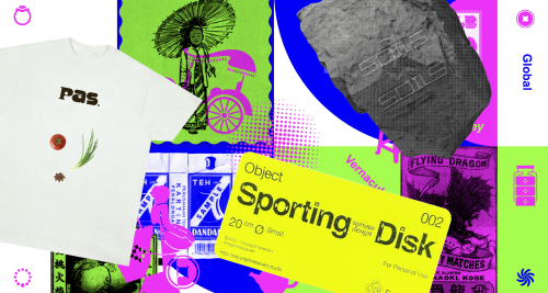
In line with the intentions of the client to present a fun impression in TMII’s branding, bright colors are imbued in this visual design. Furthermore, the use of such a colorful palette also helps represent the diversity of the nation. In practice, it is often demanded for the design process to be broad. Grace mentioned that the design process of this particular project was very organic and responded to the flow and needs of the client. The design of the design system and implementation moved in step with each other. However, that very process was utilized as a trial phase as well as a way to round out the design by the 6616 team.
Overall, the design created by the 6616 team successfully imbued a freshness to the TMII identity without completely uprooting the previous TMII identity. Playing with bright and joyful colors effectively distanced the identity from their dated image attached to TMII. Through this rebranding, 6616 adequately married a modern character with the distinct Indonesian identity. On the matter of design derivatives, the designed merchandise also has an impression that is both fresh and still close to this “Indonesian-ness”. An appropriate implementation for both print and digital needs, especially by the client, will be its own challenge in applying this design that is comprehensive and quite complex.


