Between Designers and Nature for the Visual Identity of the 2023 Bintaro Design District
Designer: Satu Collective
Scope: Visual identity
Client: Bintaro Design District
Multidisciplinary creative festival, Bintaro Design District (BDD) returns once again. Taking up the theme “Envisioning Nature”, BDD has roped in Satu Collective to create the visual identity of this year’s edition of the event. Creative director of Satu Collective, Seto Adi, explained that the design is intended to present something fresh without diminishing the existing strong identity of BDD. From the three ideas presented by Satu Collective, the design was narrowed down to the concept “Frosted Glass”.
“Before anything else, we made a mind map. We measured the extent of our boundaries. The breadth of our exploration and our limits, because we didn’t want to make a design or branding that erased the existing BDD identity which the public is already aware of,” Seto said, explaining their initial creative approach for this project. The team then responded to the theme and extracted the connection between the theme within the context of design.
“[We interpret] ‘Envisioning Nature’ as if we’re looking at nature with fresh eyes, what we’ve done for nature, what we’ve done as designers. The grand design is actually nature right? Before humans design anything. But, now there’s a lot of exploitation. It’s like we now view nature through frosted glass. We don’t really touch it, we don’t really see it. We see nature as something blurred. As if our vision of the future is unclear. So, the hope is that we’ll be able to see nature without that frosted glass at BDD. This concept carries an introspective yet satirical impression that invites creative practitioners to reexamine their relationship with nature.

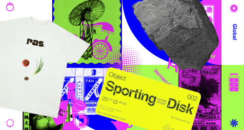
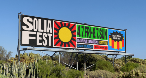
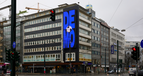
This concept was designed with considerations of both digital and print needs. Said design was planned to be derived to the signage and even Instagram filters. For print purposes in particular, Satu Collective provided a few design templates depending on the print materials’ context of application. “There are media that we felt suited the ‘frosted’ treatment but there are also [media] that don’t. So, we only gave the frosted treatment to the logo and text. The rest aren’t given that photo treatment because we know that using photos may not suit all the printed materials. Some look good with it and some don’t,” Seto elaborated the implementation plans of the designs.
The circular shapes which became the thematic logo for this year’s edition of BDD has sufficiently represented both the theme as well as its relevance to BDD. As a symbol of Bintaro, design, vision, and earth, the circular shape serves as a representative visual element. Not only does it have a deep connotation, as a visual element, this circular shape can be considered quite adaptive. Overall, the design created by Satu Collective has successfully given a fresh impression in their response to the theme and was able to keep away from stereotypical designs when dealing with nature as a theme. The blue in the design maintains BDD’s identity while simultaneously giving a touch of harmony in keeping with the theme. This design could be pushed further if the design collaterals and its derivatives were also responded with more environmentally friendly production techniques and materials.


