TIM's Refreshed Visual Identity Designed by Thinking*Room
Designer: Thinking*Room
Scope: Brand Identity
Client: Taman Ismail Marzuki
Transforming without seeming like anything’s been changed. This was the basic principle adopted by Thinking?*Room for the new brand identity of the Taman Ismail Marzuki (English:Ismail Marzuki Park), or TIM. In this project, the internal team received quite a bit of direction from Danton Sihombing, a representative of Dewan Kesenian Jakarta (English: The Art Jakarta Council), or DKJ, regarding the historical significance of the area. The council itself is one of three policy makers at TIM along with Akademi Jakarta (English: Jakarta Academy, a governorship advisory board regarding the arts and culture) and Institut Kesenian Jakarta (English: Jakarta Institute of Arts), or IKJ.
The Indonesian Association of Graphic Designers (ADGI) also played a part in this projects. As a consultant to Jakpro, ADGI bridged communications between DKJ and Jakpro. Furthermore, ADGI also acted as curator in the selection of designers as well as accompanying and supervising the progression of the project.
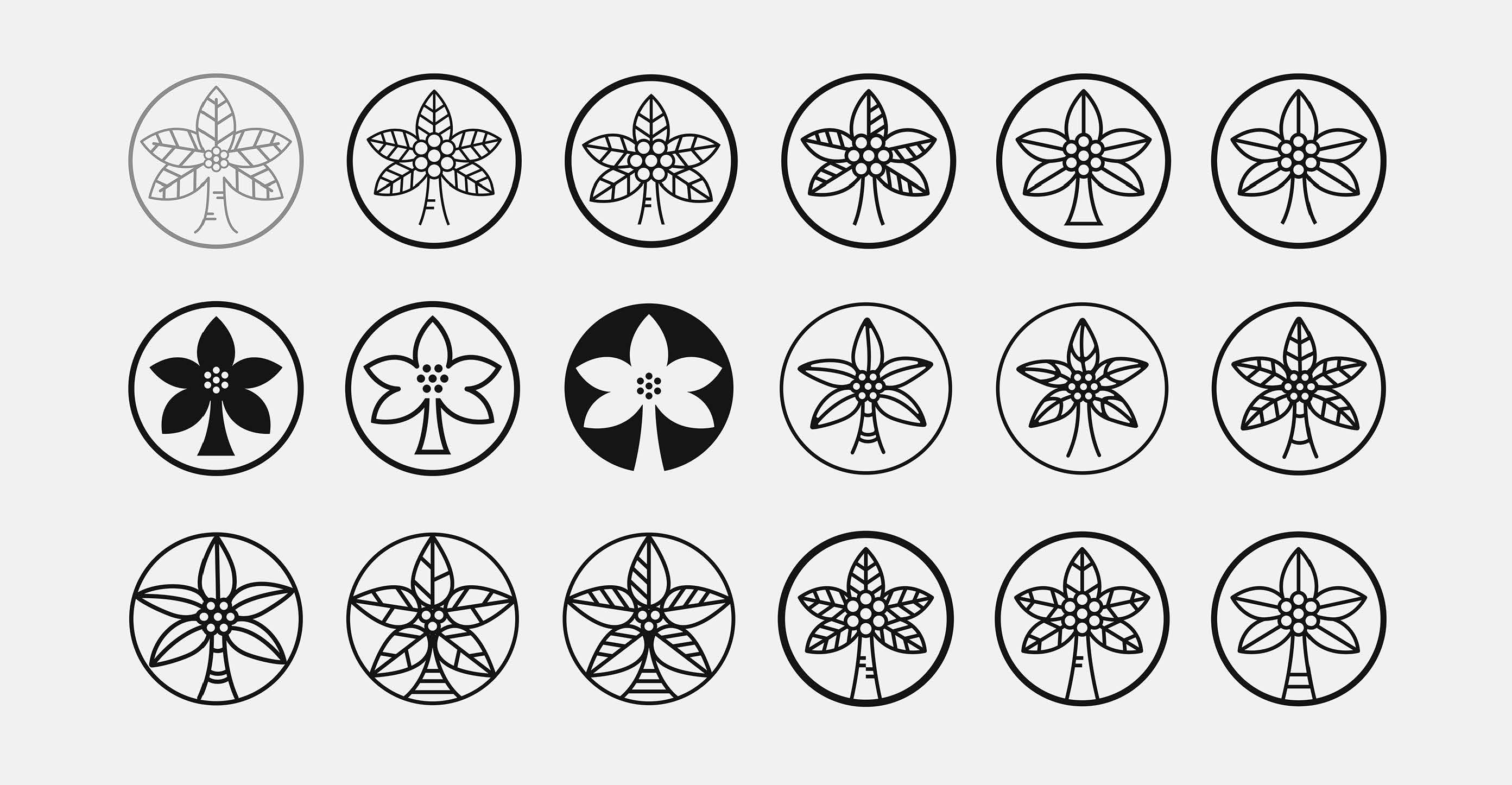
In the development of of this visual identity, Thinking*Room takes off from the logo used thus far by TIm as a vessel of the arts. This logo was designed by Oesman Effendi, a painter and lecturer at IKJ. The logo itself depicts a coconut tree as a symbolization of the source of life and seven coconut fruits to represent seven artistic fields; music, dance, literature, visual arts, theater, film, and tradition.

“The objective that we wanted to achieve is of course a holistic visual identity system. However, what was important for us to pay particular attention to in this was the consideration of [TIM’s] legacy, because TIM itself is something that has been present for a long time. But, how do we make something new to support TIM’s aim as a global center of the arts and culture.”
Ritter Willy Putra, art director at Thinking*RoomThinking*Room’s decision to not apply drastic changes to the logo seemed to be the right choice, keeping in mind the historical value and nostalgia attached to the previous logo used. The idea conception stage all the way to the final result shows the level of care and attention to detail Thinking*Room paid to this project. Their design outcomes which use a bold, sans-serif type as well as ink-traps on the logotype adds a fresh impression to the TIM visual identity. Although there seems to be some distance when the logotype is placed together with the logogram, the modern and contemporary character is more strongly felt in this new iteration.
Thinking*Room successfully implemented a simple four-row grid taken from the concept of musical notation. That idea was applied particularly well, evident in the overall design implementation in multiple formats. We feel that this system was particularly impactful in adding a breath of fresh air to TIM’s visual identity. In terms of color use, the mix of terracotta and black gives a firm yet organic impression. On the whole, this project has shown just the right mix and match of an existing past visual identity with the newness that they are aiming for. Another important aspect, Thinking*Room’s design concept can be said to be very applicative both for online and offline implementations.


