Dynamic Graphics in Figma's New Look
Figma has introduced a new look for the first time in five years, reflecting the growth and evolution of the design platform that now serves a wide range of creators. This refreshed visual identity celebrates dynamic and playful graphic elements, accompanied by a vibrant new color palette. In an official press release, Damien Correll, Creative Director of Figma, stated that the refresh tells the story of how the company has grown and evolved. “As Figma matures and embraces new audiences, a refreshed identity can act as a signifier of that change both internally and externally. We crafted a more inclusive brand with a flexible foundation that will continue to grow and adapt with Figma’s ambitions in the years to come,” said Damien.
Over the past decade, Figma has supported the broader design and creative ecosystem. As its focus expanded, Figma recognized the need to move beyond a visual language rooted in vector graphics. As we know, static graphics have defined the Figma brand for the past five years. “We wanted our new identity to reflect the many hands involved in crafting the journey from imagination to reality,” wrote Figma in the article Figma on Figma: Evolving Our Visual Language.

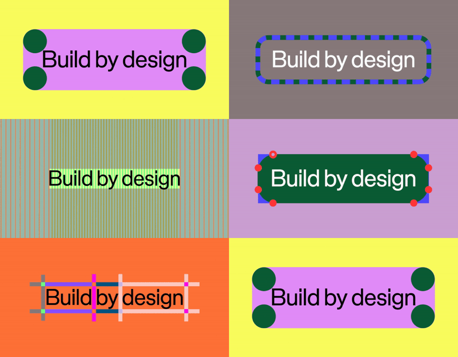
Broadly speaking, the design concept for Figma's brand refresh centers on the idea of "build by design," aiming to redefine design as more than just a skill, a department, or a phase in a process—but as the lifeblood of Figma as a brand. “Build by design” is driven by three core beliefs: design is everyone’s responsibility; true innovation happens when everyone is inspired to participate; craftsmanship in design is a differentiator, where creativity and quality make great work stand out; ideas are just the beginning, leading with "build"—the act of turning ideas into reality. In formulating this new visual identity, Figma drew on four main pillars: flexible core elements that represent the diversity of individuals involved in collaboration; dynamic compositions reflecting varied approaches to creativity; a broader color palette for easy adaptation across different contexts; and integrated motion principles, bringing action and flow to the creative process.
Every graphic element in Figma's new look reflects the company’s current position, looking forward—a vessel of hope where anyone can bring their ideas to life. The dynamic evolution of Figma—and how creators use it—sparked an exploratory phase by Figma's Brand Studio. The concept of Figma as a “shared playground” became the initial inspiration for this brand refresh. Jefferson Cheng, a Brand Designer, drew inspiration from memories of playgrounds designed by Isamu Noguchi and Mitsuru Senda. “They were a metaphor for the Figma canvas—a place where people come together to create and experiment,” he explained. From that initial idea, the team mapped out as many Figma activities as they could think of, using this concept as the foundation for their graphic exploration.
Previously, Figma’s graphics were dominated by geometric shapes but lacked a certain adaptability. Their brand team sought to create visuals that could grow and be communicative. Damien elaborated, “Enduring visual identities should be thought of as languages, not systems. Systems imply rigid rules and predictability.” Figma’s Brand Studio developed a set of core graphic elements that form varied building blocks, ranging from ambiguous blobs to shapes representing different Figma approaches and functions, such as jumbo node graphics—a large square placed in the corner of object boundaries, evoking node decoders and the “selection” action on the Figma canvas. These graphic elements were deliberately made to be varied and inconsistent—like they were hand-drawn. Despite their differing characteristics, all the graphic elements share one thing in common: they look highly graphical, bolder, and braver compared to their predecessors.
To bring these graphics to life, motion designers collaborated with brand designers, sparking ideas on how these elements could work together on a single canvas—like the appearance of moving graphics from a dashed-marquee border representing collaboration. Just like on Figma’s canvas, every object interacts with others, creating compositions within the same space. To maintain consistency with Figma’s elements, the design team revisited the list of actions and design processes creators can perform on the platform. Ideation is represented by free-form collages, like sticky notes on a FigJam canvas; designing relies on movement through manipulation and transformation; and building is represented by visual abstractions of coding, inspecting, and annotating. Overall, this composition encompasses four main movements: Overlap, where shapes layer over one another; Reveal, where selected shapes expose underlying structures; Clustering, where shapes and patterns gather into free compositions; and Multi-move, where various compositional elements unite to form a dynamic whole.

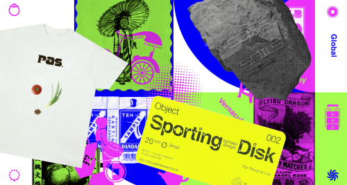
Turning to other graphic elements such as color, Brand Studio developed a color scheme that is complex yet harmonious. Figma has retained its signature purple but introduced a wider range of colors, including bold primaries, bright neons, and soft, grounded hues. In their design, Brand Studio paired two tonal colors at different hue levels. These colors clash with each other to create sharp contrast and motion—like energy flowing from one individual to another. Complementing these graphic elements without sacrificing functionality, Figma also introduced a custom typeface called Figma Sans. In addition to this font, Figma includes three other typefaces: Figma Condensed, Figma Mono, and Figma Hand.
Figma’s internal Brand Studio utilized advanced tools from their own platform to design all the graphics needed for this brand refresh. Each graphic is an abstract interpretation of phases in product development, whether it’s brainstorming, designing, or building. In an official statement, Figma’s team shared that the brand refresh process was far from linear and took months of team exploration. With shared enthusiasm and strong ideas, the Figma team refined each other’s work. “Figma lends itself to being egoless,” said Jefferson Cheng, Brand Designer at Figma. “It doesn’t matter where something originates; we’re coming together to make something great.” Figma’s new dynamic look underscores the company’s forward-focused flexibility as both a platform and a brand. This latest visual identity serves as a starting point for continued growth and adaptation in the future.
Figma’s Brand Studio: Andrea Helmbolt, Brand Strategist; Andy Luce, Brand Designer; Becca Ramos, Brand Designer; Catherine Bui, Brand Designer; Damien Correll, Creative Director; Gilles Desmadrille, Brand Motion Designer; Jefferson Cheng, Brand Designer; Kaley Aposporos, Brand Copywriter; Leandro Castelao, Brand Designer; Maria Chimishkyan, Brand Designer; Sydney Halle, Brand Producer; Taryn Cowart, Design Manager
Agency Collaborators: Buck, for out of home campaign; Nimble, for narrative work.


