A Closer Look at the Paris 2024 Olympics Designs
Competition, controversy, and visual beauty at the Paris 2024 Olympics has been in the spotlight since the games opened on July 26th. Design plays an undeniable role in this quadrennial competition—giving the Paris 2024 Olympics a strong appeal from a visual perspective. Instead of simply prioritizing function as a medium of communication to bring together the athletes, spectators, and the world, all visual elements of the Paris 2024 Olympics were designed with a thorough artistic concept and depicts the French spirit influenced by fashion, architecture, and history.
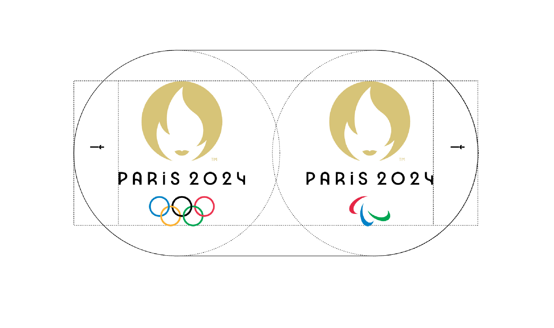
The Paris 2024 visual identity was first announced in 2019 with an introduction to the female icon that represents the Republic of France. For the first time in history, said visual identity will be used for two big events: the Olympics and the Paralympics—reflecting Paris 2024’s ambition to revolutionize the sporting event. There are many ways to describe the Paris 2024 designs: elegant, soft but exciting, revolutionary with style, idealistic—all attributes of France and their residents. This design born from a long consideration blends modernity with the heritage of the Art Deco movement which reached its peak in 1924, where Paris had also played host to the Olympic Games.
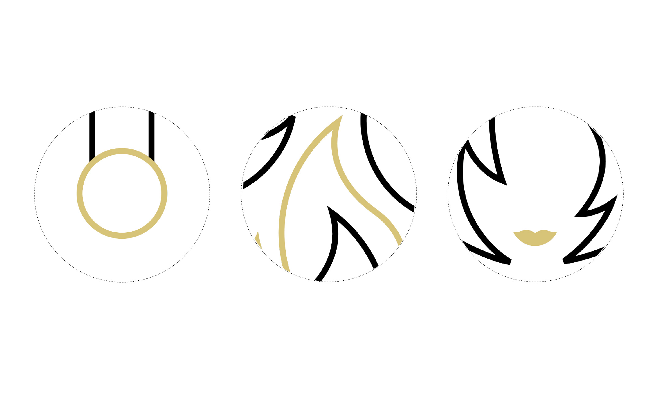
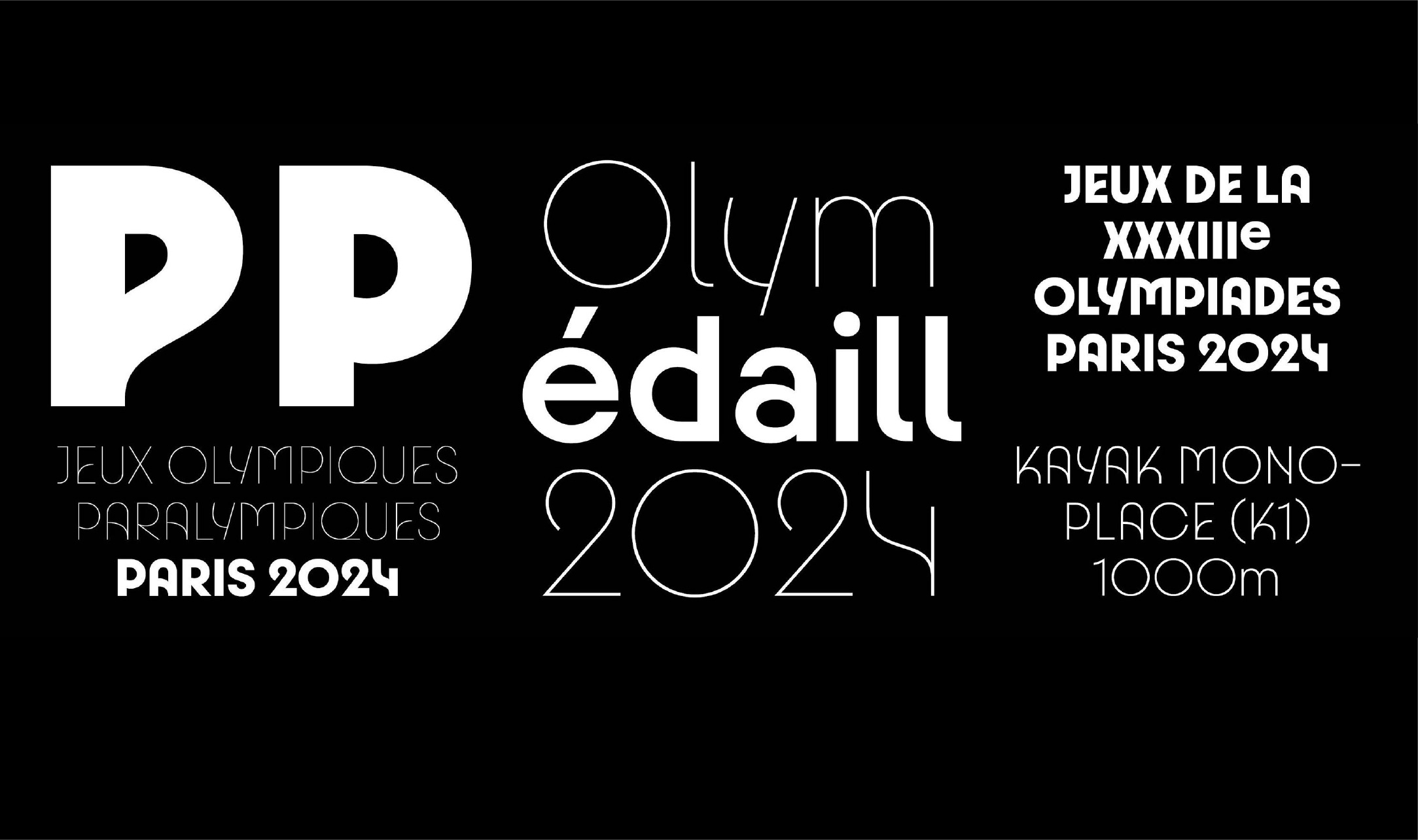
When discussing the Paris 2024 identity, the logo is at the top of a list of highlights, the first in history to depict a female face. Designed by Sylvain Boyer, a designer at the Paris-based brand and innovation consultancy Royalties, the Paris 2024 Olympics logo blends three main elements each with their own interpretations: Marriane’s face, a woman representing the freedom of Paris (from the etymological roots offranc/frei/free); the Olympic flame as a symbol of progress for all; and gold which represents human excellence. On their official website, Royalties states that although it carries many meanings, the logo is not a mere symbol, rather a promise from Paris 2024 to the world to revolutionize the Olympics—turning the event into an inclusive vessel. From a technical perspective, an interesting aspect of the Paris 2024 logo is the use of eco-branding in its design guidelines:graphics that use less ink, typography with specific variables in order to save energy and paper, environmentally friendly colors, and an official website design with a dark mode option to reduce energy consumption of mobile phones. The Paris 2024 logo has established a standard of eco-branding in design that may become an inspiration for other major events.
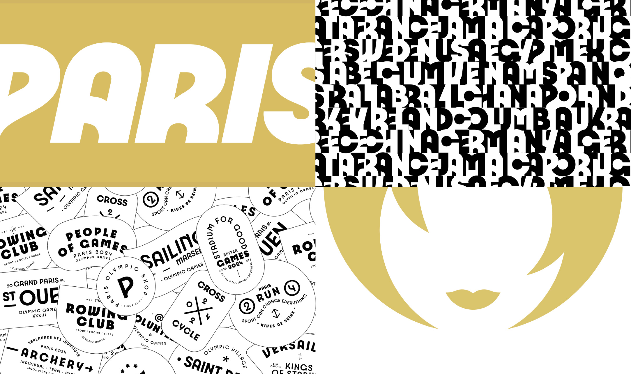
Aside from the logo, part of the Paris 2024 visual identity that can be seen throughout all sectors of the competition is the main graphic element which is a harmonious combination of geometry with a blend of colors. In an interview with Creative Review UK, Julie Matikhine, Brand Director of Paris 2024, stated that that main graphic was based on the slogan “Sous les pavés, les Jeux”, meaning “Under the paving stones, the Games”. That sentence expresses the national revolutionary attitude as well as using the paving stone as a foundational symbol of every city, village, and street of France. Taking off from that notion, the main graphics of the Olympics are inspired by the geometrical shape and texture of the paving stones which were arranged to form buildings. These geometric forms also take inspiration from the symbols and architecture of the host city including the Eiffel Tower, the waves of the Seine River, and a number of arenas where a variety of sports are played—evident in the curved tracks of the visuals.
The mix of sharp lines and simple graphic shapes that come together in said grid system is a reflection of the Art Deco style. The colors used in the main graphics of Paris 2024 is a combination of green, purple, blue, pink, white, and gold, with a pastel treatment that reiterates that France is a nation of style and culture—inviting many to feel a life of elegance, optimism, full of passion and aesthetics, as well as joy. This Art Deco feel is also injected into the Paris 2024 typography design created by jli Type Studio. The Paris 2024 typeface family includes many alternative variables, italics, and glyphs with forms that resemble the architecture unique to France, like the capital “A” which reflects the Eiffel Tower.
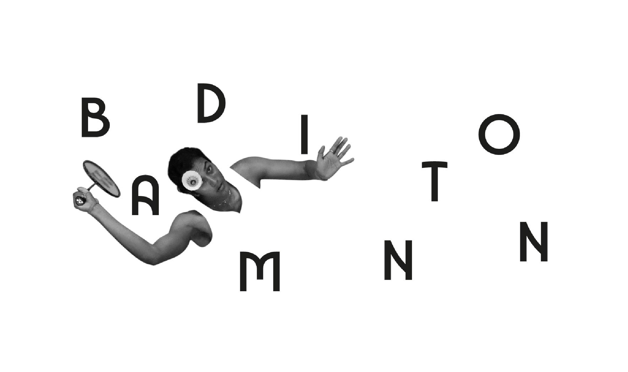
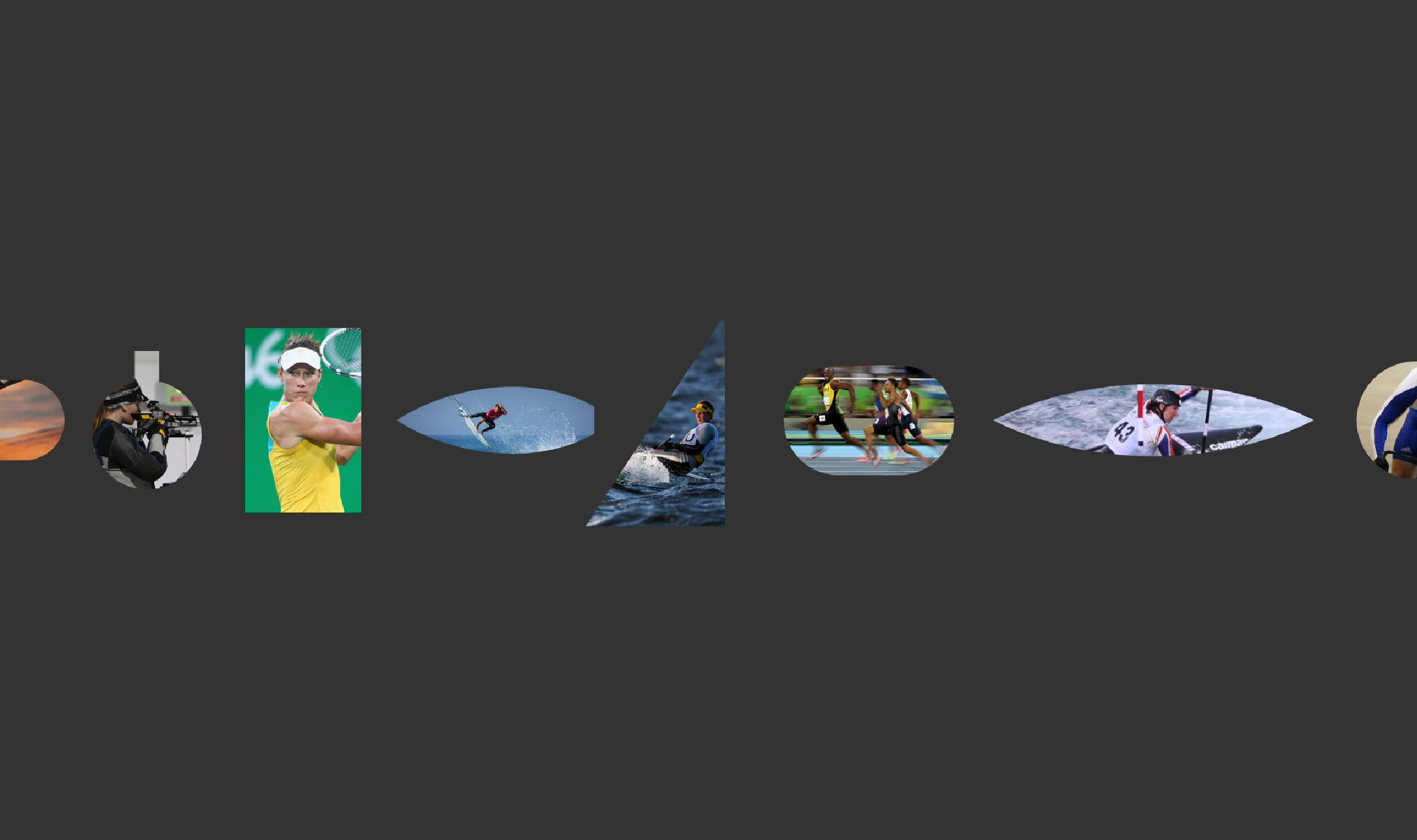
From the main visual identity, the Paris 2024 graphics are then derived into a set of pictograms which represent each sport. Unlike the pictograms of the Olympic Games that have come before, Paris 2024 chose to emphasize lines, geometry, and the sport equipment rather than prioritizing a set of iconography that prioritized human figures—a tribute to the 1968 Mexico Olympics. Each Paris 2024 pictogram is a sum of three graphic elements: a symmetrical axis; a depiction of the grounds; and a representation of the sport illustrated. For example, the athletics pictogram, which is typically depicted with a human icon, takes the image of two shoes on opposite sides of an oval-shaped running track. These pictograms which rely on strokes and geometric shapes is a refreshing graphical breakthrough for the Olympics. Each pictogram that is then applied on the field fills the space and helps shape the competing field. The mirroring objects in each pictogram also leaves an impression of elegance—reminiscent of playing cards and royal crests. Unfortunately, these pictograms have been deemed by many to have forgotten its primary function. In the history of the Olympics, pictograms also serve as a guiding tool for the thousands of athletes and millions of spectators to find their way to the sport they are looking for. The graphical pictograms of Paris 2024, with its focus on strokes and forms, communicate information regarding the sport they represent clearly, as written by The Loop Marketing: “While it gets it right in the unique design and identity of the Paris Games, it falls extremely short in functionality. It completely misses the mark on the original purpose of the pictograms: to easily communicate without written language.”
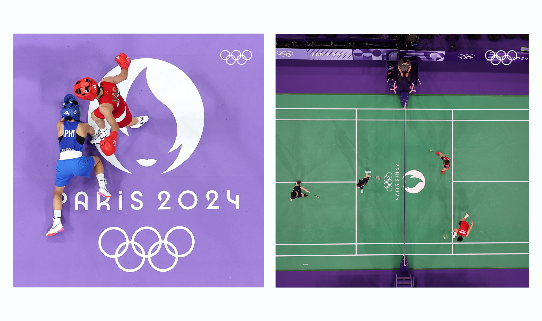
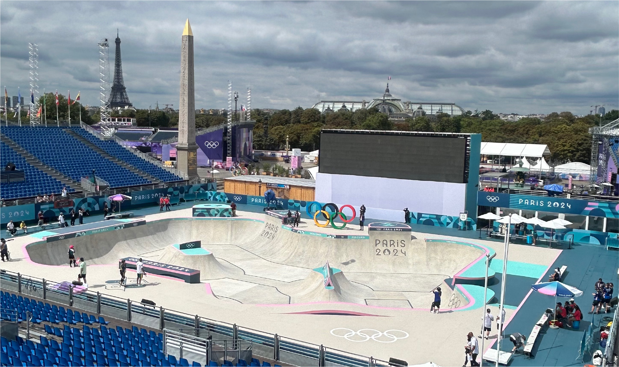
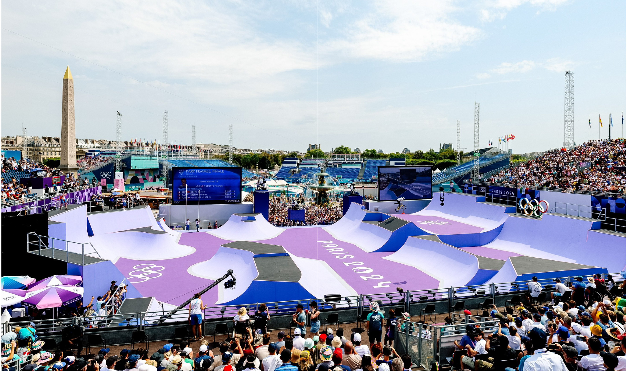
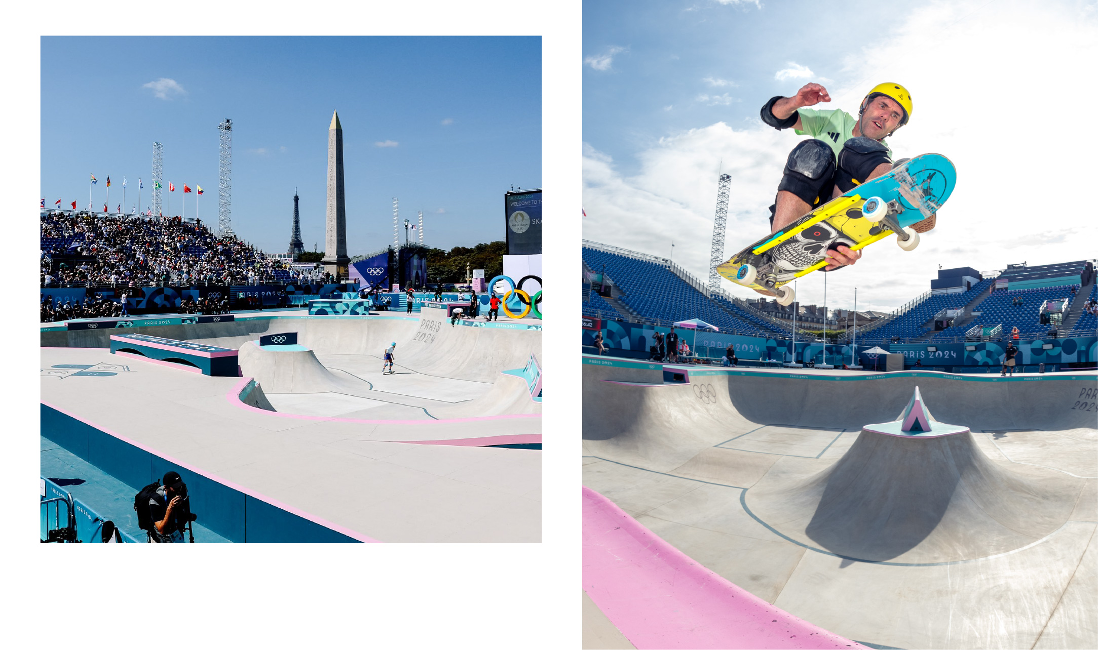
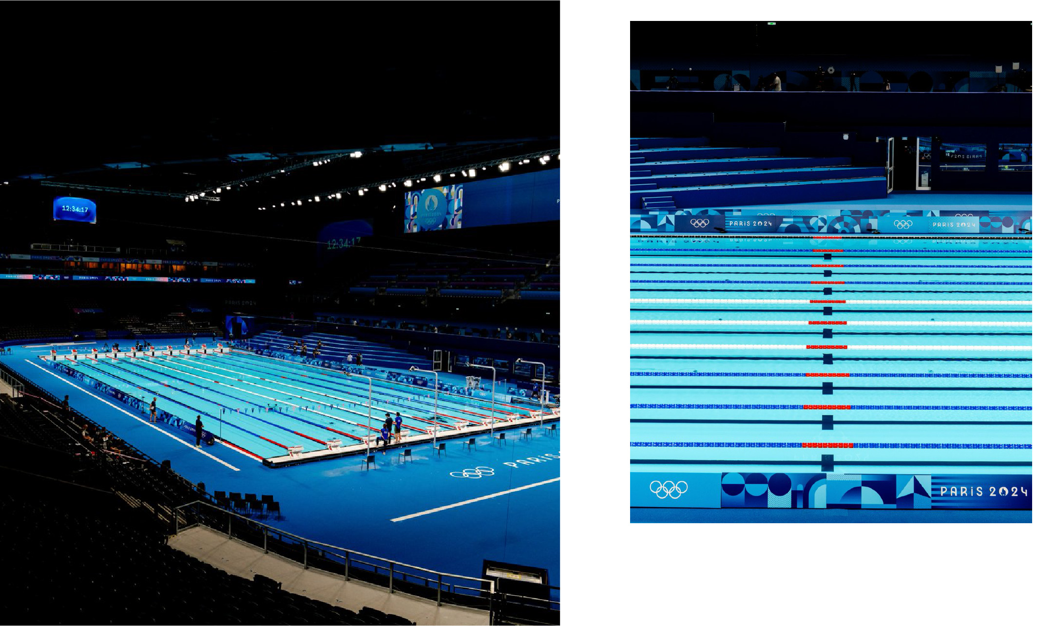
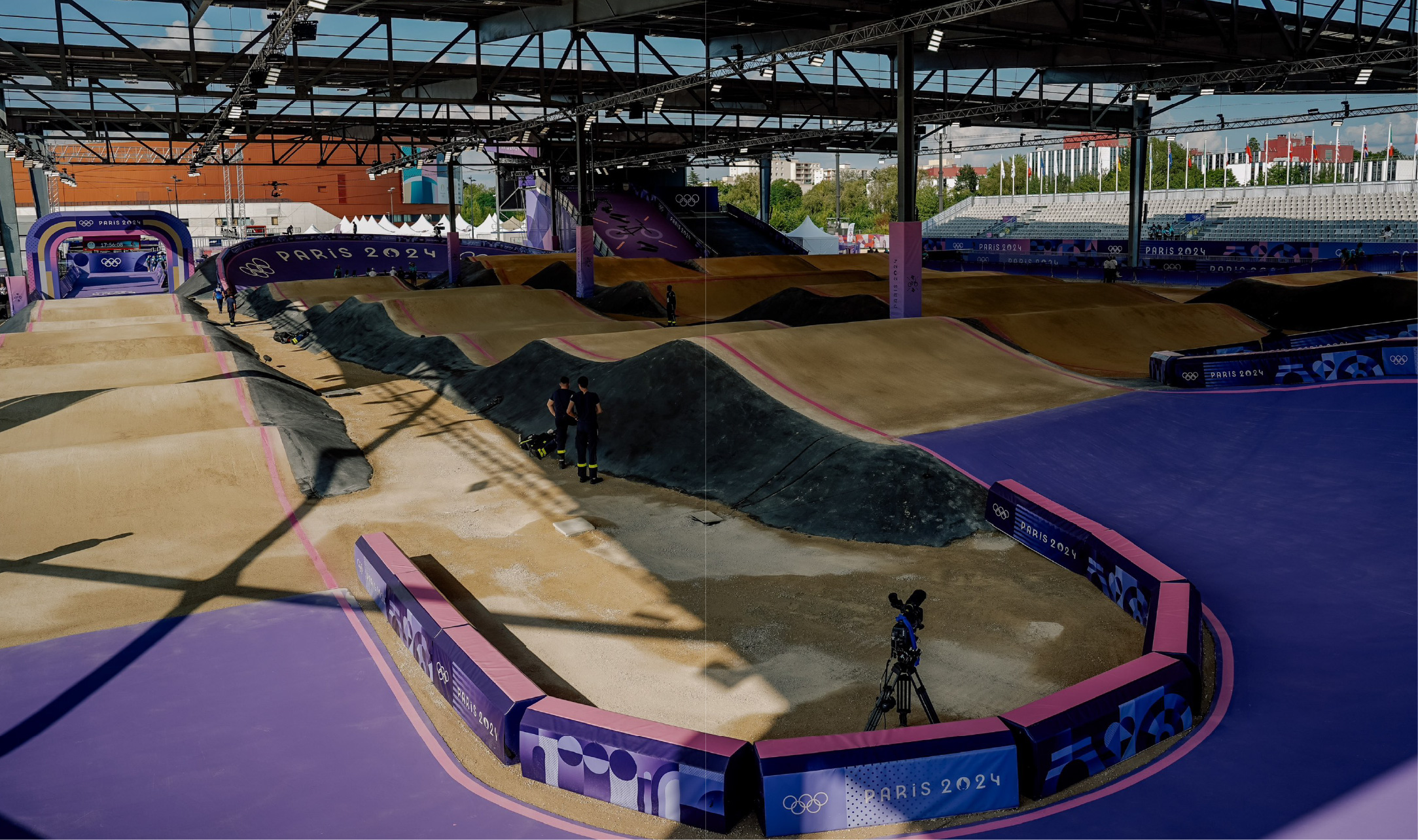
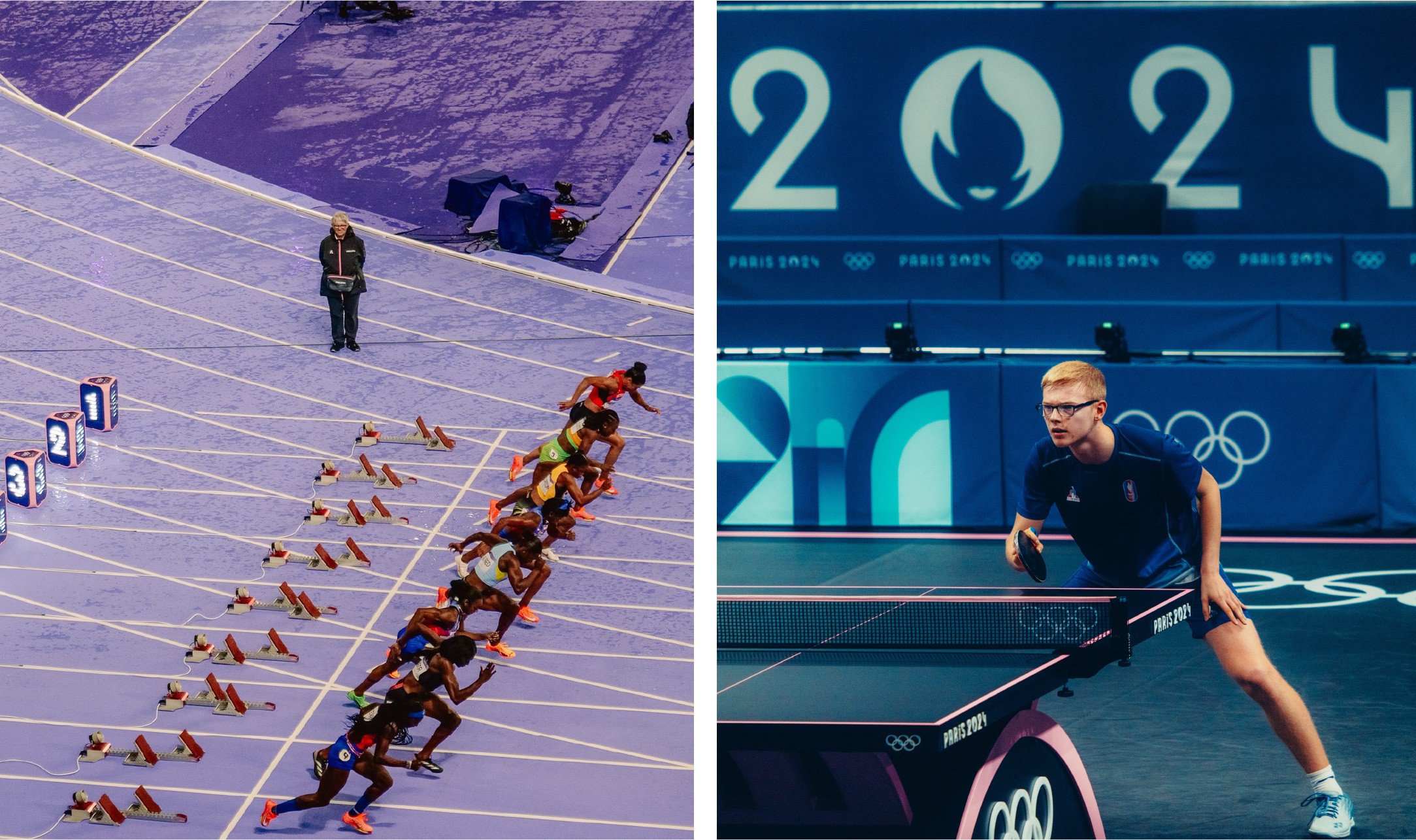
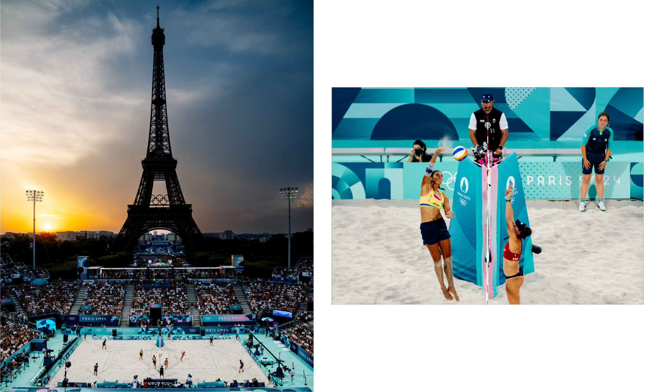
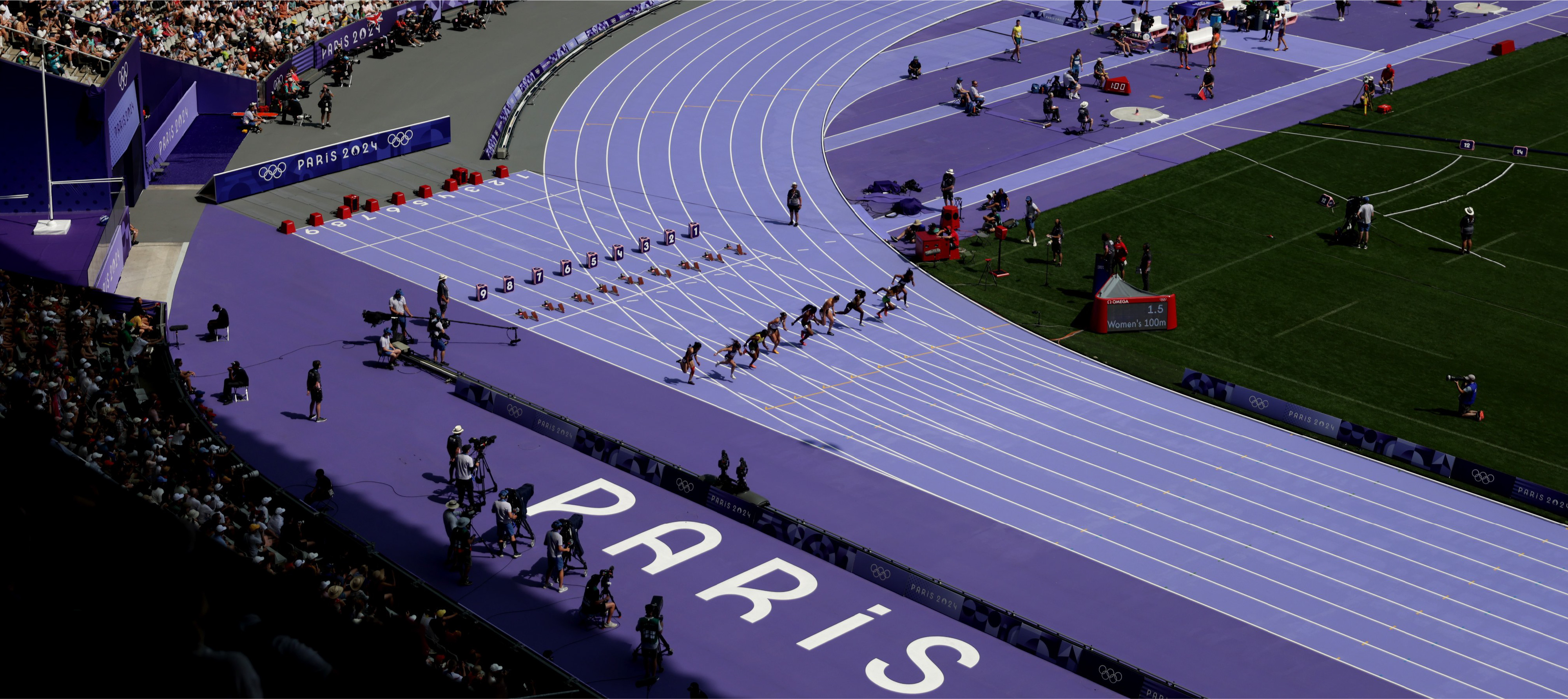
On the designs of the Paris 2024 Olympics, it would be remiss to not also discuss the spatial design which has caught the eye of the public. With the organizers aiming to minimize new construction in order to reduce their carbon footprint, nearly all of the 35 venues are pre-existing buildings or temporary structures built at a number of famous landmarks in France. Not only designed in accordance with the spatial guidelines, each venue also implements the visual identity through placement of the graphic elements on the walls and the primary color palette displayed harmoniously as seen on the skateboard rink, the athletics track, and even on the beach volleyball field.
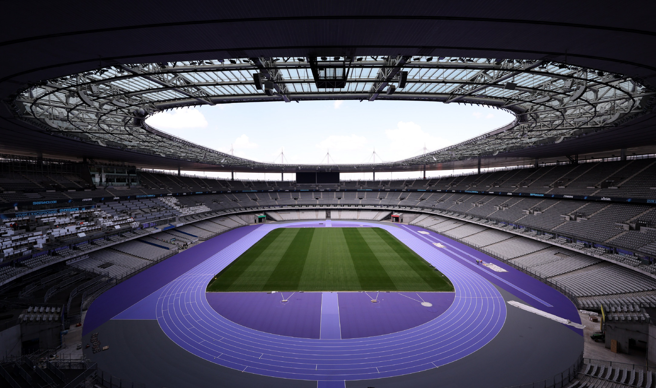
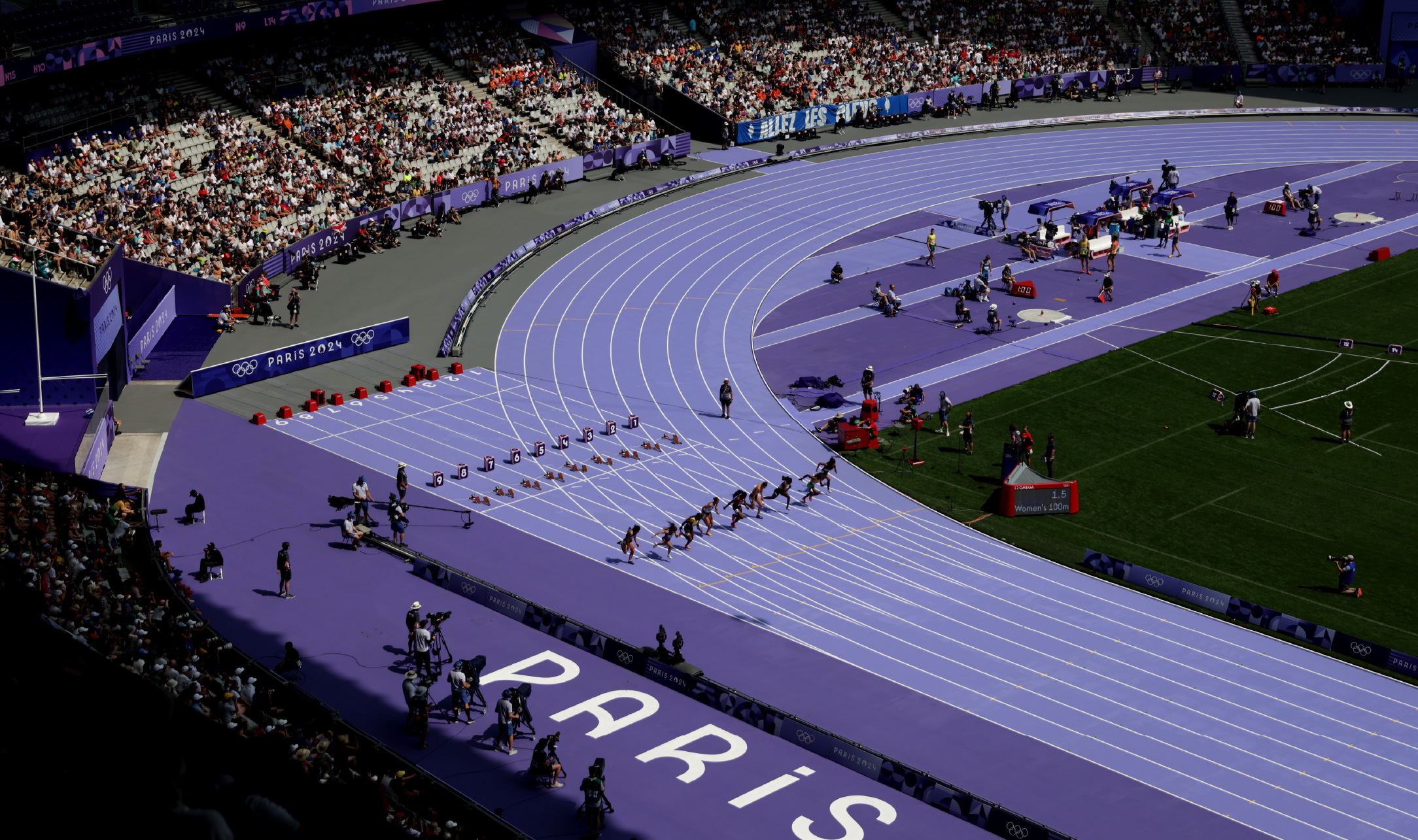
Initially used as a site of execution during the French Revolution. Place de la Concorde is temporarily transformed into a sports complex and will host the skateboarding event. As we know, the skate park is a rather complicated venue in terms of construction and spatial design. In the Paris 2024 Olympics, this skatepark was not only made challenging for the athletes, but also artistic with the placement of sky blue and pastel pink at the peak of the slopes. Said colors add their own silhouette to the wavy venue. Another venue to highlight is the athletic venue, with a dominant purple color in pastel that surrounds the area. The track is designed by Italian manufacturing group Mondo, who has designed every main stadium track for the Olympic Games since 1992. Athletics tracks are generally brick red or blue, but Paris 2024 has taken a daring approach by taking a new approach that is more elegant and feminine—keeping in mind how the sport is often associated with loud and masculine colors. The new track with nine lanes is a light purple in the center and a slightly darker purple at the edges. Meanwhile, gray is used at the curve of the track as a tribute to the track at the Paris 1924 Olympics. The harmonious blend of colors not only bolsters the strong Paris 2024 visual identity, but it also provides a spatial experience both when one observes and or is on the track—with a silhouette that pleases the eye.
Spatial design was indeed one of the main concepts carried by Paris 2024. The “Look of the Games” is an additional value offered by Paris 2024, where the visual identity decorates each location involved with the Olympics, like the competition venues or the Olympic Village. In line with their ambition to make a mark in history by revolutionizing the Olympic symbols, Paris 2024 presents a look that is outside the box, and for the first time in history, this look adapted to the other host cities—colorful and aesthetically pleasing, bold yet minimalist, modern yet rich in symbolism. On their official website, the Paris 2024 Olympics state that the “Look of the Games” is designed to celebrate sports, enliven the ambience with a visual identity full of color, celebrate style and elegance that is undeniably French, welcome back Art Deco, and implement sustainability.
The Paris 2024 Olympics is a visual celebration with design as its primary vessel—with the many issues that the sport event wishes to voice through their visual identity. The final look of all the Paris 2024 design elements that we see now is the result of collaboration between designers of many sectors—graphic, typography, and even spatial. The visual excitement of Paris 2024 is nicely summarized in the official poster by illustrator Ugo Gattoni that brings us to a utopian Paris—a city open to the world, an inclusive vessel wherein sport is celebrated by all cornets, and the influence of the Art Deco movement that creates a bridge between the past and the present. Through design, Paris 2024 not only fulfills a functional need but also uplifts the artistic and symbolic values unique to Paris.
Images courtesy of Olympics.com and Royalties.fr